UConn Huskies Logo
Tags: athletic branch | University of Connecticut | USA
UConn Huskies is the athletic branch of the University of Connecticut, representing various teams playing for this university. That includes American football, basketball, tennis and more. The organization is known since the early 1900s, although the current name has only been in use since the 20s.
Meaning and History
![]()
UConn Huskies date back to the early 1900s, when this University of Connecticut introduced the sports division to represent the establishment on various athletic competitions, most notably the college ball. In the 20s, they’ve adopted the name Huskies and became using a husky dog as their mascot.
The name is the wordplay on the Canadian territory of Yukon, famous for its huskies and husky safaris. The university has nothing to do with the territory, located in Connecticut as it is. The name choice was only made due to the clever wordplay.
What is UConn Huskies?
UConn Huskies is an athletic branch of the University of Connecticut, incorporating several sports teams competing on behalf of the university. The organization has been active since the 1900s, and the husky dog has been their mascot since the 1920s.
1959 – 1960
![]()
The earliest unique logotype used by the Huskies depicts a rather bewildered husky dog (only the head and neck are depicted). The design is very minimalistic and far from the realistic depictions the team started using later on. The image is mostly white, with black used for shades and features, as well as a thin black outline around the emblem.
1960 – 1970
![]()
In the 60s, they’ve introduced a more human-like emblem. The new logo is a black-and-white depiction of a minuteman with the head of a husky dog. A minuteman is a common symbol of New England, of which Connecticut is a part of. They hold a rifle in the logo and wear the 18th century militiaman costume, including a triangle hat.
The husky bit is a lot more cartoonish than before, depicted with a strikingly happy face instead of the previous bewildered expression.
1970 – 1981
![]()
The 70s image depicts the head and neck of a husky dog, like the original logotype. Unlike that, it’s a lot more realistic. The dog doesn’t have any particular expression to make it more believable. For this design, they’ve used plenty of black strokes to highlight shades and various features, like the eyes, the nose and more.
1981 – 2002
![]()
They’ve used a similar approach for this next logo, although the style has changed a lot. Whereas the previous logo seems etched in, this design is a lot more like a typical drawing. The lines are more fluid, balanced and create a more cohesive image. The emblem is more detailed as a result. In terms of substantial changes, the husky adopted a much more jolly expression with its tongue out.
2002 – 2010
![]()
The following design is structurally almost identical to the previous installation. The lines are thicker, there are fewer minor details (like the shading strokes), and the image in general is more cartoonish. They’ve also changed the color palette, breaking the decades-old tradition. The black elements are now dark blue, whereas the tongue became a bright red.
2010 – 2013
![]()
The logo used for twenty years got a significant remake. The husky dog was now done as a less detailed drawing rather than a realistic image of a dog. It had the same friendly and at the same time curious expression. Instead of a round base, the image now had a light gray outline. The animal also had its tongue colored red, which brightened up the whole image. The name was no longer overlapped by the drawing, nor was it done using a three-dimensional font. The new typeface had a modern, stylish, and confident look.
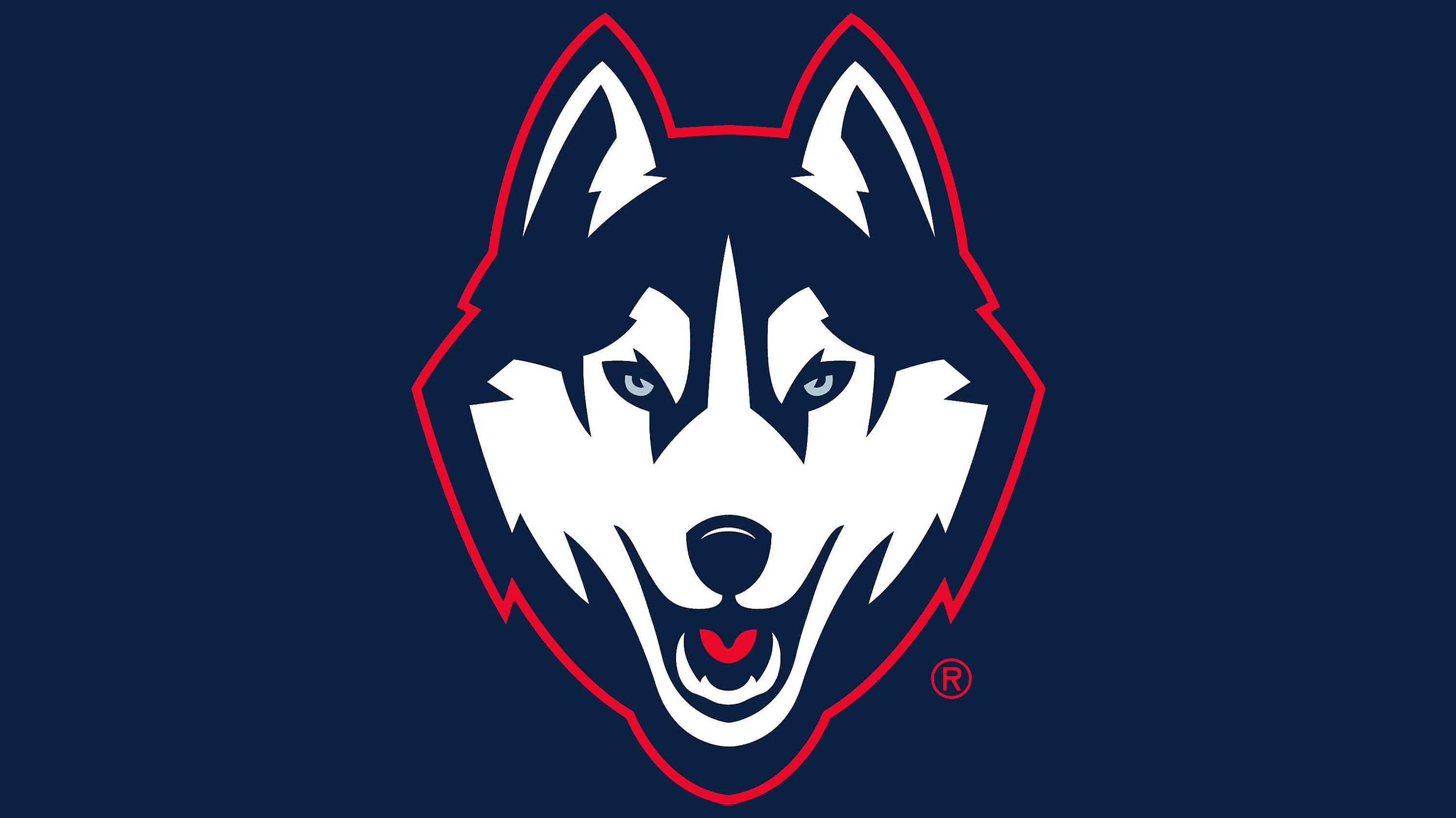
2013 – today
![]()
The 2013-introduced logotype is a less detailed but simultaneously more realistic depiction of a husky head, full face. Some parts are similar to the previous image, in particular with the color scheme. The image is mostly white and dark blue (for the fur). The husky’s eyes are light blue, whereas the tongue is also bright red.
Font
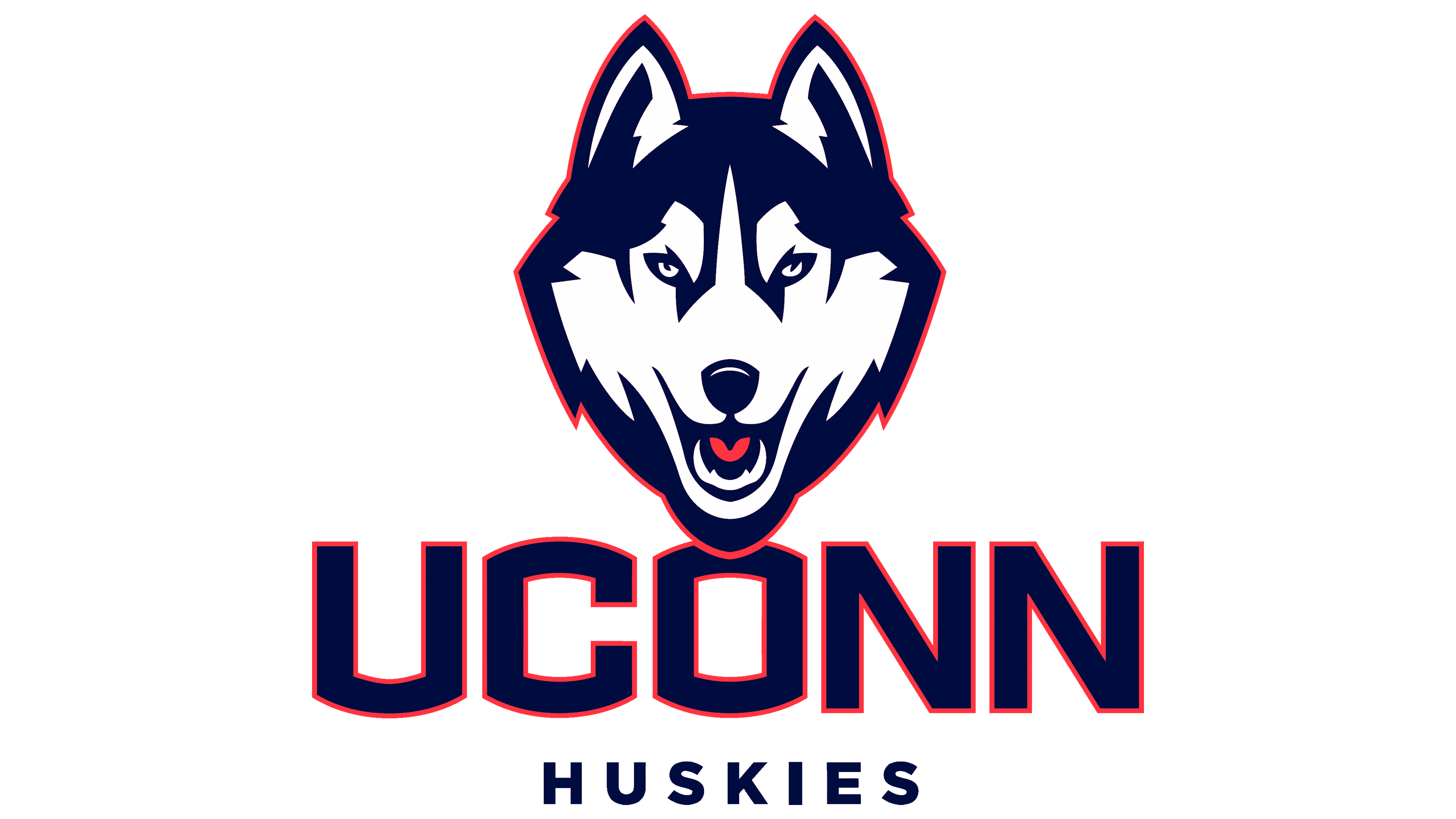
These teams use a wordmark on some occasions, which uses dark blue letters to spell ‘UConn’ in all capitalized letters, and sometimes the ‘Huskies’ below that in smaller capitalized letters. The font is typically a geometric, bold style that uses elements of a typical college font.
Color
The main color has long been the dark blue, utilized not only for the team’s logo, but also for their uniforms, banners and other elements. The other common color is white, used generously in the logotype itself and for other uses. Red is also used occasionally – in particular, to outline the letters in the wordmark.