UPS Logo
Tags: mail delivery | parcel delivery | USA
UPS is an acronym for United Parcel Service, a worldwide supported corporation that offers logistics services to individual clients and corporations. With locations in over 220 countries, UPS delivers over 20 million parcels a day. The brand’s feature is its brown vehicles and employee uniforms which have become one of the most recognizable brand identity elements today.
Meaning and history
![]()
UPS was established in 1907 as a small delivery service in Seattle, Washington, by 19-year-old James E. Casey and Claude Ryan. Initially titled American Messanger Service, the firm was a transporter of documents, mail, and messengers across the US. Six years after the foundation, the brand was renamed as United Parcel Service.
Throughout most of the 20th century, the business grows primarily nationwide, delivering cargo in major cities. The expansion beyond home took place in the 70s when UPS opened delivery locations in Canada, Europe, and South America.
The number of clients, trucks, and employees grew, and the business started the implementation of innovative solutions in its operational mechanisms. One of these solutions became their official website, that appeared in the 1990s and exists today. It allows people to buy UPS services online, and track their packages in real-time.
Today, USP is an international giant with half a million employees, 10,000 vehicles, and over 5,000 operating locations in 220 countries.
What is UPS?
UPS is among the biggest businesses that offer cargo and mail delivery for corporate and personal needs. Since its start in Seatle, Washington, in 1907, the firm has opened delivery locations globally. Now it conducts about 20 million parcel delivery operations every day and works in 220 nations.
1916 – 1937
![]()
The very first corporate emblem of USP was a schematic depiction of a black flying eagle put over a metallic shield. The bird carried a small roped box within its claws. The bronze shield had three sharpened tips at the top and a white outline.
1937 – 1961
![]()
The USP acronym first appeared on their corporate logotype at the end of the 30s. It consisted of three lowercase characters colored brown and white and executed in neat and rounded lines.
The lettering was positioned at the center of a brown shield with its top part straightened. The crest had thick yellow contours, that covered the shield’s borders and also separated its upper part, which contained the brand’s catchy tagline. Below the shield, there was a ribbon saying ‘since 1902’.
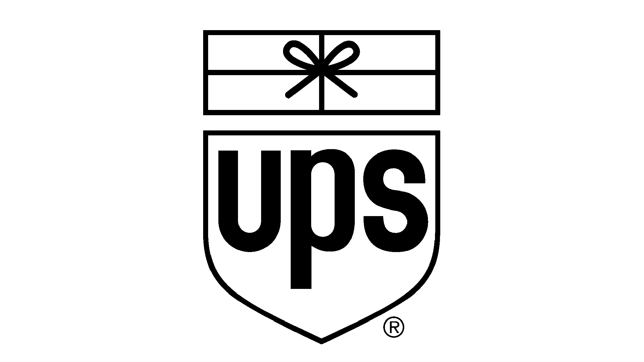
1961 – 2003
![]()
In the second part of the 20th century, UPS used a more schematic logotype. It showed a white shield with brown contours. The crest was shortened and contained only the acronym, written in bold character without serifs. Above it, a rectangle split into four sections and having a knot at the center found its place.
2003 – 2014
![]()
The 2003 logo transformation displayed the shield shape restored to something similar to the early ones. It was a crest with a rounded top and pointed lower tip. It was colored gradient golden and white, as well as the lowercase acronym on it, which got a new typeface. Additionally, there was a gradient brown/white insert that mostly mimicked the shield’s shape, but its upper left corner was heavily rounded.
2014 – today
![]()
The latter variation of the company’s shield depicts all the same elements but in a simplified yellow and brown chromatic choice.
Color
Now, the brand’s logotype uses a bright yellow and dark brown color code that is the perfect combination to give people a sense of status, seriousness, and security, associated with the United Parcel Service.
Font
The characters of their name have a bold typeface without serifs. It has smooth lowercase characters with rounded lines and small gaps in between.