Target Logo
Tags: Canada | store chain | stores | USA
Target is an American convenience store line that appeared in Minneapolis, in 1902. It offers a variety of typical products, including groceries, household goods, and clothes. With over 1900 locations in the US, Target is among the most considerable store lines in the nation. Since its launch, it came through a number of logotype reinventions that relaunched its brand identity.
Meaning and history
The current moniker of the company reflects the brand’s dedication to offering customers high-quality products that can match their needs and want at an affordable price, thus providing a personalized customer experience.
Set up at the beginning of the 20th century by George Dayton as Dayton Dry Goods, the brand evolved over time, which resulted in its renaming to Target in 1962. It was accompanied by the brand’s transformation into a significant player in the US market. It was made possible by their commitment to high-quality goods, customer service based on respect and trust, and involvement of the community in the brand’s operations.
Nowadays, Target’s core goal is to adapt to constantly changing customer preferences and trends. For example, it launched an online platform that offers its users products based on their preferences and needs. This is a part of their strategy to provide convenient and affordable solutions while helping neighborhoods where it works.
Target experienced expansion across all of the main cities in the United States via strategic collaborations, marketing campaigns, and a consumer-targeted way of work. The latter was reflected in their extremely simple yet distinguished logotype – a large circle reminding a target to strike at.
What is Target?
Target is a large convenience store chain established in 1902 and headquartered in Minneapolis, Minnesota. It maintains more than 1900 stores across the United States and Canada.
1962 – 1968

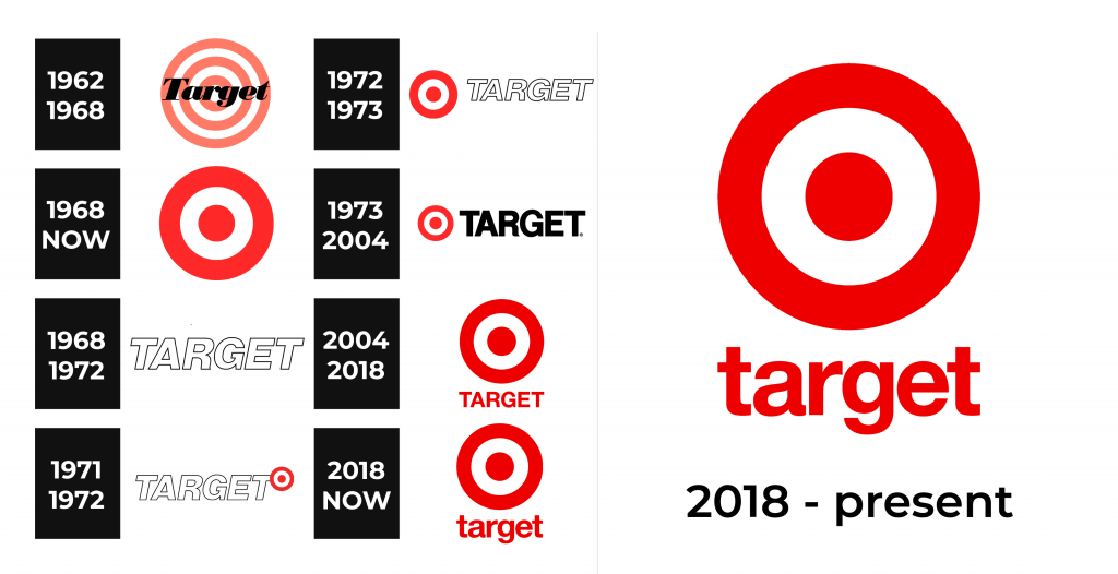
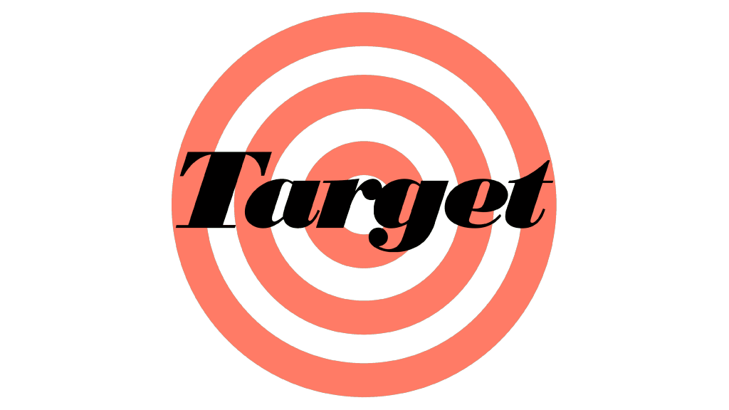
The original logotype of the Target brand showed a big red circle, containing a smaller circle, which itself contained the third circle (the smallest one). The third had its center colored white, while the other circles were separated by white spacing. The bold, italicized name caption with a capital ‘T’ ornamented with sharp serifs found its place over the circles.
1968 – today
Later, they simplified the logotype by removing the name caption and adding two red shapes: an outer bold frame, and a thick small circle inside. This emblem is still used without changes.
1968 – 1972
During the 1968-1972 period, they utilized the italicized nameplate composed of thick sans-serif capitals, made in contours.
1971 – 1972
At the beginning of the 70s, they used the aforementioned wordmark, accompanied by the small emblem that dates back to 1968. The lessened emblem stood to the right of the top of the inscription.
1972 – 1973
Then, they changed the emblem’s position and placed it prominently to the left of the caption.
1973 – 2004
In 1973, they finally settled on a logotype that would last for the following 30 years. It depicted the black wordmark, that was enlarged and written with a fresh typeface. The modifications touched on the designs of the letters ‘G’, ‘R’, and ‘E’. The first character had its lower extension even more angular than previously; the ‘R’ got a stylish curl at the bottom, and, finally, the central bar of ‘E’ became shorter than others.
2004 – 2018
Throughout most of the 2000s and the 2010s, the brand used a completely red logotype where the familiar emblem stood prominently above the lessened wordmark, the script of which remained unchanged.
2018 – today
The latter image of the brand shows its nameplate in lowercase. Additionally, the whole logo is now darker.
Font

The company’s nameplate is executed in a font similar to Helvetica Noue. It has simple, minimalistic lines and no serifs. The latter version is in lowercase.
Color
The red color is often associated with action, movement, and passion. Since ancient times, it was used on the targets in which strikers and warriors hit. No wonder why many people instantly recognize Target shops among all city buildings – their logo is distinctive due to the color choice.
