State Farm Logo
Tags: investment services | provides banking | USA
State Farm is the biggest provider of insurance in the United States, combining a myriad of smaller firms all over the country. It was created in 1922 to mainly provide auto insurance. Later, they expanded to the new types of insurance, now offering this service for cars, property and other purposes. They also have a thriving presence in the banking and investment spheres.
Meaning and History
State Farm was founded in 1922 in Bloomington, Illinois. The original name was the ‘State Farm Mutual Auto Insurance Company’, later abbreviated to ‘State Farm’. It was called this way because the company’s original target audience was the farmers of Illinois, who increasingly purchased vehicles to facilitate transportation between the countryside and the cities.
What is State Farm?
State Farm is a large American insurance conglomerate that also provides banking and investment services. In terms of insurance, State Farm mainly offers car and home insurance, although wider property insurance and many other types of this service are also prominent.
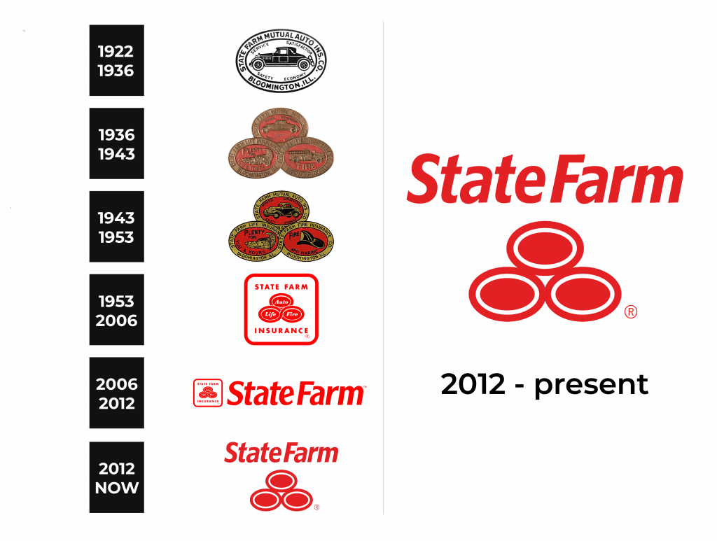
1922 – 1936
The original emblem was an oval that can be divided into two distinct sections. One is the frame, which includes the company name at the time written along the top of the figure and the words ‘Bloomington, Ill.’ beneath. The text used a generic sans-serif script in all uppercase letters.
The other section is the inside, which includes a big picture of a car in profile, as well as words ‘service’, ‘satisfaction’, ‘safety’ and ‘economy’ all around. This is to convey the main product sold by the company – the insurance, as well as its many benefits. All of these words were written in the same script as the words in the outer section.
The entire logo is black and white.
1936 – 1943
The 1936 logo incorporates the previous emblem, alongside two other, similar pieces.
The 1922 image is placed at the top of the vaguely triangular order alongside two other oval elements. The biggest visual change is the coloring. The outer frame became completely bronze in appearance, including both the letters and the background. The car and the words inside were also painted this way, while the background of the inner section became bright red.
This emblem fuses into two other elements at the bottom, meaning the ‘Bloomington, Inn.’ bit it cut off. Curiously, the two lower ovals join their frames in an infinity symbol of sorts, whereas the upper part is somewhere behind it all. The frames of both these pieces say the same thing as in the original logo, including the location.
Inside the two new elements are also the bronze images against the red background. On the left, they’ve placed the cornucopia next to the words ‘plenty for you and yours’. On the right, the firetruck is placed in the middle next to the word ‘fire’. The images are supposed to represent the life and fire insurance respectively.
1943 – 1953
In 1943, several visual changes followed.
The text all over the logo became black instead of the previous bronze, as did the images inside each oval (albeit partially). These remained in part bronze, although their appearance was also updated. In particular, the car took on a much more modern look, whereas the firetruck was replaced with a fireman’s helmet. The cornucopia image is largely the same.
In terms of the text, the word ‘and marine’ was placed within the bottom right oval, meaning the company now offered flood protection, as well. The location piece at the bottom of the top oval also came back, although part of it is cut off.
1953 – 2006
In 1953, State Farm adopted a new streamlined logotype that they’ve kept for many decades.
It still pays homage to the previous logotypes in the form of three ovals. They are located in the very center of this new logo, although in an updated way. There are still three of them, and the frames of the two bottom ones are connected in a symbol of infinity. They are almost completely red, except for some white outlines around the frames. Everything on these ovals was scrapped. However, they’ve added three words: ‘auto’, ‘life’ and ‘fire’ onto these shapes in tilted text.
This image was placed in the middle of a white square with a red frame. Above and below the central image, they’ve placed the company name in two bits: ‘State Farm’ and ‘Insurance’ respectively. The letters are red, bold and all capitalized.
2006 – 2012
The 2006 logotype is a logo with a logo within. The previous design is used here as an emblem next to the company name, ‘State Farm’ in this version. The former changed barely, save for the size. They made it much smaller to fit the proportions of the letters to its right.
The letters use a somewhat artistic but ultimately basic sans-serif. They are tilted and bold. They aren’t all capital, unlike in the previous logo. Like it, however, they are all red.
2012 – today
Perhaps realizing the redundancy of using the same name twice, State Farm updated the emblem in 2012. This time, they’ve only kept the ovals. They scrapped everything else, including the text inside said ovals. They’ve enlarged them and also changed them visually somewhat. The white sections are bolder, and the frames aren’t connected any longer.
The red is also visibly darker throughout the logo.
Font
The font used in the previous few designs of this logotype include is mostly unchanged. It was updated in 2012, but the general characteristics are the same. The letters are slanted, fluid, smooth and pretty artistic. They are also bold and use a sans-serif style. Not all of them are capitalized.
Color
For ages, the two main colors in State Farm’s color scheme were bright red and white. It’s been this way since the 50s, and even before the color red was one of the main colors in their branding. The other color that was commonly used in their logotypes, including primary and alternative designs, was black.


