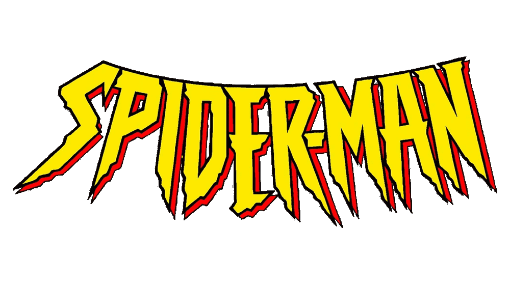
Spiderman Logo
Tags: comics | fictional superhero | Marvel | movie
Spiderman, a character synonymous with agility, courage, and the struggles of adolescence sprang from the creative minds of Stan Lee and Steve Ditko at Marvel Comics. This iconic figure made his debut in “Amazing Fantasy” #15 in 1962, a publication of Marvel Comics, which is a division of Marvel Entertainment, now owned by The Walt Disney Company. The imaginative landscape of Marvel, initially steered by the visionary Stan Lee, has seen tremendous growth. Spiderman, as a flagship character, has significantly contributed to this expansion. Marvel, initially an American enterprise, has branched out globally, enthralling audiences in every corner of the world with its intricate storytelling and captivating characters, of which Spiderman is a central figure.
Meaning and history
Spiderman, a character that reshaped the superhero narrative, was birthed in the offices of Marvel Comics in 1962, the brainchild of writer Stan Lee and artist Steve Ditko. This creation marked a paradigm shift in the superhero genre, introducing a character with everyday problems and a relatable persona. Over the years, Spiderman has traversed a remarkable journey, from the pages of comic books to the glitz of Hollywood. His storylines have often mirrored societal issues, making him a unique and relatable figure. The cinematic adaptations, especially under the Marvel Cinematic Universe banner, have received worldwide acclaim, elevating Spiderman to a global phenomenon. Today, Spiderman is not just a superhero; he’s a cultural symbol, representing resilience, innovation, and the ever-present battle between good and evil. His enduring appeal continues to captivate new generations, making him a timeless icon in the annals of popular culture.
What is Spiderman?
Spiderman is not a company, but a fictional superhero character created by Stan Lee and Steve Ditko for Marvel Comics. Known for his agility, web-slinging abilities, and spider-sense, Spiderman has become a cultural icon, influencing various media and merchandise worldwide. His global impact is seen in his enduring popularity and significant influence on the superhero genre.
1963 – Today
The original emblem for “Spider-Man” was crafted with a bold and distinctive flair, featuring the title in all capital letters using a sans-serif font with gentle curves. This design was bathed in a vibrant yellow, complemented by red shading on the lower edges to create an illusion of depth. The lettering itself was artistically arched downwards, adding a dynamic element to the logo.
1976 – 1987
In a later iteration, the design team opted for a more pronounced and angular approach. This version reversed the downward arc of the text into an upward sweep, imparting a sense of ascent. The color scheme was also revamped, introducing stark white letters accented with red shading beneath, presenting a striking visual contrast.
1985 – 1988
The 1985 version marked a significant shift towards a more sophisticated and cinematic style. Emulating the iconic 3D lettering seen in the intros of films like those from 20th Century Fox, the logo was given a taller, more linear font. This redesign featured an aerial perspective, with the letters in bold red accented with yellow, creating an impressive and commanding presence.
1994 – 1998
For the “Spider-Man: The Animated Series,” the logo underwent a dramatic transformation. The designers embraced a flat, yet fierce typographic style, mirroring the agility and intensity of a spider. This resulted in exceptionally tall, sharply angled letters, predominantly in white, outlined in a vivid red, capturing the essence of the series’ energetic animation.
1996 – 2005
The 1996 logo revision took a bold step by straightening and refining the previously gothic and somewhat intimidating typeface. Aligning the letters in a straight, horizontal line and adopting a clean white and red color palette, the logo was reimagined with a more modern and streamlined look. This design choice resonated with the audience, leading to its decade-long tenure as the face of the franchise.
2016 – 2018
The 2016 redesign introduced a geometrically precise and stable representation of the “Spider-Man” logotype. It featured crisp white letters encased in a slender red outline, backed by a substantial black shadow. This, combined with rounded corners and the smooth, squared shapes of the characters, infused the logo with an aura of energy and motion, reflecting the superhero’s dynamic nature.
2005 – Today
When John Romita, Sr. took over as the main artist in 1966, he altered the superhero’s costume palette, swapping most of the black for blue, yet the logo remained unaltered. It was in 1984, to align with the Symbiote costume change, that the logo was significantly enlarged and rendered in white, creating a stark contrast against the black backdrop. Intriguingly, the Symbiote costume concept originated from a fan, Randy Schueller. Marvel recognized the potential in this idea, purchasing it and enlisting Mike Zeck and Rick Leonardi to realize the vision, thus adding a unique chapter to the Spider-Man saga.


