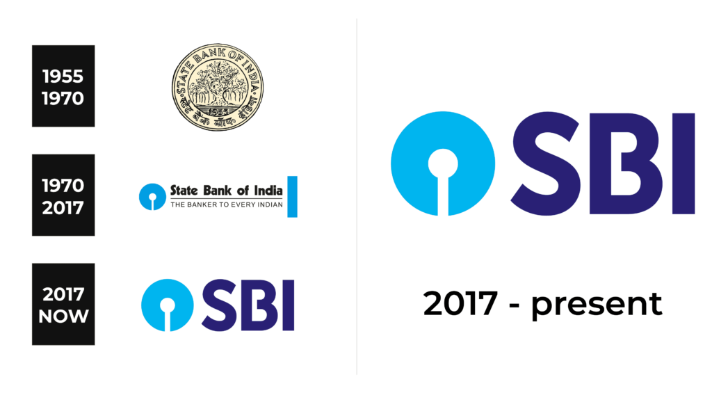
SBI Logo History SBI is among the most considerable banking organizations in India. Known as the State Bank of India, the bank is based in Mumbai. They provide customers with a diverse array of services, from credit/debit cards, to insurance, and mortgages. Since its establishment in the early 19th century, it has become the 21st in the rating of Fortune 500 companies.
Meaning and History
The State Bank of India (SBI) carries a storied legacy that traces its origins to the early 19th century. Established in 1806 as the Bank of Calcutta, it marked India’s inaugural commercial bank under the British East India Company. Over time, amidst shifts and consolidations, it metamorphosed into the State Bank of India in 1955, a transformation spurred by the Indian government’s nationalization efforts. This strategic step aimed to centralize banking operations and foster economic advancement.
In the aftermath of independence, SBI emerged as an important member in the process of propelling India’s economic growth and modernization. It spearheaded numerous breakthroughs, ushering in innovations like branch banking, pioneering computer technology integration, and the creation of specialized subsidiaries to address diverse financial needs. SBI’s horizons expanded, both domestically and across international frontiers, solidifying its status as India’s largest public-sector bank and a formidable global contender in the financial realm.
Presently, the State Bank of India stands tall, embodying India’s rich banking heritage. It stands as a steadfast provider of an extensive array of financial services to countless patrons, contributing significantly to the nation’s economic journey while upholding an esteemed legacy characterized by excellence and progressive thinking.
What is SBI?
SBI is a multinational financial organization from India that offers its clients credit and debit cards, investment programs, insurance, mortgage, etc. This is among the hugest banks in the world, ranking 21st in the Fortune 500 companies.
1955 – 1970
The inaugural SBI logo, unveiled in 1955 to celebrate the bank’s final transformation, featured a resplendent gold coin encompassed within a dual outline. Within this circular boundary, both Latin and Indian alphabet wordmarks found their harmonious place. At the center of this coin, an highly detailed tree flourished. Nestled below, the year “1955” also decorated the emblem.
1970 – 2017
A transformative evolution unfolded in 1970, reshaping the SBI logo’s aesthetic whilst preserving its circular essence. Now imbued with a vibrant blue hue, the circular emblem featured a vertical white element at its base. This motif evoked imagery of a keyhole, a match, or an abstract, stylized tree.
The emblem could stand unaccompanied or nestle to the left of the wordmark, itself divided into dual tiers. A black line demarcated the upper and lower parts. The upper tier donned an assertive sans-serif, while the capitalized slogan “Banker to Every Indian” adorned the lower tier, embraced by a spacious, airy font with generous character spacing.
2017 – today
In 2017, a distilled and refined iteration of the logo emerged, casting aside the elongated wordmark and slogan in favor of the succinct “SBI” abbreviation, elegantly rendered in deep, regal purple. The color palette seamlessly merged shades of blue and purple, symbolizing the institution’s unwavering reliability, robust stability, and forward-thinking vigor.
The wordmark, resplendent in its pristine sans-serif, bore a distinctive touch—the horizontal bar of the letter “B” elegantly abbreviated, bestowing the composition with an air of buoyancy and sophistication, thereby accentuating its intrinsic uniqueness.
Font
The serif-free typeface for the SBI logo has undergone a significant overhaul to evoke a sense of “weight and heighten the institutional feel” as stated in the company’s official directive.
This geometric font combines excellent legibility with effective visibility even from a considerable distance. The hallmark of the wordmark is the intentional space within the “B”, a design element, creating a visual symphony that harmonizes with the lettering and emblem.
Color
Though the State Bank of India logo has long been gentle blue, the 2017 rendition introduces a deeper variant, coupled with a reduction in white usage. The interplay of these two distinct shades of blue invokes a sense of familiarity with the logotypes of digital banking entities and e-wallets such as PayPal or PayTM. This convergence, however, has presented SBI with a formidable challenge, as the visual resonance draws comparisons and ushers in a period of intense competition.


