San Jose Sharks Logo
Tags: NHL | Pacific Division | USA
Seasoned travelers and hockey fans say you can’t set foot in the Californian city of San Jose without being surrounded by the turquoise color and San Jose Sharks emblem. They typically did well in the regular seasons but consistently were exhausted during the playoffs. Thus, the Sharks reached the Stanley Cup final only once, in 2016, and lost 2:4 to the Pittsburgh Penguins. Over the entire period, the Sharks played in the playoffs twenty times. The elusive Stanley Cup may still be in sight for the Sharks, but they already boasts loyal fans and a rich history.
Meaning and History
The Sharks have existed since 1991, playing in the Pacific Division. Before their appearance on the ice, the California Golden Seals team played there for almost 10 years before moving to Ohio. Some of the owners of California Golden Seals were unhappy with the move. Gordon and George Gund were confident that hockey had a future in California, so they sold their shares and returned to the coast to start a new team. They held a competition among local residents for a new name, and so the Sharks were born, and George Kingston was appointed coach. Between 1998 and 2017, the Sharks missed the playoffs just once, in the 2002/03 season. They still have yet to win the Stanley Cup.
What is San Jose Sharks?
The San Jose Sharks is a sports club that plays ice hockey professionally as part of the NHL. The club mainly plays in California state in the USA and has a large fan base despite not yet winning significant trophies.
1991 – 1998
The logo of the club looks very bold and daring. It features a black shark jumping out of an inverted black triangle. The shark looks fearsome and confident. However, it is the hockey stick bitten in half by the sharp teeth of the shark. One surely would not want to play jokes with the Sharks. There was no need to add any inscriptions to the logo as it could be easily recognized and associated with the San Jose Sharks.
1998 – 2007
Since the original design was introduced in 1998, the only noticeable change was the darker yellow color of the hockey stick.
2007 – 2008
The updated logo presents a fiercer shark character. Although the color palette and key elements stayed as they were, the logo looks different. First of all, the shark has a more three-dimensional and sharp appearance. The top of the shark’s body is done in the same dark turquoise color as the one used in the border lines. The triangle, by the way, had the top curved to make it look more like an arrow. The hockey stick also changed its shape and the gray wrapping was replaced by a white one. The yellow color of the shark’s eyes makes it look extra angry and more realistic as the shark’s eyes appear to glow.
2008 – Today
Unless you place the two versions side by side, it might not be instantly obvious what has been changed. The turquoise color got slightly lighter, while the bright yellow color got a bit dimmer. The fact that the club has not made any major changes to its emblem engraved its image in the minds of the fans.
2016 – 2018
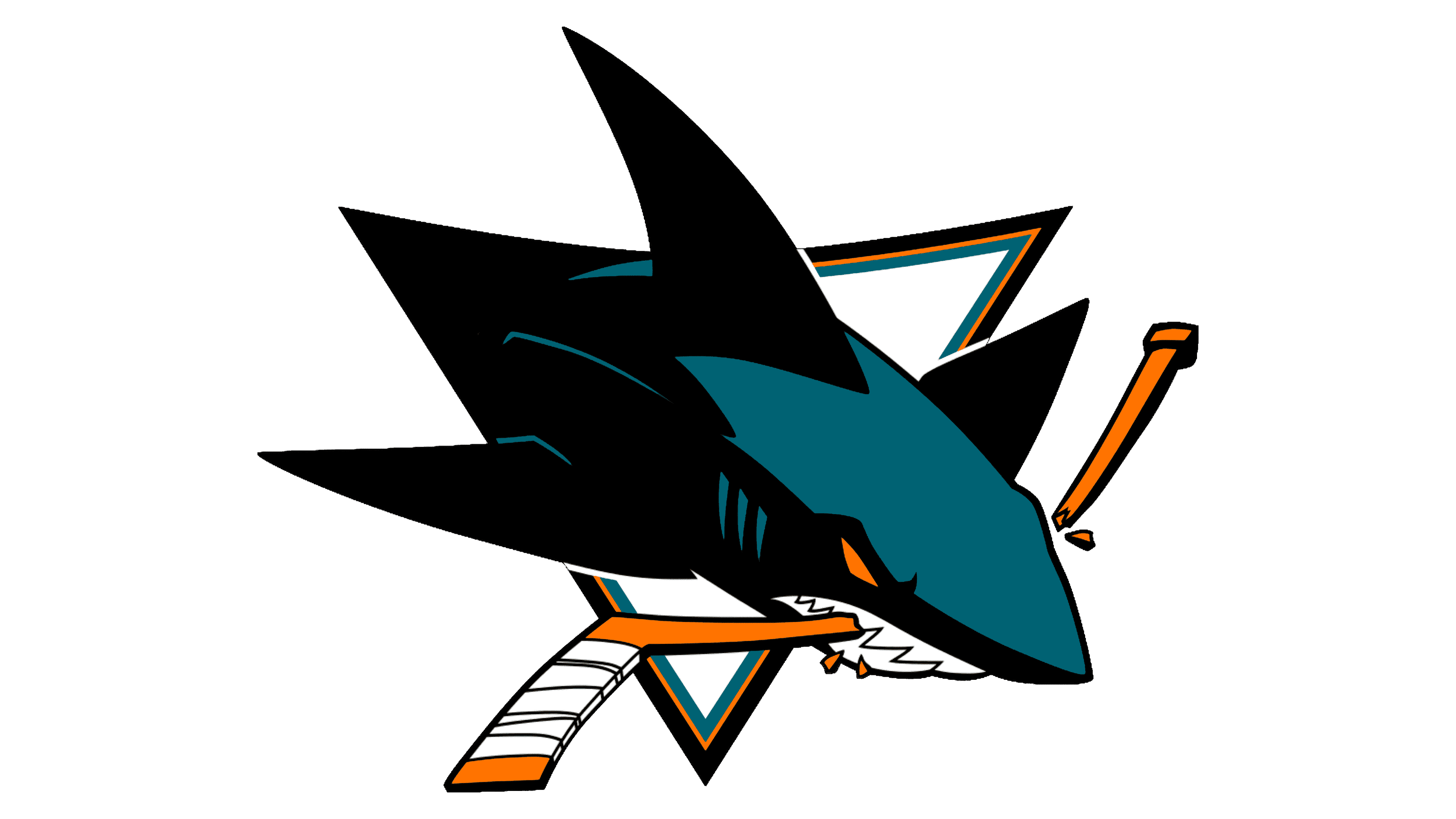
The logo presents a dynamic and aggressive visual, a stylized rendition of a shark. The creature is depicted in mid-leap, breaking through an unseen barrier with a forceful burst. Its body is streamlined and aerodynamic, with the characteristic torpedo shape of sharks, accentuating its swift and powerful nature. The color palette is limited but striking, with deep teal as the primary color, providing a cool and oceanic feel which is contrasted by accents of black and white that add depth and definition to the design.
The shark’s mouth is wide open, displaying an array of sharp, white teeth in a menacing snarl that suggests ferocity and the intimidating presence of a predator. An orange eye, simple yet piercing, adds a touch of vivid color that draws attention and enhances the fierce expression. The animal’s gills are represented by black lines which flow into the sleek contour of the body, contributing to the impression of speed and movement. The black also outlines the top of the shark, emphasizing its distinct dorsal fin, which is a key characteristic of these sea creatures.
Overall, the logo is not just a representation of a shark but a symbol of aggression and determination. It is designed to evoke the strength and competitive spirit of a sports team, likely intended to rally fans and intimidate opponents. The logo has a modern feel, with clean lines and bold shapes, yet it also conveys a timeless sense of power and resilience that is emblematic of the natural world from which it takes its inspiration.
Font and Color
The teal/turquoise color added a youthful and energetic touch to the logo. It is also often associated with stability, sophistication, trust, and reliability. The yellow color is also energetic and optimistic. The yellow in this logo can also be a sign of danger. The main color in the logo, though, is black and it stands for the strength and power of the team. There are no inscriptions in this logo.


