Samsung Logo
Tags: electronics | mobile phones | non-consumer goods | south korea
Samsung is a giant South Korean tech corporation. It’s mostly known as a major electronics producer in the world, but they are present in plenty other fields. It’s one of the biggest companies in South Korea overall, as well as one of the largest tech corporations in Asia and the world. It’s an established global supplier of everything from phones to fridges to TVs.
Meaning and History
The current Samsung was founded in 1969 in South Korea, although the brand has a longer history that dates back to the 30s. Before their establishment as a producer of electronics in the 60s, the company made agricultural and food-related products. The name is translated to ‘three stars,’ which doesn’t have any deeper meaning besides the desire of reaching to the ever-new heights.
What is Samsung?
Samsung is one of the largest suppliers of tech and electronics in the world. They produce everything from mobile phones to fridges, TVs, laptops, as well as memory chips and non-consumer goods.
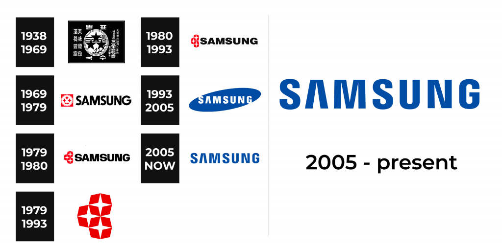
1938 – 1969
The earlier logo belonged to the Samsung Group, an obscure predecessor of the contemporary Samsung that specialized in fertilizers and food additives. It didn’t have any actual branding, and its ‘logo’ at the time was more like a stamp.
It was a black rectangle, almost like a square in shape. It contained an emblem in the middle, which depicted three five-tip stars arranged in a triangular order in the middle of a white disk. That disk also included three horizontal lines at the background, as well as an ear of wheat on the side.
All around the disc were the Japanese glyphs, Japan being Korea’s colonial overlord at the time. The writing included the company’s name, as well as several pieces of description. The glyphs were later replaced with Korean letters.
1969 – 1979
The design was massively updated when the company came to be in its current form. It now possessed an actual logo: a small emblem with a name written on the right.
The emblem is a red square, most of which is occupied by a white disc. It’s less busy in this iteration. It still includes the three stars, but they now have four tips. The wheat and other elements were removed from this emblem. It was a rather small image, as well – meant to fit the height of the text on its right. The text, therefore, was the central piece of this logo, although the emblem was used independently often enough.
The written part used the Latin form of the word ‘Samsung,’ while the Korean version was also commonly used – in particular, in the domestic market. The font was a very basic sans-serif script: all letters capitalized, bold and black.
1979 – 1993
The main part of the 1979 logo was the emblem, updated once more. It could be occasionally used with the company’s name, but it was depicted independently more often than not. It still shows the three stars, although in a different fashion. The square and disc shapes are gone. Instead, there are three red octagons stacked one on top the other.
In fact, they intermingle with one another, fusing into a shared ladder of shapes. They are all red, without any borders between the three. In the middle of each shape, there is a four-tip star – each is now much thinner than before. Their tips coincide with the tips of their respective octagons in all four cardinal directions. They are also arranged in such a way that all the tips of all three stars touch one another, creating a continuous pattern.
1979 – 1980
That’s the version of the previous logo as used with the company name. It was updated only a year later. This design, however, uses the emblem exactly as described above, although much smaller. On its right, they’ve placed the company name. The style is similar to the previous one, although the letters are bolder and wider. The emblem is also rather taller compared to the letters, unlike the previous logo.
1980 – 1993
That’s the second alternative version of the primary logo, used with the company name. They’ve pressed the emblem to appear thinner, although the same change didn’t apply to the main emblem. The font has also been updated in minor ways. It’s technically a new script, but it’s only slightly different: slightly wider and with a few visible changes.
1993 – 2005
The logo design updated massively come 1993. They modernized it, brought along a new color scheme and the font. This script is still in use as of 2023. The letters are much simpler, taller, with wider gaps between and generally normal. The only exception is the letter ‘A,’ which lacks the usual line in the center.
What they’ve usually done with it is color it white and place it inside a dark blue oval. It wasn’t perfectly horizontal: instead inclined counterclockwise so that the letters on the far sides poke out ever so slightly.
2005 – today
The 2005 logo did away with the oval part and just kept the letters. They’ve kept the now-iconic blue color, painting the characters with it. There were also some minor font changes. They’ve made these letters somewhat thinner and not as bold.
Font
The font changed from a generic sans-serif to the script that is iconic and unique to this brand in 1993. The current typeface isn’t particularly unusual, besides the appearance of the letter ‘A,’ which lacks one of the lines. In fact, it resembles the Greek lambda letter, and it’s often associated with this brand because of it.


