Real Madrid Logo
Tags: Primera Liga | Spain | sport team
Real Madrid is the world’s most-proclaimed football club, originating from the eponymous Spanish city. It has never left the nation’s first-tear league since its inception in 1902. Being recognized among the best professional football teams of the 20th century, Real Madrid has been titled the win record holder in the UEFA and the champion of numerous international and domestic tournaments.
Meaning and history
Real Madrid, a name brimming with significance and heritage, encapsulates the team’s storied journey and enduring legacy. “Real” translates to “royal” in Spanish, paying homage to the close connection to the Spanish Crown. Madrid, the capital city of Spain, serves as the team’s proud home.
From humble beginnings to unrivaled greatness, Real Madrid has etched its name in the annals of footballing lore. With an illustrious record of success, the club has claimed countless domestic and international titles, solidifying its status as a footballing powerhouse. From their remarkable achievements in the Primera Division to their unrivaled dominance in the UEFA Champions League, Real Madrid’s triumphs have captivated the world and become the stuff of legend.
Beyond their on-field prowess, Real Madrid embodies the values of integrity, sportsmanship, and determination. Their unwavering commitment to excellence has earned them the admiration and respect of football enthusiasts worldwide. United by a shared passion, both players and supporters embody the spirit of the club, creating a harmonious bond that transcends boundaries and unites people from all walks of life.
As the white-clad players take to the hallowed grounds of the Santiago Bernabeu Stadium, the echoes of their storied past reverberate through the air. Real Madrid’s journey is a testament to the enduring spirit of resilience, dedication, and unyielding pursuit of greatness. They continue to inspire generations, leaving an indelible mark on the beautiful game and etching their name in the hearts of football lovers across the globe.
What is Real Madrid?
Real Madrid is a Spanish football club, established in 1902. It has been among the most successful teams during the 20th century. Throughout its history, Real Madrid won a multitude of international trophies and local awards in Primera Liga – Spain’s most considerable football league.
1902 – 1908
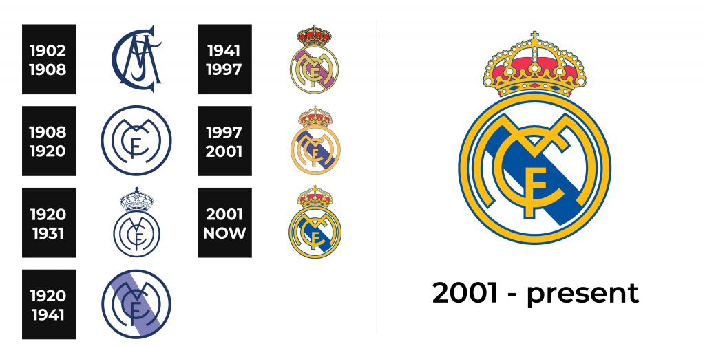
Their original logotype appeared back when the team was known as Madrid FC. It showcased a distinctive capital ‘M’ with diagonal sidebars and prominent serifs. The symbol intertwined a curly and ornamental ‘F’, and this duo was incorporated into the design of the larger ‘C’. All symbols were going dark green without a backdrop.
1908 – 1920
The year 1908 saw the redesign of their official logotype. It now displayed a big circle, containing a smaller circular shape reminding the letter ‘m’ with rounded sidebars. An even smaller symbol ‘c’ crossed the shape with its top and the letter ‘f’ finalized the whole design, intertwining with the lower part of the ‘c’. The whole logotype was dark blue, as before.
1920 – 1931
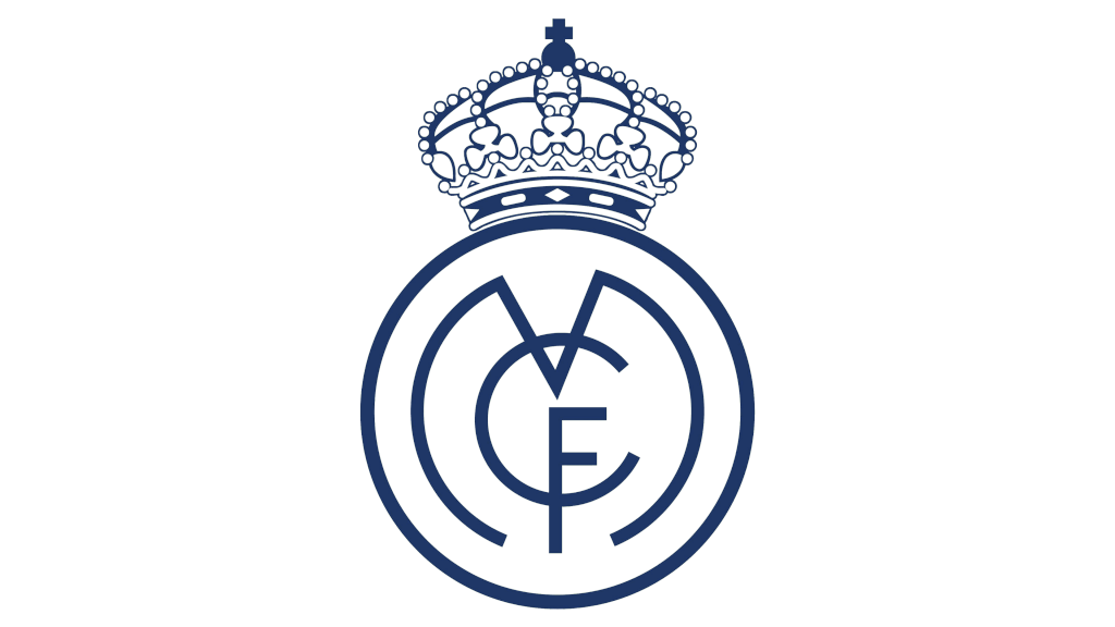
The 1920 logo reinvention saw a few modifications to the 1908 version. First, the blue circle was elongated to the top. It allowed for sharpening the bars of all symbols inside this circle. The letter ‘m’ was now tilted a bit, so the place where its central bars met was slightly off-center. Moreover, the capital ‘F’ got a long vertical bar and shifted to the right.
The more significant element of the new version was a regal crown atop the circle. It reflected the club’s appreciation of the monarchial authority of Alfonso XIII, who signed the club’s official approval in 1920. Since then, the club’s nameplate contains the ‘real’ part.
1931 – 1941
On the eve of the Civil War and the stationing of Franco’s regime, all demonstrations of monarchial signs became a problem in Spain. It resulted in the removal of the crown from the club’s logotype. Additionally, it received a thick blue diagonal stripe behind the symbols, which signified the flag of Castile, the club’s home place.
1941 – 1997
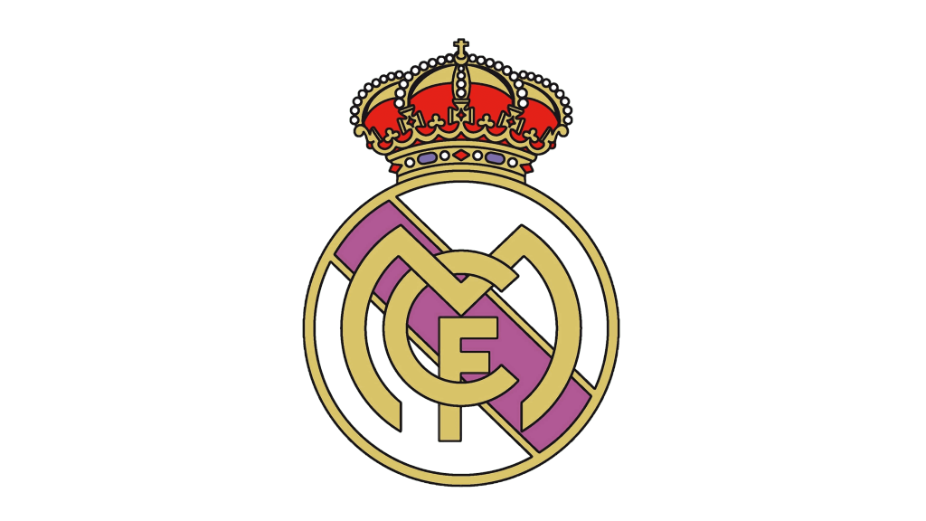
When the Spanish government allowed the royal symbolism again, the Madrid Football Club returned to its former logo conception but in a refreshed style. The beige-and-red crown, ornamented with numerous rocks and pearls, was atop the circle. It became beige with a thin black contour, while the diagonal stripe was recolored.
1997 – 2001
The new look had a simpler and more elegant look and did not have as much association with royalty even though the crown was still there. It was achieved by replacing golden with a muted yellow, making the red not so bright and all the black lines significantly thinner. The club also brought back the blue, which made the appear stronger and reflected their long, rich history.
2001 – now
Although all the elements stayed unchanged when it comes to shape and their positioning, the logo looked fresh and more stylish. It was all in small details. All the colors looked brighter and more vivid, which brought more life to the emblem. In addition, the team brought more blue into the logo by replacing the black lines with blue along with green diamond shapes in the crown with blue shapes. Another small detail that changed was the diagonal blue line, It no longer went all the way to the border, but ended with the “M”. This created an additional white border line. A true fan will also notice that the letters in the monogram no longer overlap. Instead, they were merged into one continuous line.
Font
During the creation of the Real Madrid logo, the designers ventured beyond conventional fonts, allowing their imagination to shape a distinctive monogram. While the letter “C” maintains a traditional appearance, the letter “F” is characterized by subtly shortened horizontal strokes, adding a touch of uniqueness. Notably, the letter “M” exhibits noticeable roundness, further enhancing the logo’s visual appeal.
Color
In the Real Madrid code, each color represents something. The yellow color was inspired by the Spanish monarchy; red reflects the team’s commitment to victory and high performance; finally, blue stands for their loyalty to traditions.
