Planters Logo
Tags: nut-based snacks | snacks | USA
Planters is a prominent brand known for its wide range of nut-based snacks. Offering products such as peanuts, cashews, almonds, and mixed nuts, Planters has become a staple in households for those seeking nutritious and tasty snacks. The brand is synonymous with quality and innovation in the nut industry, catering to diverse consumer preferences.
Meaning and History
Founded in 1906 by Italian immigrant Amedeo Obici and his business partner Mario Peruzzi, Planters started as a modest nut company in Wilkes-Barre, Pennsylvania. Obici, who began his career as a fruit vendor, saw an opportunity in the nut market and invested in a peanut roaster. This decision marked the beginning of what would become a leading brand in the nut snack industry.
In 1916, the brand’s iconic mascot, Mr. Peanut, was introduced. Created through a contest held by Planters, the dapper peanut with a monocle and top hat quickly became a recognizable symbol. Mr. Peanut played a significant role in Planters’ marketing strategy, helping to establish a strong brand identity and connect with consumers.
Throughout the 20th century, Planters expanded its product line and distribution network, becoming a household name in America. The brand introduced various nut products and snacks, including dry-roasted peanuts and mixed nut assortments. Planters also focused on convenience, offering resealable packaging and single-serving options to meet the needs of busy consumers.
What is Planters?
Planters is a leader in the nut industry, known for its commitment to quality and innovation. The brand offers a wide range of products, from traditional roasted nuts to flavored varieties and trail mixes. Planters’ dedication to providing delicious and healthy snacks has cemented its place as a trusted name in the snack food market.
1916 – 1919
The original Planters logo features an intricate, classic design. The text ‘Planter’s Pennant Double Washed Salted Peanuts’ is written in an ornate serif font with decorative flourishes, emphasizing the premium nature of the product. The black-and-white color scheme adds a sense of tradition and quality, setting a strong foundation for the brand.
1919 – 1924
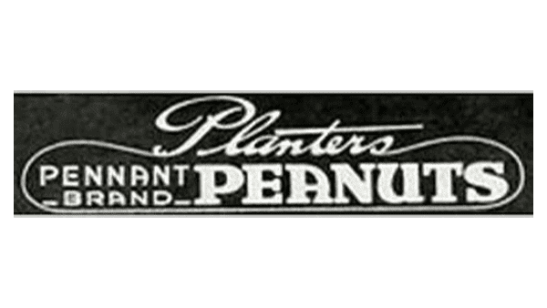
In the subsequent iteration, a more streamlined approach is taken. The font becomes slightly more modern and less ornate, while still retaining a serif style. The text ‘Planters Pennant Brand Peanuts’ is enclosed in a rectangular frame, providing a clean and structured appearance that speaks to the brand’s evolving identity.
1924 – 1927
With the next version, the logo adopts a cursive script for ‘Planters’ and a more simplified serif font for ‘Salted Peanuts.’ The design places greater emphasis on elegance and sophistication, with the cursive font adding a personal touch. Maintaining a black and white color scheme, this iteration underscores the brand’s commitment to quality. The name caption, ‘Planters Salted Peanuts’ is written in a heavy, sans-serif font, reflecting a no-nonsense, industrial aesthetic. This design underscores the brand’s reliability and quality, reinforcing its presence in the market.
1927 – 1943
A significant shift occurs with the introduction of a bold, uppercase sans-serif font with a gold color against a blue background. This version emphasizes visibility and impact, making the brand name stand out prominently. The simple yet striking design conveys strength and reliability.
1943 – 1988
The logo retains the bold, uppercase sans-serif font but introduces a rectangular frame with a blue background and a yellow outline. The addition of a red star element provides a subtle yet distinctive touch, enhancing brand recognition and visual appeal. This iteration marks a notable enhancement in the brand’s visual identity.
1988 – 1997
Mr. Peanut, the brand’s mascot, is featured prominently in the next version. The bold, uppercase ‘PLANTERS’ text in yellow remains, set against a blue background. This design introduces more character and personality to the brand, making it more relatable and memorable to consumers.
1997 – 2005
A wavy blue banner with bold yellow ‘PLANTERS’ text is introduced. This design adds a sense of movement and dynamism, reflecting the brand’s adaptability and modern appeal. The playful, dynamic pose of Mr. Peanut further enhances the logo’s appeal during this period.
2005 – 2006
The logo incorporates Mr. Peanut more prominently with a playful, dynamic pose. The ‘PLANTERS’ text remains bold and yellow, set against a blue background with a splash-like effect. This version highlights the brand’s fun and approachable personality, appealing to a broader audience.
2007 – 2017
Simplification defines the next iteration. The bold, uppercase sans-serif ‘PLANTERS’ text in gold with a subtle 3D effect stands alone. The blue background is removed, focusing on a clean, modern look while maintaining the brand’s iconic color scheme.
2015 – 2020
Continuing with the bold, uppercase sans-serif ‘PLANTERS’ text in gold, the current logo adjusts the letter spacing and alignment for a more balanced appearance. This design exudes a sense of heritage and trustworthiness, reinforcing the brand’s long-standing reputation. The updated look retains the core elements while presenting a refreshed visual identity.
2020 – Today
The redesign of 2020 has brought some new shades to the Planters logo. The yellow of the characters became smoother and more tender, especially in combination with thin pink lines, added to them. The dark blue shadowing creates distinction and confidence in the inscription, keeping it strong and stable, and making a great contrast with light yellowish shades.
Color
The colors in the Planters logo have evolved to enhance visibility and brand recognition. Early iterations relied on a simple black and white color scheme, emphasizing a sense of tradition and quality. With the introduction of blue and gold in the mid-20th century, the logo gained vibrancy and a more contemporary feel.
The use of a bold blue background with bright yellow text became a defining feature, creating a striking contrast that made the logo stand out. Additional elements, such as the red star and Mr. Peanut’s introduction, added further color variety, enriching the visual identity. Over time, the colors were refined to maintain a clean and modern look while preserving the iconic blue and gold palette that consumers associate with the Planters brand.
Font
The fonts used in the Planters logo evolution showcase a progression from ornate and classic to bold and modern. Initially, the fonts were detailed and decorative, reflecting a traditional serif style that emphasized the brand’s heritage and premium quality. As the years progressed, the fonts transitioned to more streamlined and simplified versions, incorporating both serif and sans-serif styles.
By the mid-20th century, the brand adopted bold, uppercase sans-serif fonts, which conveyed a sense of strength and reliability. These bold fonts remained consistent, with minor adjustments to letter spacing and alignment, maintaining a strong visual impact while modernizing the brand’s appearance.


