Pinterest Logo
Tags: content | online platform | Photos | videos
Pinterest is a social network that allows users to upload images or videos, save them, collect them, and share them with others. It is not just a social network, but a visual search platform. Its feed is a bunch of pins created by different users and linked by keywords and a theme. This allows any user to see your content according to the parameters they are looking for. Pinterest is very popular for finding inspiration for home, fashion, lifestyle, weddings, parties, gifts, and more.
Meaning and History
Ben Zilberman, who worked at Google in the online advertising department, met with his college buddy Paul Sciarra and asked him to work on some ideas together. In 2008 they released the Tote app. In 2009, work began on a new project, the future Pinterest (the name of the startup was invented by Zilberman’s wife during a Thanksgiving dinner). In March 2010, a beta version was launched. In the spring of 2019, Pinterest held an IPO, and in August the company’s capitalization almost reached $20 billion. Today, more than 300 million users use Pinterest, 84% of them use it to make a purchase, and 77% percent learn about a new brand on Pinterest.
What is Pinterest?
Pinterest is a platform where users post photos, videos, or graphics. They can save content, organize it into collections, and show it to other subscribers. Many people use Pinterest as a mood board – looking for inspiration, copying other people’s ideas, and offering their services. Pinterest crossed the 10 million mark faster than any service that has a website in the history of the internet.
2010 – 2011
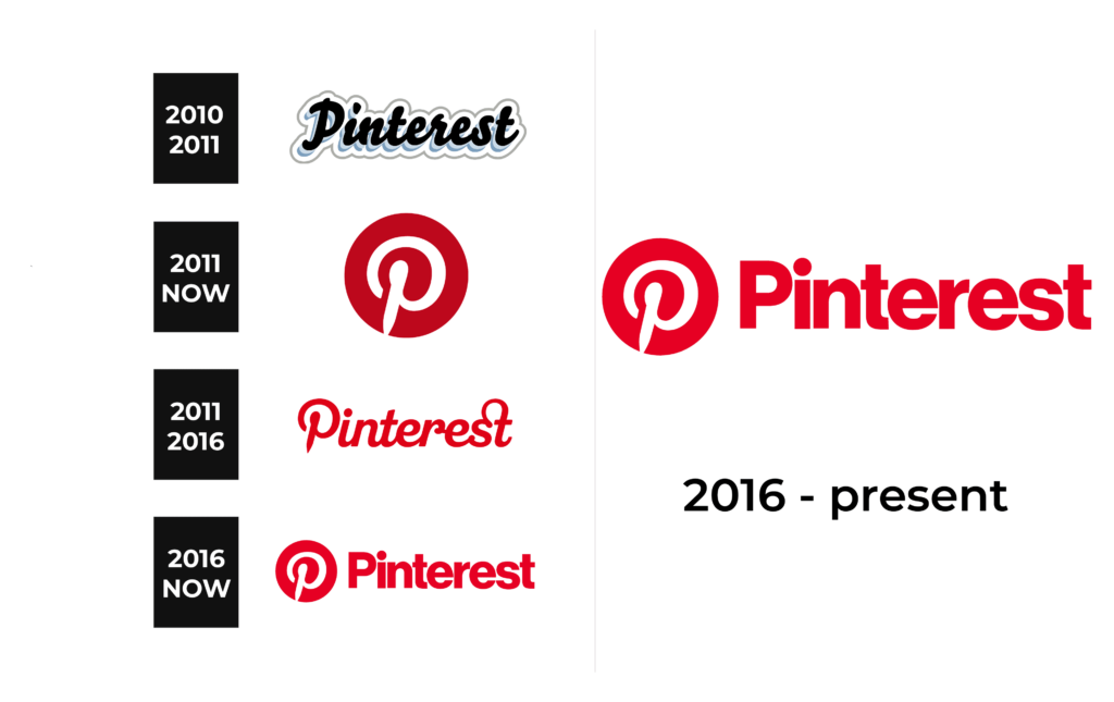
The first logo looks creative and elegant thanks to the beautiful, cursive typefaces. The black inscription had a double shifted down and left being done in a light blue color. The letter had a shadow that added volume. The layering was not done, though. The characters were placed on a white background and had a thin light gray line outlining the whole emblem and repeating the shape of the letters. The outline had a soft, rounded look and almost reminded of a cloud. The logo turned out welcoming and artistic.
2011 – Today
Shortly after creating the original emblem, the company presented a visual identity that most people are now familiar with. In fact, it created two logo versions that it used alongside for five years. One was a round emblem with a white “P” printed inside. The letter was round with soft strokes. Since the vertical stroke was relatively short and the letter was spaced closer to the bottom, the emblem resembled a target board with an arrow. This was quite symbolic as it not only represented the ideas pinned to the board but also hinted that one will find everything they need.
2011 – 2016
Besides the round emblem, the company created a logo that consisted of its full name. It was printed using a cursive font, which made a connection to the original version. However, this version has only one solid color and no shadows or outlines. The red color used for the inscription attracted attention and made the logo stand out on any background. The font resembled a customized version of Pauline Bold Oblique with all the characters, except for the first capital letter, being interconnected.
2016 – Today
In 2016, the platform updated its logo and used a stricter font with bold strokes and straight cuts. The closely spaced characters enhance an image of a solid company. The font closely resembled Aktifo A Extra Bold and Neue Haas Grotesk Standard Display. The logo had a few elements that reminded of the previous version. First of all, the platform continued to use the bright red and white color palette. In addition, they added the round emblem created a few years earlier to the left of the inscription.
Font and Color
For the first six years, the platform used sans-serif, cursive fonts. The second version was inspired by a font similar to Pauline Bold Oblique. In 2016, the platform abandoned the more elegant font in favor of a modern typeface that would be more universal and not limit the platform to specific content. The font used to print the name looks exactly like Aktifo A Extra Bold or Neue Haas Grotesk Standard Display fonts.
For its original logo, the company went for a traditional black-and-white color palette, complementing it with a light blue to add a unique touch. Afterward, the logo done in red and white colors became instantly associated with the platform. It is not only an attention-grabbing color palette but also made an association with the passion that users had for Pinterest and its content as well as the strong position of the company.


