Nestlé Logo
Tags: beverage | food industry | Switzerland
Nestlé is a globally considered food and drinks business that has been operating since 1866. It was established by Henri Nestlé as a family-controlled business. Today, Nestlé has a rich heritage and a presence in 180 countries under various brands – Kit Kat, Nesquik, Nescafé, etc.
Meaning and history
The name “Nestlé” carries a sense of nurturing and comfort, evoking feelings of warmth and care. It derives from the second name of the company’s founder, Henri Nestlé. Over time, his name became a reminder of the brand’s dedication to creating products that bring families together and enhance their everyday moments.
The history of Nestle spans over a century and a half, rooted in a passion for quality and innovation. The company’s journey began in 1866 when Henri Nestle established his groundbreaking infant food formula. From this humble beginning, Nestle grew steadily, expanding its product offerings to include a wide range of food and beverage items.
Throughout its history, Nestlé has consistently strived to meet the evolving needs of consumers while upholding the values of nutrition, health, and well-being. The company’s unwavering commitment to research and development has led to groundbreaking advancements in the field of nutrition science. Nestlé’s dedication to quality and safety has earned the trust of millions of people worldwide.
Today, Nestlé stands as a global leader in the food and beverage industry, with a presence in numerous countries. Its rich history is a testament to its continuous pursuit of excellence and its ability to adapt to changing consumer preferences. Nestle remains dedicated to delivering delicious and nutritious products that cater to the diverse tastes and lifestyles of individuals and families worldwide.
And now, it’s time to explore the representation of the company’s mission—its logotype, beginning with the original emblem based on a shield.
What is Nestlé?
Nestlé is an international manufacturer of products based on milk or the preparation of which requires milk. Their products are sold in 180 countries under various brands – Nesquik, KitKat, etc. They also produce non-dairy products, such as Nescafé tea.
1866 – 1868
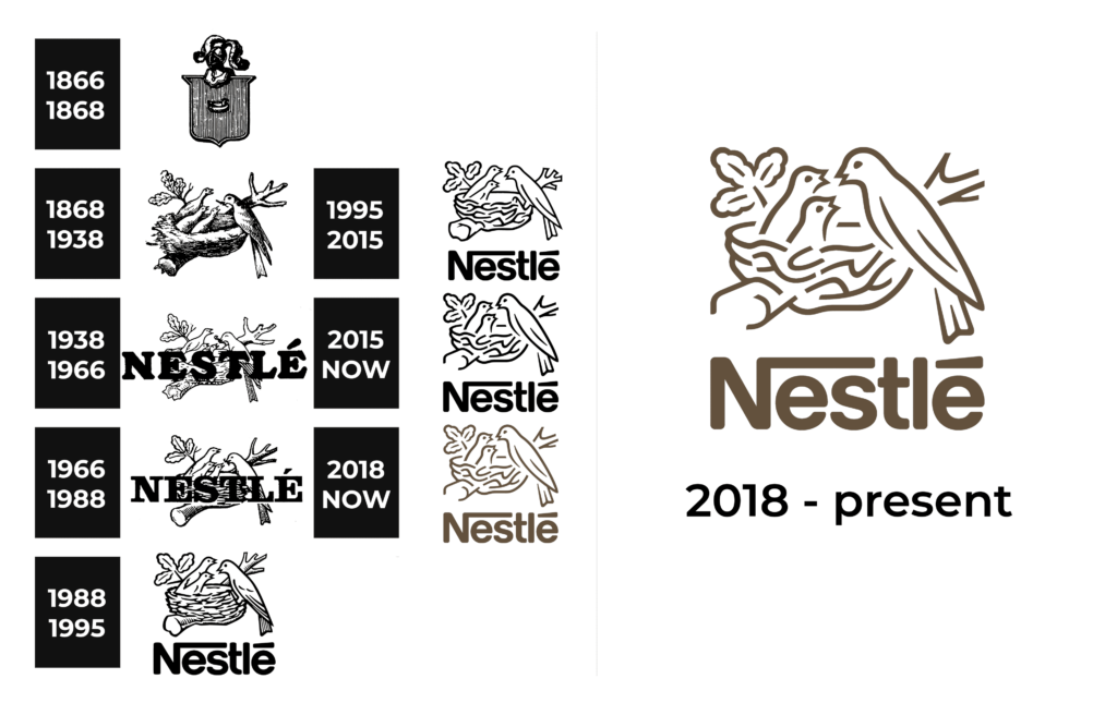
In the first two years, the company was known as the Anglo-Swiss Condensed Milk Company and used the image of a shield with a knight’s helmet on it and a single bird in a nest centrally on it. The chromatic scheme was black and white, which made the logo quite serious.
1868 – 1938
The following reinvention of the company came alongside its renaming to Nestlé. Since 1868, Nestle has used the founder’s family coat of arms – a highly detailed nest where a mother bird feeds its three chicks. The entire image was drawn in a pencil style and keeps it until, with significant modifications.
1938 – 1966
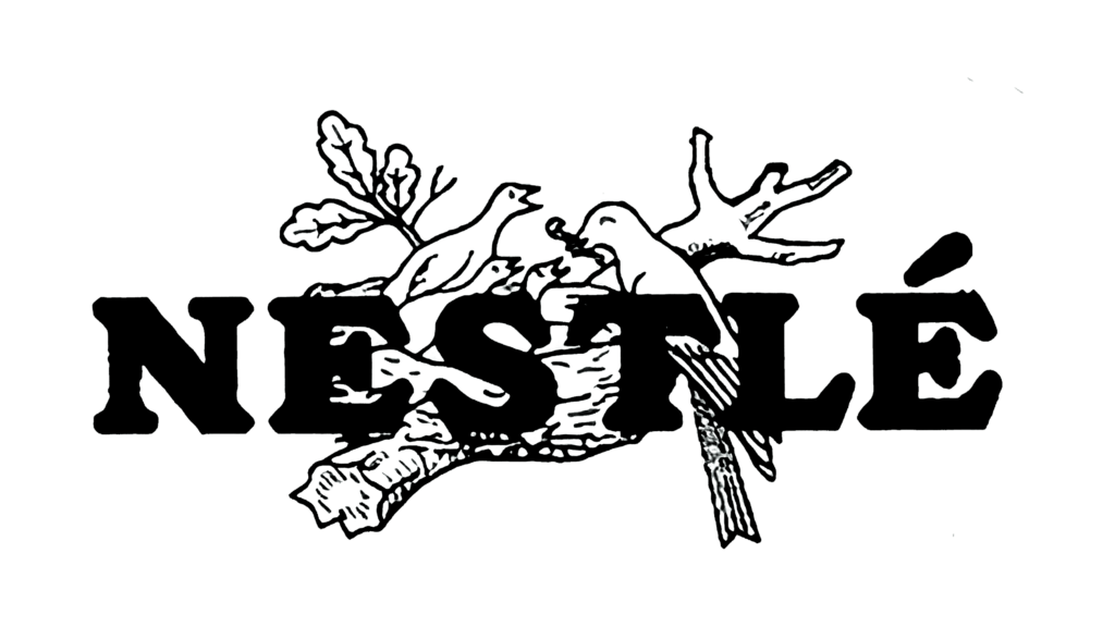
In the 1938 redesign, the company’s watermark was redrawn to include fewer pencil strokes and be more minimalistic. Additionally, it was nestled behind the wordmark – a large ‘Nestlé’ inscription in all bold black capitals with prominent serifs.
1966 – 1988
The course to the logotype simplification followed the brand in its 1966 redesign. Compared to the highly detailed version of 1868 that included various shades and shadows made of contours, this emblem was a nest drawn in simple contours. In contrast, the company name’s typeface was changed to a straighter and thinner one.
1988 – 1995
The following logotype was an even more simplified and modernized depiction of a nest with two chicks fed by their mother instead of three. Below the image, an inscription with the company title found its place. The bold and serif-free lettering was composed in all contours in this logo.
1995 – 2015
Later on, they changed the logotype again. This time, they made the wordmark completely black without significant modification in design. The birds and the nest were redrawn too: the brand designers removed almost all unnecessary strokes.
2015 – today
Since 1995, the company has used a logo in which lines are not used for detail, but simply to separate objects from each other. This makes the nest and the birds extremely minimalistic, which contrasts with all previous versions.
2018 – today
The latter iteration of the logo shows the wordmark and the emblem colored brown instead of black.
Color
The official logotype, as described on their website, is used in an oak brown plus white chromatic scheme. However, their logotype comes in several variations, including black and white or gray and white.
Font
The emblem uses a serif-free script. The letters are written in bold lines with rounded tips. The first capital ‘N’ is considerably larger than other characters, and it has a long line coming from its tip and covering the letters ‘e’ and ‘s’. Also, a distinctive dash stands above the last ‘e’.


