Basketball is a beloved sport for many across the globe. The Miami Heat team has earned plenty of fans. Home matches are played at the American Airlines Arena with a capacity of almost 20 thousand people. At various times, famous players were part of the team, including LeBron James, Shaquille O’Neal, Chris Bosh, Dwyane Wade, and Tim Hardaway.
Meaning and History
![]()
The Miami Heat of America was formed in 1988, which makes it a relatively young member of the association that already existed for over forty years. A year earlier, NBA announced the expansion of the championship. One of the four available places was taken by this team. For the first 3 years, the club was located at the bottom of the standings. In 1992, the team reached the playoffs of the championship for the first time but unfortunately lost during the first round. The year 2006 proved to be a historic year for the Miami Heat. For the first time, local basketball players became champions of the national association.
What is Miami Heat?
The Miami Heat is a professional basketball team that competes in the NBA. The team is a 3-time NBA champion, 6-time conference winner, and 14-time division winner. The first couple of decades were mostly not the best times for the team, but later it proved to be quite successful.
1988 – 1999
![]()
The logo of the team is very symbolic. It depicts a black ring with a basketball ball flying through it. The ball’s flight trajectory is marked by fire that was coming from the ball. This detail not only added a feeling of motion but also symbolized the “Heat” portion of the name. The latter was printed right underneath the basketball using bold, clean, and straight strokes. The inscription featured italicized characters, which further enhanced the feeling of movement, while sharp horizontal strokes of letters “A” and a squiggly line that resembled fire coming off of the “T” added a touch of sharpness and showed that the team is always on point with its moves.
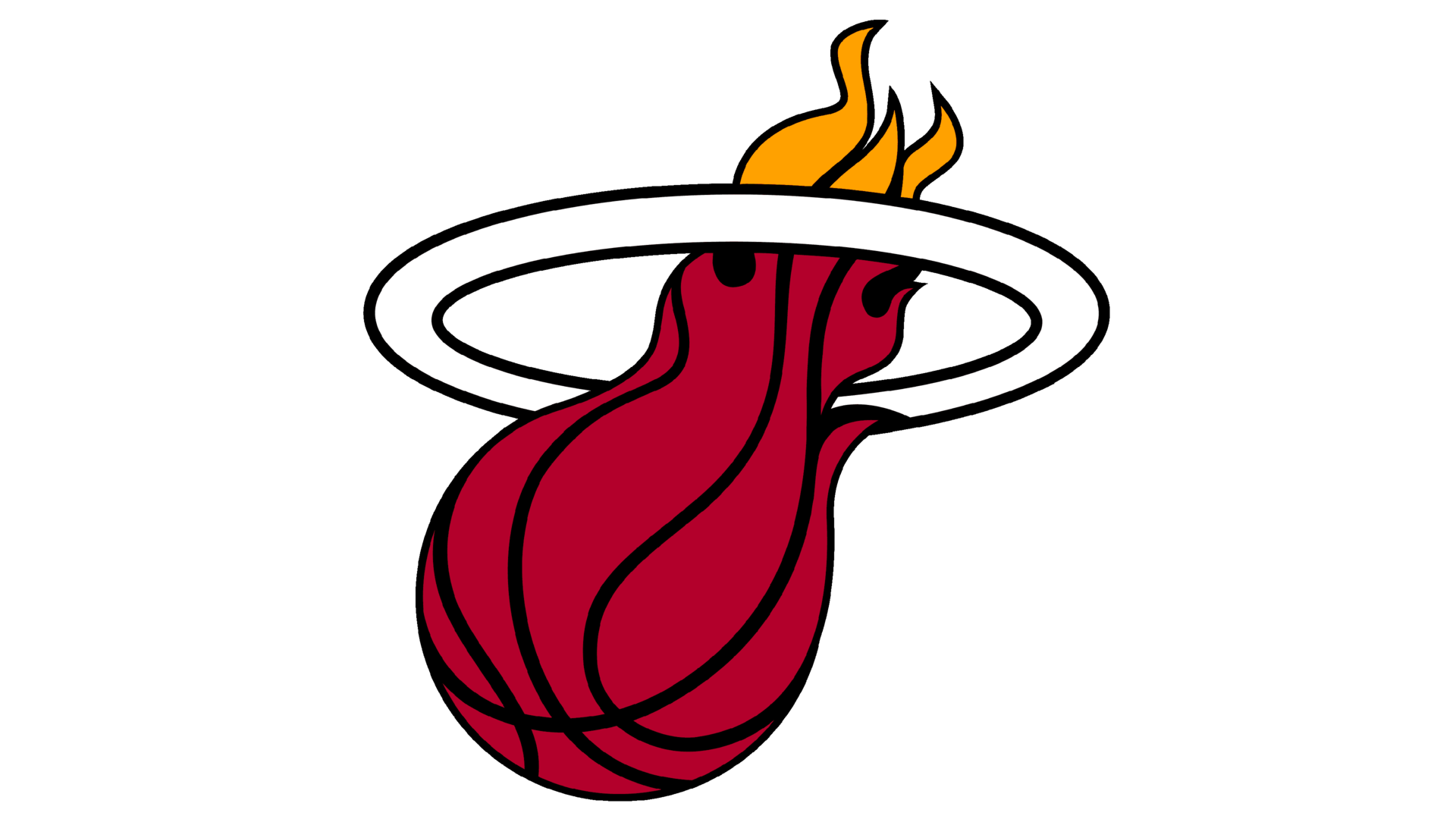
1999 – Today
![]()
A dynamic, bold logo was slightly redrawn. The first thing that catches the attention is the strong, dark red color of the ball which now features black lines instead of white. They surely go well with the black inscription underneath. The ring, on the other hand, now had only a black outline. It was also made thicker, but the fiery ball was still the center of attention. The team kept the inscription without making any major changes. The designers have simply redrawn the wavy line that was part of the “T”, making it go up on a diagonal and match the direction of the flying ball.
Font and Color
The font used to print the name in both cases resembles a customized version of the Antique Olive Compact Italicized font. They mainly changed the horizontal stroke of the “A”, making it sharp and dynamic. The letter “T” was also enhanced by a squiggly line that went with the fire theme.
The color palette of the original logo not only uses the traditional orange color of the basketball ball but also shades of fire. Later, a crimson shade or red was introduced instead of orange. It was accompanied by a splash of yellow that added brightness and reminded of the original version. The black and white colors also seen in both logos add a touch of boldness, but also create a professional and formal look.