Golden State Warriors Logo
Tags: NBA | professional team | USA
The Golden State Warriors stand as a top-tier basketball franchise headquartered in San Francisco, California. GSW has maintained a prominent presence in the NBA since the league’s inception in the 1940s. Initially founded in Philadelphia, they later went to California and embraced the state’s renowned moniker as their official title. Under this banner, the Warriors have etched an impressive legacy and garnered widespread recognition both in the United States and on the global stage.
Meaning and History
![]()
The team’s roots trace back to the early days of the NBA when it operated under the name Basketball Association of America (BAA). The Philadelphia Warriors, as they were originally christened, played a pivotal role in shaping the association, being one of its three initial teams. Their relocation to California in 1971 marked a transformative juncture in their history, and they’ve since been proudly identified as the Golden State Warriors.
Throughout the years, the Warriors’ logo has transformed. The initial design in Philadelphia featured a Native American chief dribbling a basketball, a prevalent motif of the era. However, upon their move to California, the team opted for a contemporary and minimalist emblem.
The current symbol prominently showcases the iconic Golden Gate Bridge within a circular framework, symbolizing their deep-rooted connection to the San Francisco Bay Area and their association with the “Golden State” identity. This emblem transition marked a fresh commencement in their new home while honoring the spirit of their region.
What is the Golden State Warriors?
The Golden State Warriors are a basketball franchise that competes at the highest levels of the NBA. This team is one of the founding members of the league, with its establishment dating back to 1949. They have earned a reputation as a highly successful franchise, thanks to their extensive collection of victories in championships and tournaments.
1946 – 1951
![]()
In these five years, the original symbol featured a whimsical representation of a Native American character rendered in lavender brushstrokes, cradling a gleaming basketball. The term “Warriors” was gracefully etched on a diagonal slant, accompanied by a golden plume adorning the character’s hair.
1951 – 1962
![]()
During the era from 1951 to 1962, a rejuvenated emblem emerged, marked by robust lines and a novel color scheme of blue and white. The “Warriors” lettering took center stage, while the addition of “Philadelphia” in white graced the extended tail of the “W.”
1962 – 1969
![]()
With the team’s relocation to San Francisco in 1962, a fresh circular badge was adopted. It featured a slender golden border, a substantial white frame, and a headdress adorned with blue feathers. The wordmark gracefully encircled the emblem’s periphery.
1969 – 1971
![]()
Another transformation took place in these two years, presenting a solid golden circle enclosed by a blue outline, accented by a blue bridge motif. Above the golden medallion, the text “The City” arched gracefully.
1971 – 1972
![]()
With the club’s name change to the Golden State Warriors in 1971, the emblem underwent a significant overhaul. It now encompassed a bold golden circle with a blue outline representing the California state, along with a blue five-pointed star. The inscriptions “Golden State” and “Warriors” were introduced above and below the emblem.
1972 – 1975
![]()
The color palette underwent a vibrant transformation, and the wordmark was streamlined to simply read “Warriors” and “Basketball.” To the right of the state’s outline, a striking, extra-bold blue “14” was introduced on a yellow backdrop.
1975 – 1988
![]()
In these thirteen years, the golden circle evolved into a basketball shape, the “14” was removed, and the California silhouette was enlarged while maintaining the existing color scheme.
1988 – 1997
![]()
The emblem saw a refinement, with the golden hue deepening. The lettering adopted an elegant typeface characterized by rounded bold lines and softened corners.
1997 – 2010
![]()
A comic book-inspired logo was unveiled during this timeframe, featuring an extraterrestrial-like superhero against a gradient blue backdrop. The wordmark was stylized in a contemporary typeface, with the letter “W” elongated to resemble a lightning bolt.
2010 – 2019
![]()
The emblem was reimagined with a light azure circular medallion, showcasing an intricate depiction of the bridge and a blue wordmark in a sophisticated serif typeface.
2019 – today
![]()
The color palette received a contemporary update with richer and more intense shades, and the wordmark was modernized with a serif typeface marked by softened curves and elongated strokes, symbolizing the team’s current visual identity.
Color
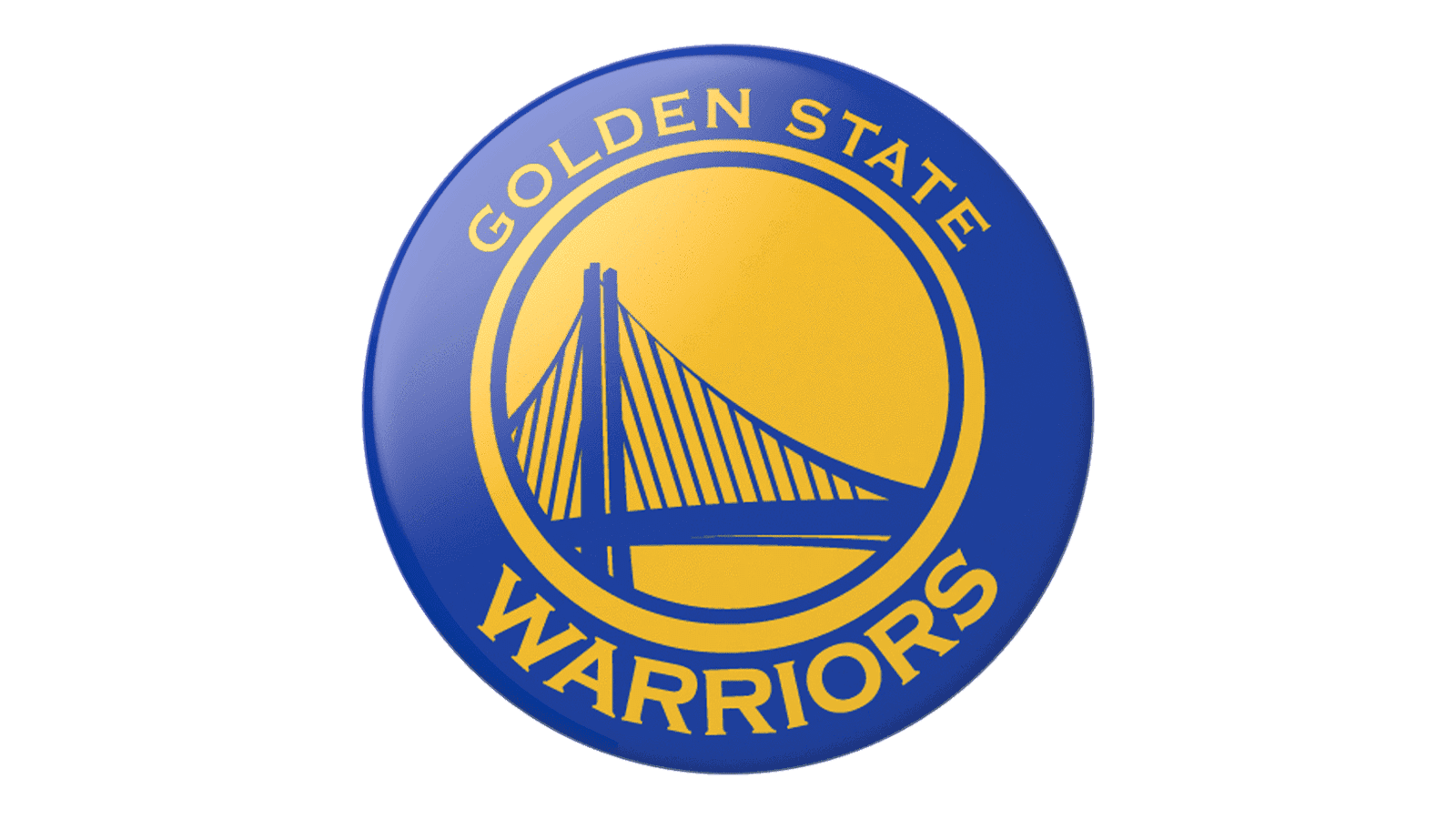
The color scheme aligns with the official team colors: royal blue for the circle and inscriptions, yellow for the Golden Gate Bridge, and a ring encircling the inner edge, creating a unified and stylish appearance for the franchise.
Font
The most recent two Warriors logos utilize a custom-designed font, created in partnership with Adidas. This font boasts an antique style with petite, sharp serifs on the left side, adding a touch of sophistication to the team’s visual identity.