Lunchables Logo
Tags: cheeses | Kraft Foods | meal snack | USA
Lunchables is a well-known brand offering pre-packaged meal kits designed primarily for children. These convenient kits include a variety of components such as crackers, meats, cheeses, and sometimes a small dessert or drink, making them a popular choice for busy parents seeking an easy and enjoyable lunch solution for their kids.
Meaning and History
![]()
Introduced in 1988 by Oscar Mayer, a division of Kraft Foods, Lunchables was created to address the need for quick, portable lunches. The initial concept was inspired by the increasing demand for convenience and the growing trend of on-the-go eating. Lunchables provided a novel way for parents to pack a balanced meal that children would find fun and appealing.
During the 1990s, Lunchables gained significant popularity and expanded its product range. The brand introduced various combinations and themes, such as pizza and nachos kits, catering to children’s diverse tastes. Marketing efforts focused on the fun and interactive nature of the meals, further boosting the brand’s appeal among its young audience.
As the brand evolved, Lunchables adapted to changing consumer preferences by offering healthier options. These included reduced-fat versions and kits with fruits and vegetables. Despite facing criticism over nutritional content, Lunchables continued to innovate and update its product line to meet the demands of health-conscious consumers while maintaining its convenience and fun factor.
What is Lunchables?
Lunchables are a staple in the pre-packaged meal snack, known for its wide variety of choices. The brand continues to expand its offerings, introducing new flavors and formats to keep pace with consumer trends. Lunchables’ enduring popularity underscores its success in providing a convenient and enjoyable meal option for kids and parents alike.
1988 – 2004
![]()
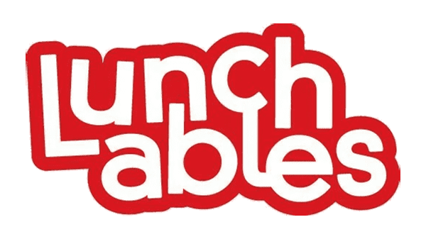
The original Lunchables logo from 1988 to 2004 features a straightforward and clean design. The word ‘Lunchables’ is displayed in a bold, serif font in red, set against a yellow rectangular background. The Oscar Mayer logo appears in the upper left corner, adding brand recognition. Below ‘Lunchables,’ a smaller text reads ‘LUNCH COMBINATIONS,’ emphasizing the product’s concept.
2004 – 2008
![]()
In 2004, the logo was redesigned to appear more dynamic and engaging. ‘Lunchables’ is written in a playful, italicized font with a 3D effect. The letters are outlined in yellow with a gradient fill, giving them a vibrant, fun look. The Oscar Mayer logo remains in the upper left corner, but the overall design has a more youthful and energetic feel.
2008 – 2010
![]()
The 2008 version maintains the playful, italicized font for ‘Lunchables’ but simplifies the color scheme. The gradient is toned down, making the text easier to read. The Oscar Mayer logo is still present, but the overall design is cleaner and more streamlined, focusing on readability and brand consistency.
2010 – 2013
![]()
From 2010 to 2013, the logo reverts to a more straightforward design. The word ‘Lunchables’ is in a bold, red, sans-serif font against a yellow background. This version simplifies the overall look while keeping the bright, inviting colors. The Oscar Mayer logo remains in the upper left corner, maintaining brand recognition.
2013 – 2022
![]()
The 2013 iteration introduces a modern, rounded sans-serif font for ‘Lunchables,’ with a red outline around white letters. The design is minimalist yet striking, focusing on a clean and contemporary look. The Oscar Mayer logo is removed, giving the Lunchables brand more prominence and independence.
2022 – today
![]()
In 2022, the logo undergoes another transformation, adopting a bold, playful font with exaggerated curves and a thick outline. The letters are filled with a gradient of yellow and orange, evoking a sense of fun and energy. This latest version aims to appeal to a younger audience, emphasizing the brand’s playful and vibrant nature.
Font
The fonts used in the Lunchables logo evolution display a journey from traditional to playful and modern. Initially, the 1988-2004 logo features a classic serif font for ‘Lunchables,’ which conveys a sense of reliability and tradition. As the years progress, a transition to a bold, sans-serif font in the 2004-2008 version marks a shift towards a more dynamic and eye-catching presentation.
The 2008-2010 logo continues this trend with a softer, more rounded sans-serif typeface, suggesting approachability and fun. In the 2010-2013 design, the sans-serif font remains but with a slightly more refined and professional look. From 2013-2022, the font becomes even bolder and more energetic, with an outline that emphasizes the playful nature of the brand. The most recent logo, from 2022 to now, showcases a quirky, blocky sans-serif font that combines a sense of fun with modern appeal, reflecting the brand’s youthful and vibrant image.
Color
The color palette throughout the Lunchables logo history reflects the brand’s emphasis on energy and fun. Starting with the 1988-2004 logo, a warm yellow background paired with red text establishes a vibrant and inviting look. Moving to the 2004-2008 version, the color scheme remains similar but becomes more saturated, enhancing its visual impact. The 2008-2010 iteration introduces a slightly softer yellow background, while the red text remains prominent, maintaining consistency.
In 2010-2013, the colors stay true to the brand’s core identity with a bright yellow backdrop and bold red lettering, ensuring high visibility. The 2013-2022 logo adopts a more playful approach with a gradient effect, adding depth and dynamism to the yellow and red hues. The latest logo from 2022 to the present takes on a vibrant yellow text with a red outline, creating a striking and modern appearance that captures attention and conveys a sense of fun and excitement.