LinkedIn Logo
Tags: job search | networking | social network
Today, LinkedIn, the social network, continues to grow, launching new features and removing not-so-popular features. The platform has become an effective tool for recruiting and posting vacancies in all areas of business, especially in IT. In terms of the number of users, LinkedIn is inferior to Instagram and Facebook, but it has practically no equal lead generation. According to HubSpot, the platform generates leads 277% more efficiently than Facebook. LinkedIn generates revenue from advertising and subscriptions to premium accounts. In 2022, the company’s revenue amounted to more than $13.8 billion.
Meaning and History
Reed Hoffman is credited as the founding father of LinkedIn. His first brainchild was SocialNet.com, which was launched in 1997 and abandoned as a failed experiment in 1999. Three years later, he announced his new creation under the name “Linkedin”. The trial version was ready in 2002, the official launch took place in May 2003. Gradually, Linkedin developed, acquiring more and more new services. The first profitable year was 2007. Since 2016, it has been owned by Microsoft Corporation. The LinkedIn logo appeared at the same time as the company was created, and in the twenty-year history of the brand, it has changed very slightly. The emblem consists of the word “Linked” and the preposition “In”. The space between the two parts is barely noticeable. If it is necessary to make the logo more readable and reduce it for a limited or square space, the word “Linked” is removed, leaving only the square sign “In”.
What is LinkedIn?
LinkedIn is a social network for job search and networking. Today, Linkedin is the largest community of professionals in more than 200 countries around the world, and the total number of all users is about 100 million people. It is important to keep in mind that there is a live specialist or company leader behind almost every account, and not a random person who created a profile for the sake of boredom.
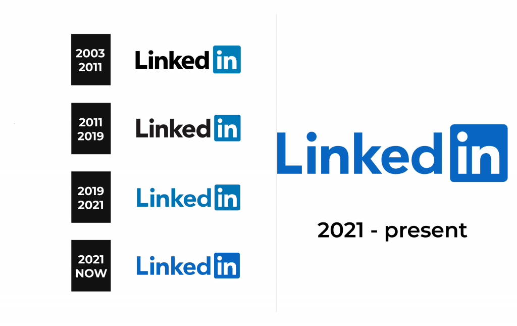
2003 – 2011
The first version was created with a strict, business style to reflect the target audience. The logo’s simple, clear font along with black, blue, and white colors symbolize the company’s professionalism, seriousness, and reliability. The first part consists of a black sans-serif inscription on a white background with only the first letter capitalized. The “In” part is placed in a blue square with rounded corners. The designers used a bold, sans-serif font similar to Radiate Sans Bold and LCT Picón Bold.
2011 – 2019
The 2011 redesign preserved the original concept and composition, as well as the color palette. They merely changed the font, which also did not look drastically different from the original. The new version used the Avenir Pro font, with thinner lines and classic timeless shapes.
2019 – 2021
In this version, only the color palette has changed significantly. The black “Linked” lettering is now the same shade of blue that is used for the square. The font has been tweaked a bit, and the dots above the “i” have been placed slightly higher.
2021 – Today
In 2021, the logo was redesigned again. As with previous updates, the company did not make any drastic changes. In fact, it merely changed the blue color for a brighter version of it. It looked lighter and more inviting.
Font and Color
Although the company has changed its logo several times, the font featured in all the versions has stayed pretty consistent since 2011. It resembles the Avenir Pro typeface. The previous, original logo uses a very similar font, which is closer to LCT Picón Bold or Radiate Sans Bold. Blue and white colors have always been part of the TikTok logo as they are closely linked to professionalism, intelligence, trust, and other features one would want to see in a professional world. For the first six years, it also used a classic black color.


