Lenovo Logo
Tags: laptop | mobile phones. Hong Kong
“Lenovo Group Limited” or simply Lenovo is a Chinese brand of electronics and IT products headquartered in Beijing, occupying a leading position in its niche. It is the largest manufacturer of personal computers in the world with a market share of more than 20%, steadily introducing innovations that make the modern world better and more interesting.
What is a curios fact about Lenovo make?
The name “Lenovo” is a combination of the words “Le—” (from Legend) and the Latin “novo” (“new”) in the ablative case. Official representative offices of “Lenovo” are present in more than 60 countries of the world, the geography of sales covers about 180 countries. More than 40 research centers and laboratories of the company operate in Beijing, Chengdu, Yamato (Kanagawa Prefecture, Japan), Shanghai, Shenzhen and Morrisville (North Carolina, USA). The company has its own factories in the USA, India, Mexico, and Europe.
Meaning and History
The Lenovo logo is a white verbal trademark located inside a geometric shape. Due to its rectangular shape, the logo can be used as a label, and the additional space around the verbal trademark facilitates the placement of the logo on various media carriers.
Thus, in May 2015, Lenovo held a Tech World event in Beijing, where, in addition to the original concepts of a smartwatch with two Magic View screens and a smartphone with a Smart Cast rotary laser projector, they presented a new logo, “which became the culmination of a long-term transformation of the company’s business.”
According to Lenovo, the logo has become more personal, attractive, it reflects corporate values, innovative DNA and a rich history of acquisitions.
The logo and corporate identity were developed by the agency Saatchi & Saatchi (New York). Speaking about the appearance of the new logo, it can be noted that blue, green, orange and pink were added to the previously present black, red and gray colors of the company.
There is also the Lenovo verbal trademark. It is used as an additional brand logo without a geometric shape. It is not the preferred logo of the brand. However, it is sometimes used in situations where it is difficult to use the main logo.
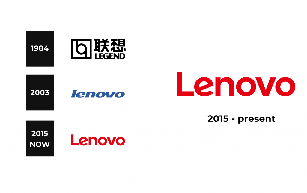
1984 – 2003
2003 – 2015
2015 – now
Font and Color
Lenovo’s main font is Helvetica Neue, a classic font that has many typefaces and provides flexibility of use. Its constant application will help to create a solid and strong corporate identity. In cases where a translation into Chinese is required, it is recommended to use a clean modern font. Han Yi is a good example of such a font.
Lenovo’s color palette consists of primary and secondary colors. Their uniformity ensures the brand awareness of Lenovo and strengthens it. So, the brand has several colors: black, red, gray, blue, green, orange, and pink.


