Colonel Sanders, the founder, is not only the good-natured Mr. with a beard and in the same glasses, whose image adorns every signature restaurant. He is also a person who was able to build a successful business from scratch not at a young age. KFC restaurants, formerly called Kentucky Fried Chicken, became a full-fledged chain back in the 50s, before their competitors McDonald’s. It specializes in chicken dishes according to unique recipes, the composition of which is a trade secret of the company. In terms of popularity, chicken-based products successfully stay on par with hamburgers in the fast food segment.
Meaning and History
In 1930, Garland David Sanders, then 40 years old, bought a gas station from Shell in Kentucky, where he opened his first Sanders Court and Cafe. After completing a course in restaurant management, he introduced fried chicken to the menu, cooked according to his own original recipe. In 1937, Sanders expanded Sanders Court and Café, but grilling a chicken in a pan took over half an hour, which was too long for visitors in cars. In 1939, he began using a pressure cooker to cut time and increase profits. Colonel Sanders entered into his first franchise agreement in 1952 with Pete Harman from Utah. In just ten years, the chain reached 600 locations. Garland Sander sold it at the age of 74 years to a group of investors for $2 million. Colonel Sanders remained the owner of Canadian franchises and was in business for a long time. KFC entered the world market in 1965. Since the death of Harland Sanders, the company changed owners several times. In 1991, the brand name was shortened to KFC.
What is KFC?
KFC is an international restaurant chain with a long history of excellence and innovation. The main item on the menu is original bone-in chicken pieces, breaded according to Sanders’ secret recipe. Around the world, there are also exotic additions to the menu: Japan, Ecuador, Singapore, and the Caribbean have fried seafood, while Greece loves potato wedges instead of French fries.
1954 – 1959
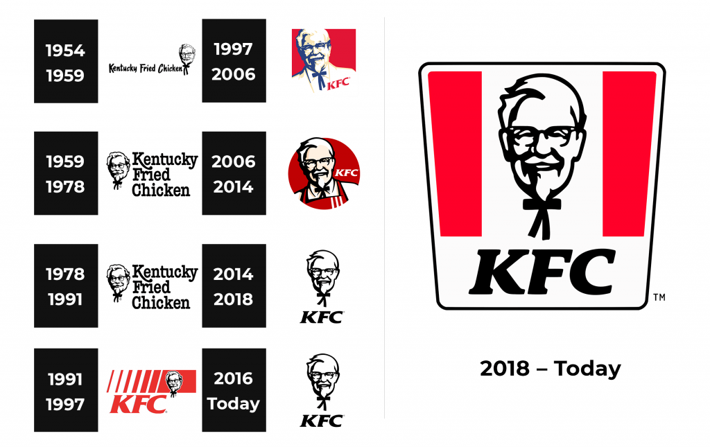
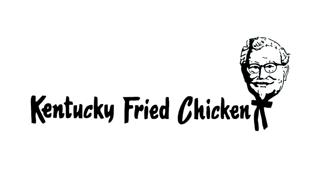
KFC franchise restaurants used a logo that featured the full name spelled out with a drawing of a couple of chickens at the bottom of each capital letter. It was an interesting black and white logo that made it even more clear what the main dish of this restaurant is.
1959 – 1978, 1978 – 1983 (secondary)
Not long after the first logo was created, it was decided to remove the chicken and leave only the inscription. The font was kept the same. It made the KFC logo look unique as the letters had uneven ends, which resembled brush strokes, and an italicized letter “C”. It gave the whole logo a more relaxed and welcoming feel.
1978 – 1991
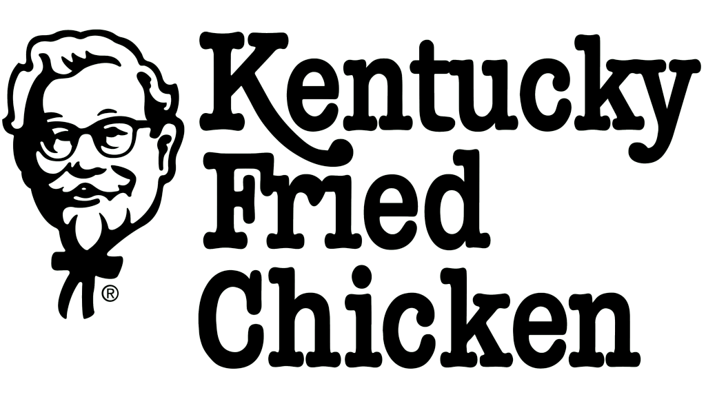
Although the logo preserved a black-and-white color palette, it looks very different. The font was updated to a fancier serif font. The name was printed in three lines, with each word aligned to the left. An abstract portrait of the founder was placed on the left. It not only showed the origins of the brand but also added a friendly touch as the man in the image had a pleasant smile. In 1950, Garland David Sanders became a popular figure in Kentucky and was awarded the title of “Colonel of Kentucky”. He grew a goatee, began to wear frock coats, and then white suits, and bolo ties and be called a colonel. It was then that a historical image appeared, which still adorns the brand’s products.
1991 – 1997
A new logo was created to make the restaurant chain look less unhealthy. The full name was shortened to “KFC” as the word “fried” was not very approved by the public. Since there was no word “chicken” in the logo, it was not limiting the restaurants in the variety of specials. The updated logo also featured a bright red color. All the letters were capitalized and had a blue shadow on the left. Above, there were slanted vertical lines that got wider as they were getting to the right side. Just like the initials, they had a blue shadow on the left. The widest line had a face icon seen in the previous logo. It also featured a blue color.
1997 – 2006
The portrait of the Colonel now became the main element of the KFC logo. it was redrawn and had a more realistic look thanks to the addition of beige color, white highlights, and dark blue for shadows. The bottom of the tuxedo was blending with the white background, while the remaining portion of the logo had a square background of red color. The initials were not gone, but got much smaller and placed in the bottom right corner on a diagonal. White highlights on the letters added some volume to the inscription.
2006 – 2014 (USA), 2006 – 2018 (Worldwide), 2006 – 2021 (China)
An already familiar face of the founder now looked even friendlier thanks to a more even coloring of the face. In addition, he was now wearing a red apron with three vertical lines on one side. The emblem was round and had a red base. Unlike the previous version where the top of the head was cut, this logo had the hair stick out a bit further than the round base. The initials were printed in white, right about the left shoulder. It was designed by Landon Associates.
2014 – 2018 (Worldwide, except China)
The black and white color palette was brought back. The face of Colonel Sanders from the previous logo was slightly redrawn and placed straight, right above the initials. The latter featured bold, serif font and italicized letters. The logo looked minimalistic and modern.
2016 – Today (North America), 2018 – Today (International)
This version features a similar inscription as seen in the original logo and the one that followed but the lines and ends were cleaner and the inscription looked more put together. A very detailed, black-and-white drawing of the founder was featured on the right. It had a feeling of sophistication.
2018 – Today, 2020 – Today (China)
A KFC bucket served as the base of this logo. It had two vertical red lines and a wider white one in the center with the portrait of the Colonel. At the bottom, there were initials on the white strip. The portrait and initials looked exactly the same as in the logo used from 2014 until 2018.
Font and Color
Until 1978, KFC logos featured a sans-serif typeface that had brush strokes. In 1978, they introduced a sophisticated, serif font, which was replaced by a less fancy bold, serif typeface in 1991. For the logo the company used from 1997, they used a modified Friz Quadrata ITC Bold. Other logos featured a similar font. Although there was a bit of blue, KFC logos used mainly black and white or red, black, and white color palettes. These are powerful colors that are full of energy. One can also call the black-and-white color palette a classic and timeless choice.
