Instagram Logo
Tags: Facebook | mobile app | social media
Today, Instagram is not just an endless collection of photos. It is a powerful social network that transformed advertising, photography, and content consumption. In just a little over 10 years, a small app has turned into a huge platform that combines entertainment, business, and the most important events of the world. It allows companies and individuals to advertise their products and find new clients, while celebrities post selfies and photos from ceremonies and various events. It is a place for users to share beautiful and happy moments of their life. Although this social network was created in the US, more than 70% of the users live outside the US. Nonetheless, there are over 100 million Instagram users in the US.
Meaning and History
Together with his partner, Mike Krieger, Kevin Systrom created j a Burbn app that combined some social media, geo-targeting, and photography features. It was then transformed into a completely different application and required a new name. This is how the world-famous network appeared and became available for download in the AppStore on October 6th, 2010. The first photo, though, was posted on July 16, 2010. It was a photo of Kevin’s dog. This is how Instagram started. The app for Android was released in April 2012. That same month, it was bought by Facebook for $1,000,000,000. An interesting fact is that Twitter tried to buy Instagram three times, but each time was rejected. Besides continuous improvement, the company started the development of Instagram for Kids, which was paused in 2021. For now, it added new safety tools for parents.
What is Instagram?
Instagram is one of the most recognized social networks today. It has made an endless number of updates, improvements, and changes since its birth to become what it is right now. The platform is a subsidiary of Meta Platforms Inc., which is the parent company of Facebook, WhatsApp, and Oculus.
2010
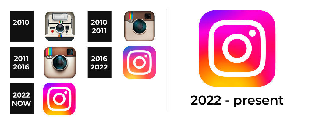
Originally, Instagram allowed square-shaped images, like those taken with Polaroid and Kodak Instamatic instant cameras. This is reflected in the first Instagram logo designed by Kevin Systrom, which depicts a Polaroid instant camera. It almost completely fills a gray square with rounded angles that serves as a base. To the left of the lenses, there is a black tag with the name of the platform printed in small white serif letters. It appears as if it is the brand name of the camera. A bright, rainbow stripe going down the milky white camera added interest and reflected the colorful nature of the Instagram photos.
2010 – 2011
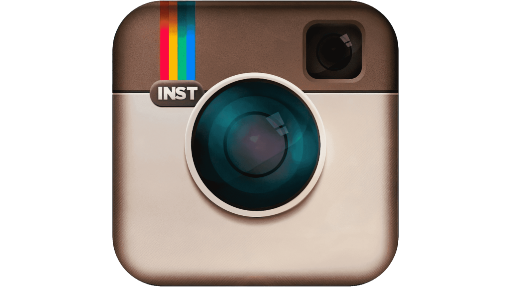
Although the previous Instagram logo was used for less than a year, it served as the base for the new one. It was created by Cole Rise. A camera from the 1950s served as an inspiration. He preserved a square shape as it was originally drawn and muted color scheme with an exception of a rainbow stripe in the top left corner. Right under the rainbow, on the line where a darker top meets a beige bottom two-thirds, there is a brown oval icon with “INST” printed in uppercase, sans-serif letters of white color. A large camera lens is placed right in the center with a viewfinder window in the upper corner on the right. There are no other details, which supports the expansion of Instagram platform functions and the fact that it was also supporting videos.
2011 – 2016
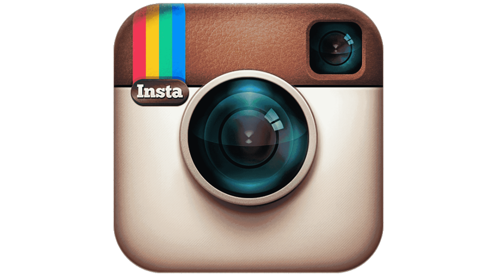
With the release of the 2nd version of Instagram, the overall idea of the Instagram logo was not changed much, but it now looks richer and has more details. First of all, the darker brown portion looks like it is made from leather material. The multicolored stripes got wider, primarily to accommodate the longer inscription underneath. It said “Insta” with only the letter “I” being capitalized. They used the original font. The lens and viewfinder window look more realistic thanks to the addition of highlights, which made the colors brighter.
2016 – 2022
Not many people remember the what Instagram logo looked like before this version. A familiar square with a gradient and rounded corners replaced the old camera. The gradient reminds of a sunrise with a yellow in the bottom left corner turning into orange, then red, pink, and purple with just a bit of blue. In the center, there is a white circle framed by a white square border. A small circle in the upper right corner makes it clear that the white shapes inside are an abstract drawing of a camera, which draws a connection to the previous Instagram logos. This bright, completely new look of the logo instantly grabs attention and reflects the amazing content and opportunities one can find on the platform.
2022 – Today
If one does not compare this logo with the previous one, one might not realize it was redesigned. The update gave it a brighter look, mainly by minimizing the darker purple and blue shades in it and adding more pink and red. Otherwise, the white element which created an outline of a camera remained unchanged. The gradient also starts with yellow and transitions into pink and purple.
Font and Color
The original emblem and the one presented in 2011, used a serif, basic font. The second Instagram logo features a Billabong font and all uppercase letters. The later version did not have any inscriptions. Originally, the company used relatively muted colors as the base of its logos. These included milky white, beige, brown, gray, and black. The logos, though, still had a little touch of color thanks to colorful stripes. Since 2016, the colors became bright and dominated by warm tones, including yellow, orange, red, and pink with just a bit of purple and blue in it. It also had pure white, which balanced out the colorful color palette and popped against the bright background.
