IKEA Logo
Tags: furniture | home goods | Switzerland
IKEA is a Dutch manufacturing and trading group of companies, the owner of one of the world’s largest retail chains selling furniture and household goods. The company has Swedish roots and maintains the image of the Swedish company in all marketing communications. It was founded in 1943 in Sweden by Ingvar Kamprad.
What is a curious fact about IKEA?
The name “IKEA” is an acronym, and stands for “Ingvar Kamprad ElmtarydAgunnaryd”, that is, the name and surname of the founder and the name of the farm Elmtaryud in the parish of Agunnaryud, where he was born.
Meaning and History
Kamprad registered the company Handelsfirman IKEA in July 1943. The first logo had a name, and below the inscription “Agunnaryud, Sweden”. Words “import-export” appeared on the logo after a while. The word IKEA was written in italics, lowercase letters with emphasis.
1951 – 1952
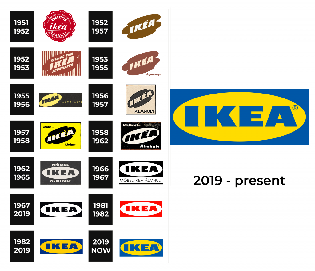
The predecessors of today’s logo began to appear in the 1950s. Thus, in 1951, the logo was a stylization of a smooth traditional red wax seal with a thin white outline.
1952 – 1957
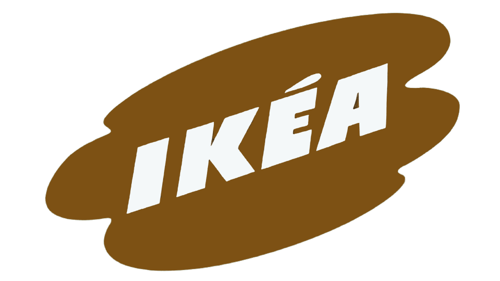
The new version was developed in 1952 by designer Gillis Lundgren. The word “IKEA” was written in capital letters and was placed in a shape resembling a cloud. There were light brown and cream shades in the color palette. The brown emblem was originally placed against the background of numerous vertical stripes of different thickness.
1952 – 1953
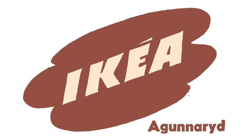
In 1953, the logo was simplified; its background became light beige without patterns. The word “Agunnaryud” appeared under the logo in the lower right corner.
1953 – 1955
1955 – 1956
The color palette changed in 1955, the yellow emblem with black letters was then located on the left side of a horizontally elongated black rectangle.
1956 – 1957
In 1956, the logo became black, and the letters and the square background became light beige.
1957 – 1958
The new logo was introduced in 1957 for the company’s first line of furniture. At that moment, the emblem was colored black and placed on a bright yellow background with a black strict outline.
1958 – 1962
In 1958, the shape of the cloud turned into an oval, and the bright yellow shade changed to white. The composition remained the same, only the background was black and the oval was white. IKEA’s black lettering was reinforced: the massive shapes of the letters became clear and strict.
1962 – 1965
The apostrophe above the letter “E” was removed in 1962, and the logo font was changed manually, to even more recognizable shapes. The logo became black and white.
1966 – 1967
1967 – 2019
The slogan was completely removed from the IKEA logo in 1967. Another change in the color palette took place in 1982, that time IKEA found its perfect combination. It was a yellow circle placed inside a blue rectangle and a blue inscription in the middle.
1981 – 1982
1982 – 2019
In 1982, the first visual profile guide appeared, which clearly described the use of IKEA as a “trademark” and “IKEA” as a “word mark”. Since 1991, only blue stores with a yellow IKEA inscription on the facade have been built.
2019 – now
In 2019, there was a rebranding. Seventy Agency (Stockholm, Sweden) did technical work that improved the logo for use in physical and digital spaces. They wanted to preserve the unique characteristics of the original iconic design, but make small and effective changes to the logo for better perception on all formats.
One of these changes was an increase in the optical size of the trademark. They increased the size of the letter by 15% by changing the proportions of the rectangle and oval. Creating a greater brand presence in the same amount of media space. The sign® was included in the design, which made it easier to align the logo.
The letters themselves became larger against the background of the oval, the space of the letters “E” and “A” became larger, and the leg “K” received a new angle of inclination. Technically, the logo became simpler and cleaner. The design of the old school disappeared.
Font and Color
Old-fashioned serifs from the Copperplate font (an analogue of Vacansia) made the IKEA logo terribly old-fashioned. By refining and redrawing the letters, the new IKEA logo is now optimized for both digital formats and small print formats.
The blue and yellow colors of the logo are also the colors of the Swedish flag and remind of the origin of the company. The combination was first used in 1977 and became official in 1983.
IKEA’s updated blue and yellow colors play a big role in branding, helping IKEA in the points of sale. The new colors are optically enhanced and optimized for individual color perception.
