Barbie is a renowned doll. Joyful pink has become an iconic color that is constantly associated with the popular doll. Evoking a lot of positive and negative emotions, Barbie became a symbol for several generations, the meaning of which is associated with the attitude towards the doll. Probably, it is thanks to this that Barbie still stands up to competition and remains extremely popular all over the world. From the ’50s to the present day, each version of the Barbie logo perfectly reflects the aesthetics and cultural characteristics of its time.
Meaning and History
In January 1945, Harold Mattson and spouses Elliot and Ruth Handler founded Mattel. Mattson left Mattel quite soon. During a family trip to Switzerland in 1956, Ruth saw a plastic doll in a store window. It was a Lilly mannequin doll with a provocative appearance and notably sexy forms. In 1959, Mattel presented its own doll at the International Toy Fair in New York. She was named Barbie, after their daughter. The corporation chose to increase the variety of toys it offered in the 1960s. It introduced a collectible line of dolls dressed by iconic brands in the 1980s. The Barbie brand encountered its first significant criticism in the 1990s due to the frivolous and unrealistic appearance of the doll’s figure.
What is Barbie?
There is no more famous and popular doll than Barbie. Barbie is a reflection of beauty, fashion, style, excellent taste, and femininity. Despite the huge range of children’s toys, this doll is the dream of many. The brand inspires creativity, independence, and self-expression in countless young minds and is consistently associated with fun and fashion.
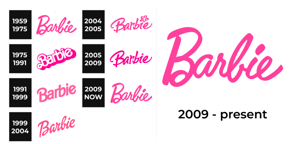
1959 – 1975
This logo was designed by the founder, Ruth Handler herself. Pink comes in different shades, but this bright, rich shade is one that will be associated with a Barbie doll. The logo consists of only the name, yet the elegant cursive font and color choice make up for the lack of any other details. It became the epitome of sophistication and glamor, just as Ruth Handler intended.
1975 – 1991
The handwritten font was replaced by a more trendy, chunky font with a hot pink shadow that created a 3D effect. The name was printed on a diagonal, going from the bottom left corner to the upper right. This update was intended to highlight the brand’s close connection to the world of fashion.
1991 – 1999
The brand presented a new version of the Barbie logo, which was clearly different from previous ones. It turned out to be less daring thanks to a muted pink color. At the same time, it was fully consistent with the design trends of those years. Such changes reflected the brand’s strive to attract a wider audience through the use of modern trends.
1999 – 2004
The cursive font was brought back, and in a few years, the bright pink color characteristic of the brand’s corporate identity will return. The logo was positioned at a 45-degree angle, giving it a more playful look. This version resembled an autograph. The dark pink color was in line with the trends of that time.
2004 – 2005
This short-lived redesign was influenced by the Y2K aesthetic, which was characterized by an abundance of decorative details. A flower appeared above the letter “i”, stressing the feminine, cute, and playful character of the dolls. A little brighter pink shade was used here.
2005 – 2009
In 2005, the Barbie logo was redesigned again, this time with an emphasis on expressiveness and simplicity. The font remained the same, but the playful flower was replaced by a classic dot. The brand aimed to make the logo more elegant, sophisticated, and less childish.
2009 – Today
The modern version of the Barbie logo replicates the original 1959 design with a classic handwritten font and a soft pink. The font and playful yet sophisticated pink color perfectly conveyed both the sense of fun and the potential of the modern woman.
Font and Color
The distinctive pink color has been a central element of the brand’s identity since its inception. Pink color means dreaminess, serenity, and lightness. These are very feminine characteristics. Its bright shades, though, look bold and daring and reflect Barbie’s confidence and enthusiasm. It is a perfect color choice for a doll brand as different individuals can interpret it the way they desire, making Barbie appealing to a wider audience.
The brand also stayed pretty consistent when it comes to font choices. The majority of logos are written using a characteristic cursive font, which reinforces the brand’s image as a champion of femininity in all its forms. There was also a bolder version that showed that Barbie dolls (and women they represent) can be confident, daring, and go against stereotypes.


