IBM Logo
Tags: mobile devices | software | USA
IBM is the world’s premier research, development, and distribution enterprise for software and hardware. In addition, it boasts experience in consulting at the highest level and IT services. The creation of the institution dates back to 1889, but it really began its current trajectory in 1911. The cornerstone of this enterprise as a single enterprise was laid by the founder of the company, Flint Charles, in the village of Endicott, located in the state of New York.
Meaning and History
IBM, founded in 1911 as the Computing-Tabulating-Recording Company (CTR), originally made punched card equipment for government and corporate use. With the release of the IBM 701 in 1952, the company ushered in the era of electronic computing and pioneered mainframe technology.
In the 1960s and 1970s, IBM was the giant of the computer industry with its System/360 mainframe family, which became synonymous with the dominance of enterprise computing. However, the company faced stiff competition and experienced declining sales, leading to its collapse in the 1980s.
Under the leadership of Lou Gerstner, IBM went through a phase of transformation in the 1990s, shifting its focus to services and software, as exemplified by popular offerings such as DB2 and WebSphere. This strategic turn revitalized the company’s prospects and strengthened its position in the global IT market.
In the 21st century, IBM has continued its development by introducing new technologies such as artificial intelligence, cloud computing, and quantum computing. Despite challenges from competitors, the company has remained an important player in the IT industry, using its heritage and innovation to shape the future of computing.
What is IBM?
IBM is a US-based technological corporation with a presence across the world. They produce various software applications and devices. The company also plays a role in the IT services and consulting market, working for the largest technological corporation worldwide.
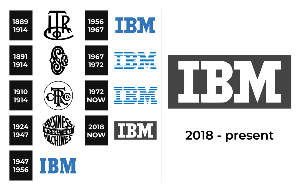
1889 – 1914
IBM emerged as a result of the merger between the International Time Recording Company and the Computing Scale Company. The initial logo, introduced in 1889, featured a sophisticated and streamlined ITRCo monogram, rendered in a monochrome palette, complemented by an elegant serif typeface with a touch of flair.
1891 – 1914
The Computing Scale Company’s logo boasted an intricate and sleek design, showcasing prominent “CSCo” lettering. Ingeniously, the letter “L” was subtly incorporated within a wishbone-shaped “C,” followed by a smaller “Co.”
1910 – 1914
The union of these two companies in 1910 led to the formation of the Computing-Tabulating-Recording Company. Their fresh logo, crafted the same year, showcased a striking and refined monogram enclosed in a delicate circular border. The custom font exhibited wishbone “C”s, a gracefully elongated and curved tail for the “R,” and a precise and straight “T.”
1924 – 1947
In 1924, the company underwent a name change, becoming International Business Machines, coinciding with the introduction of a new logo. The emblem boasted bold, sans-serif lettering, evoking a sense of a globe. “Business” and “Machines” were inscribed in black, separated by a white “equator,” while “International” appeared in white, symbolizing global aspirations and the company’s ambitious drive.
1947 – 1956
In 1947, International Business Machines simplified to IBM, unveiling a new logo characterized by minimalism and solidity. The calm and light blue emblem featured capital letters in a square and robust serif font.
1956 – 1967
In a 1956 redesign, the color palette of the IBM logo remained, but the font underwent improvement. Serifs were elongated and made more prominent, and the negative space inside the “B” was altered to include two white squares.
1967 – 1972
The iconic IBM striped logo made its debut in 1967, a modified version of the previous emblem. The blue inscription now sported 13 horizontal stripes of equal width.
1972 – Today
In 1972, the number of stripes was reduced to eight, resulting in a bolder and more confident logo. A darker shade of blue added a sense of solidity and strength. Designed by acclaimed designer Paul Rand, this redesign has since become the brand’s enduring symbol.
2018 – Today
In 2018, the company decided to reintroduce its original “full” logo from 1956, but with a new color scheme. The logo now presents “IBM” in white, positioned within a horizontally oriented dark gray rectangle.
Font
The IBM wordmark features a Roman serif typeface inspired by classic fonts like Galería or Egiziano. It stands out with unique touches, such as replacing the circles in the “B” with squares and carving out the “M” serifs from the inside.
Color
The brand logo is made in two color codes that change from one version of the logo to another. Navy blue and white are used to paint the 1972 logo, while the black and white palette is an integral part of the 2018 logo. Notably, the shade of blue used by the company has been nicknamed “IBM blue” due to its close association with the brand over the years.


