HP Logo
Tags: computer hardware | laptops | software | USA
HP is an American tech corporation, created in 1939. It’s known for a large variety of tech products, most notably computer hardware and software. That includes PCs, laptops, printers, 3D printers and much more. They are considered one of the most prolific, successful and popular such brands in the world.
Meaning and History
HP, originally Hewlett-Packard, was founded in 1939. The name refers to the two founders of the company, Stanford graduates B. Hewlett and D. Packard. The company was one of the most prominent suppliers of computer parts and engineering products for decades. In 2015, the company was restructured, and its sole official name is now ‘HP Inc.’
What is HP?
HP is a popular American producer of computer hardware, one of the most prominent manufactures of laptops, PC parts and various other products. It was created in 1939, and went by ‘Hewlett-Packard’ for a long time.
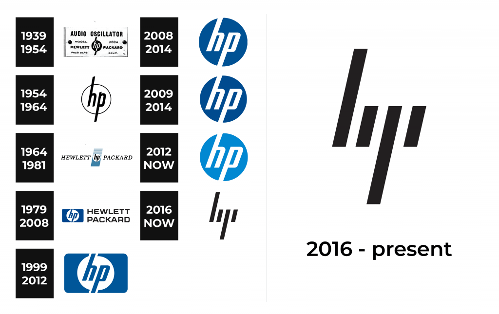
1939 – 1954
The original HP emblem wasn’t terribly different from the contemporary design. It included a circle with two letters – ‘H’ and ‘P’ inside – and two lines protruding up and down from this circle aligned to the directions of the letters within, as if continuing them. The entire emblem is black and white. The letters themselves are lowercase, thin and slanted.
The words ‘Hewlett’ and ‘Packard’ were typically written on either side from the emblem, in black.
1954 – 1964
The 1954 design uses largely the same emblem as the previous edition. This time, though, it’s a white circle with a black edge and the letters go way beyond its borders, extending into the long lines as seen in the original logotype. Their design is mostly the same, except they are black now.
1964 – 1981
The following design is more reminiscent of the original logo. The combination of circle and letters are more similar to the previous edition, except without the black edge and the extra lines beyond the borders. Moreover, this circle is now placed in the middle of a slanted vertical rectangle. It’s mostly colored a greenish blue, although its upper half is arranged as a series of horizontal lines.
On each side of this rectangle, they’ve also placed the words ‘Hewlett’ and ‘Packard’ in similar slanted letters. They are black, capitalized and use a sharp, strict sort of serif script.
1979 – 2008
The next logo uses many of the same elements, except rearranged. The main piece is still the acronym of the brand, written inside a white circle. The letters have become bolder and white, and they go somewhat beyond the borders of the circle. The parts that do are outlined in white. In general, this symbol is placed in the middle of a horizontal blue rectangle of the same color as the letters.
To the right, the company’s full name is written in big black letters and two lines of text. The font is much less strict. These characters are big, bold and squarely proportioned. They have smooth, rounded corners.
1999 – 2012
The design introduced in 1999 is very much just the emblem from the previous edition. It has some changes, such as the slightly lighter color scheme. However, they’ve basically just scrapped the written bits.
2008 – 2014
That’s an alternative logo they’ve introduced in 2008 and made primary in 2012. It’s very much just the circle with the ‘HP’ letters inside, like in the 1999 design. The only difference is that it’s a blue circle with white letters inside. The rectangle part is removed.
2009 – 2014
The other alternative design is almost identical to the 2008 logo. The only real difference is that the letters are slightly larger, to make them more visible when placed in some places.
2012 – today
The 2012 redesign also saw just a handful of small changes. They’ve taken the 2009 emblem as the base, changed the blue to a much lighter, paler azure shade. Not much else is different.
2016 – today
The 2016-released alternative emblem builds on the iconic ‘HP’ emblem, but goes in a new direction.
What they’ve done is scrap the circle and much of the letters, leaving only the four vertical lines that are slanted slightly in the same direction. They are taken directly from the structure of the two letters in the previous logotypes, but they are much sharper, not as round as their predecessors and black. It’s a simplistic, modern design used for premium products.
Font
HP used the same script for many decades. The letters written inside their main emblem are sans-serif characters – very thin, but tall and bold. They have an iconic slanted look, which makes them very alike because of the resulting positioning. They seem almost like mirrored reflections.
Color
HP has long been using blue colors for their logotypes and branding as a whole. There isn’t a single meaning behind this choice. The other colors commonly found in the HP color scheme are white and black. In particular, the 2016 design is depicted almost exclusively black.


