Google Logo
Tags: Google | search engine
It is not necessary to introduce this search engine to anyone. Although the first internet search engine, Archie, appeared back in 1989, few people know about it. Google, on the other hand, is recognized and used across the globe. In almost 30 years, Google has gone from zero to more than a trillion both in value and pages. About 90% of the world’s searches are done through Google, but the Chinese government has banned it in their country. Google.com is known for its occasional doodles, which are special drawings that are somehow attached to the company logo.
Meaning and History
Back in `96, Stanford graduate students Larry Page and Sergey Brin start a partnership to develop the BackRub search engine. This project revolutionized web search. Next year, Page and Brin renamed BackRub to Google. They derived this name from the numeral “googol”, which is used in mathematics to denote numbers with a hundred zeros. This name reflected their mission – to organize the seemingly endless amount of information on the web. Like all super-successful companies, Google started on very modest terms. Officially founded in 1998, there was a time when a giant with offices in every major country in the world worked out of a garage in California. In 2004, Google went public and many of Google’s employees became millionaires. The company continued to expand and in 2015, Google Inc turned into Alphabet Holding, which became the largest company by market cap, surpassing Apple.
What is Google?
Google is a search engine without which it is almost impossible to imagine the internet. The verb “google” was even added to the dictionary. It might not have been what it is now if Excite did not reject to purchase Google back in 1999.
1996 – 1997
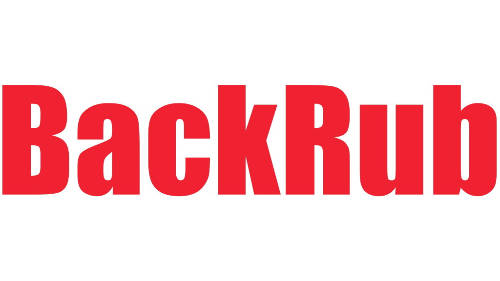
The original version was not as colorful and featured only red color. It spelled out the name of the company, which was “BackRub” at the time. There were no other details. The logo featured a basic sans-serif font.
1997 – 1998
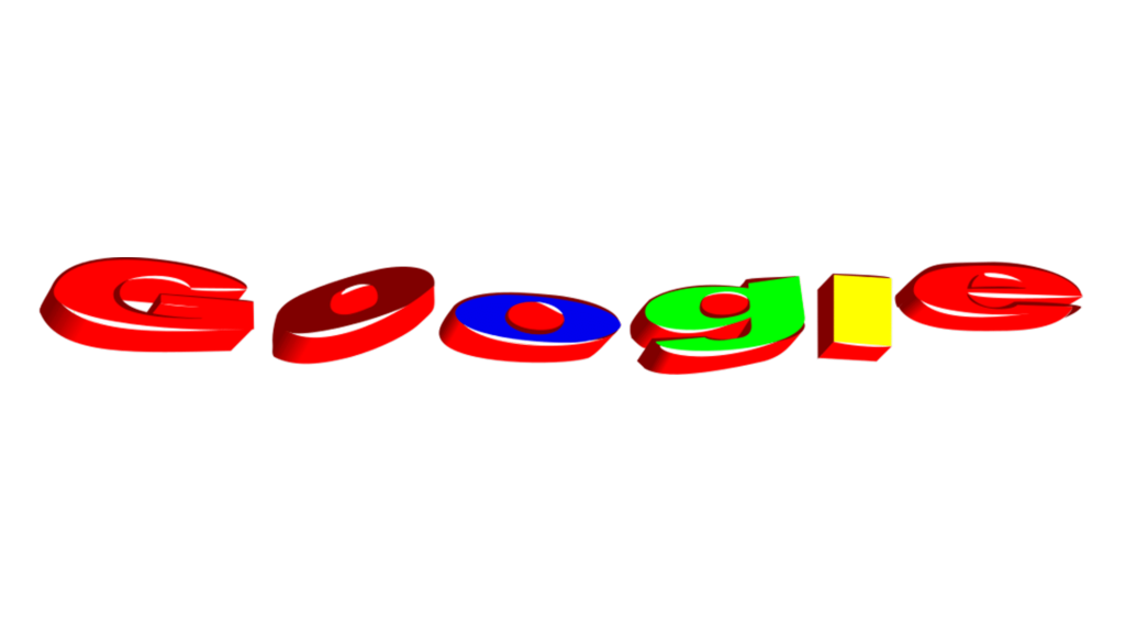
Although it required a professional touch before becoming the brand image we know today, they came up with an original multicolor design that could withstand the time. Essentially, the temporary logo was “Google” printed in colorful 3D letters that appeared to be laying almost flat.
1998
It is speculated whether this first “real” Google logo was drawn by Page or if Brin designed it using a free image editor. The new design was much better. The letters were printed the “typical” way but still were done using different colors and having a shadow for that 3D feeling. The shadow, though, made them feel more rounded on the edges. When it comes to colors, yellow and blue were used only once, while red and blue are repeated twice.
1998 – 1999
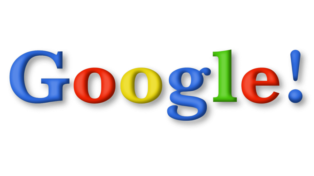
There were a few updates. The first letter was now also of a blue color. In addition, there was an exclamation point at the end, which was an imitation of Yahoo!’s logo. Otherwise, it was the same as before.
1999 – 2010
The changes introduced here made the letters look more delicate and thin. Obviously, a different font has been used. The “o”s are slightly slanted to the left, while the lowercase “g” has a completely different style. The “e” is also slanted. Just like in the previous version, the letters have a 3D appearance, but this time, there are more highlights and darker shadows. The exclamation sign is gone, which made the logo unique again.
2010 – 2013
Although the designer kept the same font, the Google logo looks somewhat different. It is much lighter for two reasons. There is no more shadow, which was there since 1998, and the letters themselves are not as dark, which makes them appear a bit thicker. The other change is the tone of the yellow, which is a bit warmer.
2013 – 2015
This is the first time in Google logo history, with an exception of the BackRub logo, that it looks flat. The designers definitely wanted to give it a modern spin without changing the brand image everyone got used to. If one looks closer, one will see that some small details have been changed. The company modified the font it used by making ever so slight changes to the serifs.
2015 – Today
This version features a completely new font. The serifs are gone and all the strokes have the same thickness. There is a link to the previous versions as the emblem is done in the same colors. In addition, the last letter is kept slanted for that interesting touch.
Font and Color
The logo that was designed in 1998 used the Berthold Baskerville Bold typeface. It was seen until 1999 when it was replaced by Catull BQ. The latter stayed with the company for 15 years with small modifications. A new typeface was introduced in 2015. It was a modified Product Sans. When it comes to the color scheme, the giant stayed true to its original choices. The exception was its BackRub logo. The blue, red, yellow, and green color palette has been successfully used for so many years. They are pleasant to look at and have great symbolism behind them.
