GoFood Logo
Tags: food delivery | Indonesia | online service
GoFood is a service that was established in 2015 by an Oceanian multiservice company named Gojek. GoFood specializes in food delivery via website and mobile software. It is generally active in Indonesia, delivering goods to more than a quarter of a million consumers right to the doorstep or in some other place. Gojek partners up with half a million shops and merchants across the country, which allows its drivers to distribute products across 70+ Indonesian cities.
Meaning and history
GoFood was established by Gojek in 2015 as a mobile and online solution for Indonesian customers, not willing to go to food markets. The logotype appeared as the platform became somewhat popular in 2016. The further redesign came up three years later.
What is GoFood?
GoFood is an Indonesian software, launched in 2015 by Gojek, a transnational corporation developing multiservice software. GoFood provides an online solution for those not intending to go food shopping to spare time. Via GoFood software, one can order a house delivery or write any comfortable address. The company’s drivers send the products to nearly 250,000 buyers across 70+ Indonesian cities and towns, which is available due to the partnership with more than half a million of merchants.
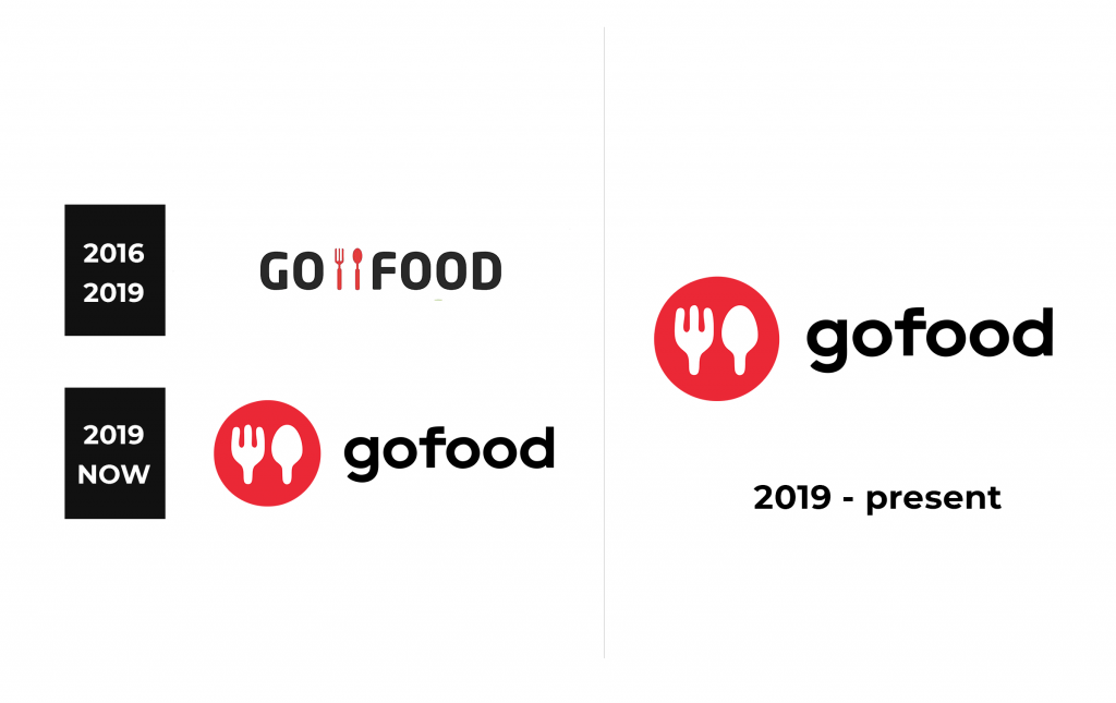
2016 – 2019
The original logotype was made to create a modern, minimalistic and stylish mood of the company’s brand identity. It featured the brand’s name, split in two words by a three-tined placed to the right from a spoon. But even this redesign got too old and was soon changed.
2019 – 2022
2022 – Today
The latter corporate mark design features a circle with renovated spoon and fork images. Now one can see only upper parts of this kitchen instruments, with no handles. The circle is positioned to the left from the nameplate.
Color
The traditional color code of the GoFood brand logo consists of black for the name, white for the spoon & fork emblem, and red for the circle serving as the background for them. Since the soft’s launch, its identity changed throughout the logotype evolution: in the original 2016 logotype, they drew red kitchen tools between two words, and if the background for all this was used, its color was white.
Font
The typeface style also changed twice with each upcoming logotype. The first signature displayed a bold, uppercase inscription without serifs. The letters had rounded corners, and there were small gaps in between. Then, a dramatic shift was introduced. The new script had simple lowercase letterforms with even smaller intervals between the letters, which were not less bold than previously.


