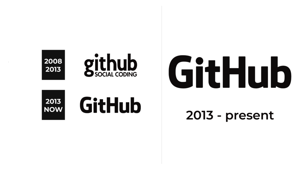
GitHub Logo
Tags: collaboration | developers | hosting platform | social network
GitHub is a cloud platform for hosting IT projects and joint development. It has a popular GIT system for managing versions, as well as a full-fledged social network for developers. One can find a bunch of open-source projects in different languages and participate in them, place a portfolio with examples of the code in order to make a reference to the resume, check out interesting architectural solutions in open projects, watch how experienced developers write code, and download a huge amount of useful, free development tools. The list of the company’s most notable clients includes Amazon, Twitter, The White House, and Facebook, which used GitHub to build its bug-tracking tool, while LinkedIn uses it to maintain its features.
Meaning and History
Founded in 2008 by Tom Preston-Werner, Chris Wanstrath, and PJ Hyett, GitHub was originally envisioned as an open-source development and management community using Git. A year after launch, the company had its first 100,000 users. In July 2012, GitHub received $100,000,000 in venture capital from Andreessen Horowitz. That same year, Forbes named the startup one of the top 10 tech companies.
What is GitHub?
GitHub is a code hosting platform for version control and collaboration. It allows programmers and other users to work on projects together from anywhere. In general, GitHub is a social network for developers where you can find open-source projects from other developers, practice coding, and store your portfolio.
2008 – 2013
The name of the company is printed using a bold, serif font similar to Collegiate font using all lowercase letters. A second line was placed right under the name and was the same height as the tail of the “g”. It was printed using all uppercase letters and the same font as the one used for the name. The letters “S” and “G” are cut at a small diagonal instead of straight like in the Collegiate font. The combination of large, lowercase characters and relatively small, uppercase letters created an interesting play, making the logo not look boring and typical. The whole emblem featured a formal black color.
2013 – Today
As in the original emblem, the designers went for a simple inscription. The update was mainly done to remove the tagline that specified what the company was doing. It was surely a sign that the audience already knew this company well and there was no need in any additional information. Instead, the focus was placed on the company name. They used a font very similar to the original, but instead of pointed serifs, the corners were slightly rounded. In addition, the designers used a combination of capital and lowercase characters. The name is sometimes accompanied by a round emblem above it. The emblem is done in black and features a silhouette of a cat with one of its hands outstretched. This figure originally resembled an octopus but was redrawn to look more like a cat.
Font and Color
The original logo features a serif, bold font that looks surprisingly similar to the Collegiate font. The characters are done using thick strokes, while whisp, pointed serifs add a sophisticated touch. The updated logo featured a very similar, but sans-serif font that resembled Orgon ExtraBold. As for the color palette, the designers chose a classic black that creates an image of a professional, well-established company.


