Fujifilm is a Japan-based corporation focusing on the production of numerous products revolving around photography, graphics, and imagery. These include digital cameras, lenses, printers, software for image processing, projectors, medical imaging products, LCDs, and even movies. The company was registered in 1934, and since then has become a giant in the international image and photography market.
Meaning and history
The brand name caption includes two terms, touching on its heritage: ‘Fuji’, standing for the symbolic mountain in Japan, and ‘film’, reflecting the company’s strong connections to the photographic filming industry that has been existing since its inception.
Their history traces back to the mid-30s when the Fuji Photo Film Company came into the light in Tokyo. At the start, they specialized in photo film production. Over the years, Fujifilm extended its product line and added products from other industries.
Their first camera appeared in 1948. It was a 35mm film camera called Fujifilm Sox. The following years brought their new cameras with improved quality and advanced technologies. The manufacturing of cameras was a part of their strategy of adapting to the new market conditions – the War was over, and people across the world started experimenting with the numerous arts, including films.
Throughout the decades that followed, Fujifilm developed new products, such as FujiColor in 1963. It was the first full-color negative film that made it easier and more affordable for people to take color photographs, leading to a significant shift in the photography market. This invention marked a milestone for Fujifilm and solidified its reputation as an innovative leader in the imaging industry.
Fujifilm was a pioneer in other fields: they developed FinePix DS-505 in 1998, one of the earliest consumer digital cameras, the first advanced X-ray systems, helping to improve the work of hospitals, and they also participated in the development of the early image sensor technologies, including the Super CCD sensor in 1999, which offered improved dynamic range and low-light performance.
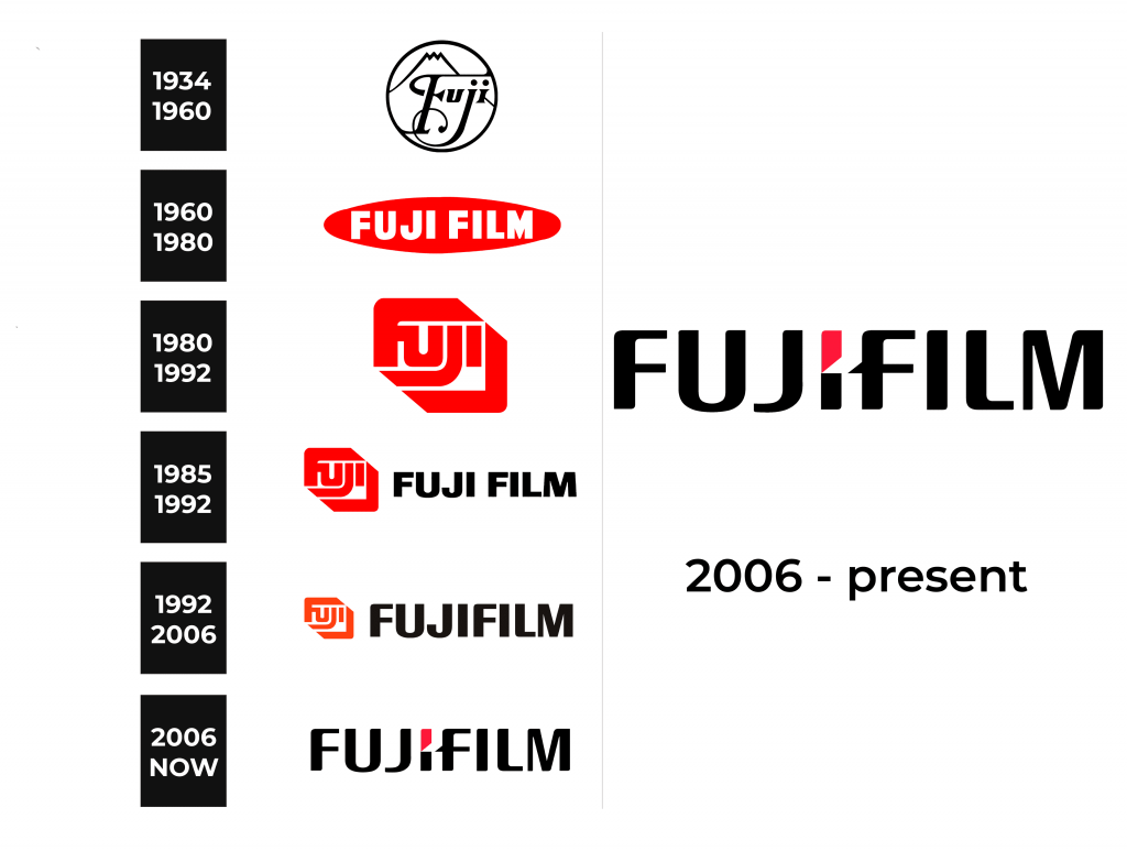
Today, Fujifilm remains at the forefront of technological advancement in the photography and film markets. And their brand identity chronology reflects their path to this state of affairs.
What is Fujifilm?
Fujifilm is a global corporation headquartered in Tokyo, Japan. They manufacture an array of products focusing on photography and graphics: movies, digital cameras, image projectors, LCDs, printers, x-ray systems, et cetera.
1934 – 1960
When Fujifilm was primarily a Japan-centric firm, it utilized a black-and-white circular image as a logotype. It featured a frame with the contours of the mountain Fjiu inside it. Over it, they wrote an inscription ‘Fuji’, with the letters written in a highly ornamented bold typeface with prominent and sharp serifs. Additionally, the capital ‘f’ has its lower and upper tips extended to form long lines.
1960 – 1980
During the 1960-1980 period, the company used its first colored logo. It was a horizontally oriented red oval with an extra bold name caption. It was divided into two words, occupying most of the backdrop. They were executed in a typeface without serifs, and all letterforms had the same height.
1980 – 1992
Later, the company released an innovative logo design, that depicted the capitalized word ‘fuji’ in a very minimalistic and futuristic format. The centerpiece of the logo was a shape reminding a parallelogram. It consisted of several unconnected elements.
The most prominent component was the character ‘f’, having its bars thickened and elongated to cover the rest of the word. Its central bar was connected to the following ‘u’, which was bold too. The next character, ‘j’, was uppercase (though smaller than the ‘f’) and had its lower bar extended. The letter ‘I’ was looking like a wide rectangle. The lower right element covered the word and reminded an arrowhead.
1985 – 1992
In the 80s and early 90s, they used a logotype with the aforementioned emblem and the inscription to the right of it. The lettering was written prominently in an all-caps typeface with streamlined thick characters without serifs. The emblem was downsized to be a bit higher than the letters.
1992 – 2006
This logotype was later modified: the nameplate and the emblem became even smaller, while the emblem was additionally recolored orange.
2006 – today
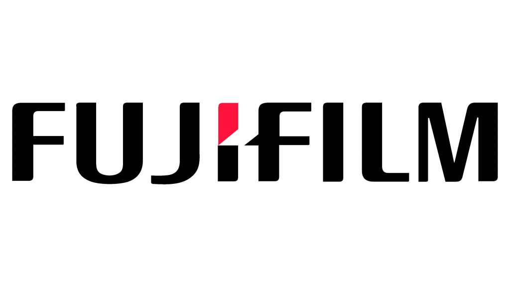
The latter logotype is based on a single wordmark on a transparent backdrop. Its most significant graphic element is a small cut at the center of the ‘I’, and a triangular extension at the back of the ‘F’. It looks like it was a single symbol, elegantly divided in two.
Font
The sleek inscription on the latter logotype of Fujifilm forms a minimalistic yet extremely recognizable aesthetic. It’s achieved due to the word’s capitalized typeface with elegantly curved edges of the letters. The most similar script to this one is Kardust TS Condensed Bold.
Color
The logotype is based on the inscription colored black to contrast with almost any backdrop. The upper part of the central ‘I’ is colored deep red. This combination reflects the company’s unwavering commitment to quality, professionalism, and innovation.


