Feyenoord Logo
Tags: Netherlands | professional club | sport academy
Feyenoord Rotterdam, a name synonymous with Dutch football excellence, operates under the prudent management of Stichting Feyenoord, a foundation committed to the club’s long-term prosperity and legacy. Since its inception in 1908, Feyenoord has not only grown into a footballing powerhouse but also a cultural emblem within Rotterdam and the Netherlands. The club’s heart beats at the iconic De Kuip stadium, a hallowed ground for football enthusiasts, located in the bustling city of Rotterdam. This storied club’s operations extend well beyond the pitch; they are deeply involved in community engagement, youth development, and fostering a culture of sporting excellence.
With an illustrious history decorated with national and international honors, Feyenoord stands as a testament to enduring success in the competitive world of football. Their operational strategies reflect a blend of tradition and innovation, incorporating modern football trends while staying true to their roots. This approach has helped them maintain a significant presence in Dutch football, attracting fans from all corners of the globe. Their commitment to nurturing young talent is evident in their world-renowned academy, which has been a breeding ground for football stars who shine on both domestic and international stages. Feyenoord’s ethos is not just about winning matches but also about building a community and fostering a spirit of unity and pride.
Meaning and history
The genesis of Feyenoord Rotterdam dates back to July 19, 1908, when a group of football-loving friends founded the club under the name Wilhelmina. This humble beginning set the stage for a journey that would etch Feyenoord’s name in the history books of football. Their trophy cabinet is a testament to their success, brimming with accolades including multiple Eredivisie titles, numerous KNVB Cup victories, and a distinguished presence on the European stage with the UEFA Cup Winners’ Cup and UEFA Cup victories.
One of Feyenoord’s most remarkable achievements came in 1970 when they clinched the European Cup, becoming the first Dutch team to do so and cementing their status in European football lore. This victory was more than just a triumph; it was a statement of Dutch football’s rising prominence on the international scene. Over the decades, Feyenoord’s commitment to excellence has remained unwavering. Their famed youth academy has been a cornerstone of this success, producing a conveyor belt of talent that has left an indelible mark in football circles worldwide.
In the current era, Feyenoord continues to be a force to reckon with in Dutch football. They consistently challenge for top honors in the Eredivisie and make significant strides in European competitions. Their blend of historic richness and contemporary ambition positions them as a pivotal entity in the ongoing narrative of football. This legacy, coupled with their forward-thinking approach, ensures Feyenoord remains a revered and influential figure in the footballing world.
What is Feyenoord?
Feyenoord it’s a symbol of sporting excellence and community spirit in Rotterdam and beyond. With a history spanning over a century, it has established itself as a cornerstone of Dutch football, known for its passionate fans, impressive youth academy, and significant contributions to both national and European football stages.
1912 – 1924
The initial logo showcased a striking combination of colors and elements: a white circular frame enveloped a core with bold red stripes. This frame was also highlighted by a sleek black outline. Emblazoned across the top half of the ring was the club’s full name in an elegant black script. The lower half was equally adorned, featuring ‘Rotterdam’ in a similar black typeface. This bi-section was artistically punctuated by two symmetrical football illustrations on either side, lending a balanced and dynamic look to the emblem.
1924 – 1930
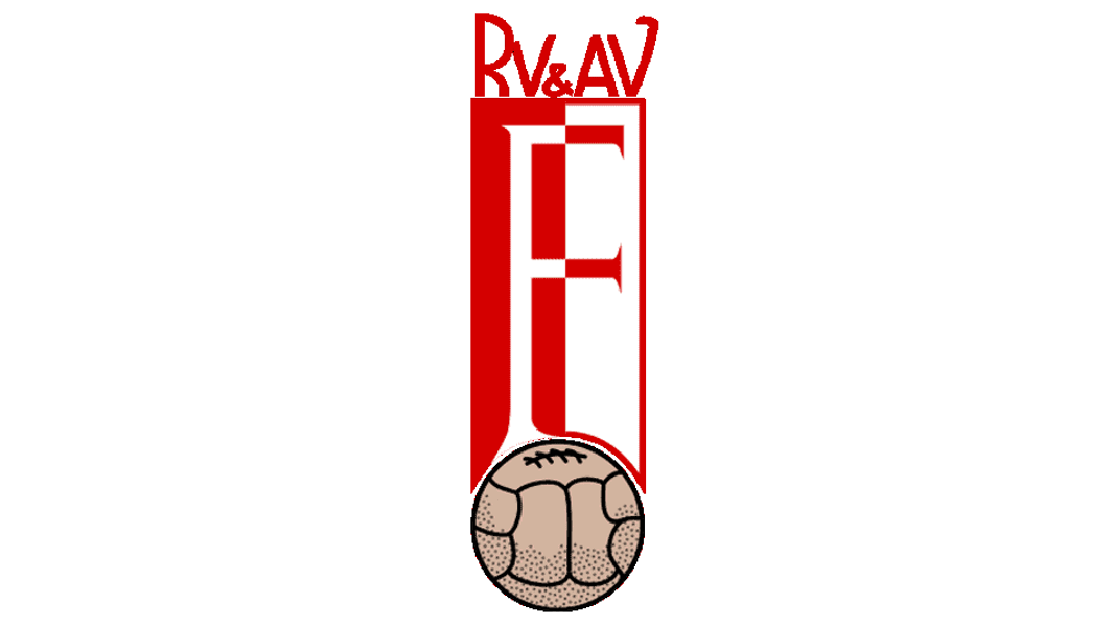
A subsequent redesign brought forth a strikingly tall rectangular logo. Dominating this new emblem was an oversized ‘F’, ingeniously split into two halves – one vivid red, the other pure white, arranged in a manner that cleverly avoided any visual confusion. Anchoring the design was a rustic brown football at the base, while the top was emblazoned with the letters ‘RV&AV’ in a vibrant red, creating a visually appealing contrast.
1930 – 1956
The year 1930 marked the debut of a revamped logo, a design that has endured through the years. Central to this emblem was a red and white circle, encircled by a robust black frame. Inside this circle sat a large, majestic golden ‘F’, capturing immediate attention. The black border wasn’t just a frame but a canvas for more details: the acronym ‘RV&AV’ gracefully positioned along the top, with the club’s name inscribed below, both rendered in crisp white letters, adding elegance to the design.
1956 – 1973
The 1956 logo revision maintained the core design principles of its predecessor, with thoughtful modifications. The central ‘F’ now appeared in a stark black, creating a bold focal point. Additionally, the black frame was enhanced with the inscription ‘Rotterdam’, infusing a local identity. The previously golden highlights were now deepened to a rich, dark brown, giving the logo a more grounded and mature appearance.
1960’s – 1973
In a unique twist, this version of the logo embraced an all-bronze color scheme. Both the prominent central letter and the surrounding text were bathed in this warm, metallic hue. The outlines, too, adopted this bronze color and were accentuated to become more prominent, giving the logo a distinct and memorable presence.
1973 – 1978
The 1970s saw the logo take on a predominantly white theme. This included the main letter, the outlines, and the surrounding text, which was now simplified to ‘Sportclub Feyenoord’. This cleaner, more minimalist approach lent the logo a fresh and contemporary feel, while still maintaining its iconic elements.
1978 – 1980’s
This iteration closely mirrored the design from the 1960s, with a notable alteration in the peripheral text, now reading ‘Feyenoord Rotterdam’. This subtle change reinforced the club’s connection to its city, while maintaining the familiar elements that fans had come to recognize and love.
1990 – 1997
A subsequent redesign made a bold statement with the central letter, the outlines, and the external text all rendered in a striking black. In contrast, the frame of the logo was inverted to a crisp white. This stark color contrast gave the logo a modern and assertive appearance, reflective of the club’s dynamic spirit.
1997 – 2008
The debut Feyenoord logo from 1997 was a classic design, featuring a circle filled with neatly arranged vertical stripes in white and red. The outer ring was rendered in white, with the club’s initials “R.V.V. Feyenoord” written in an elegant black script inside. These initials stood for “Rotterdamsche Voetbal Vereeniging”, a proud nod to the club’s Rotterdam roots.
2008 – 2009
In 1997, the logo underwent a significant transformation while retaining its iconic red stripes. The design was simplified to just a pair of stripes – one red and one white – artistically placed inside a circle. At the forefront was a large, imposing white ‘F’, outlined in a thin black line. This was set against a bold black ring, which featured the lettering “Feyenoord Rotterdam” in white, creating a stark and impactful visual contrast.
2009 – Today
Following the anniversary season, the Feyenoord logo evolved again, this time discarding the vignette but retaining the luxurious gold accents. The current design mirrors the 1997 layout in its basic shape but is distinguished by the inclusion of opulent gold details, lending an air of sophistication and timeless elegance.
