Facebook Logo
Tags: Facebook | Mark Zuckerberg | social network
Hard to find anybody not aware of Facebook. Being an American communications platform, which conquered the attention of nearly 3 billion people across the globe, FB software is available on all the main systems and in multiple languages. In this public network, people are offered to create their pages, fill it with information, recordings, put their photos as the avatars, share their Stories and Reels posts with fellows, establish groups and communities, based on interests shared by various people across the Internet. Its first iteration was released in 2004 as Facemash.
Meaning and history
The Facemash website was a university project developed in 2003 by two friends, Mark Zuckerberg and Eduardo Saverin aimed to develop a social network oriented on students willing to communicate with one another, share photos and videos. That time it was rather a forum for students willing to talk to one another, share photos and videos. In 2004, Facemash became The Facebook. This word originates from a university term, which refers to student address books, where people could find contacts and photos of students they wanted to find.
Initially, the software was distributed across the major universities of the USA and Canada. But in the 2000s, various companies and people sponsored FB, and it was decided to expand the office to distribute the software across the United States and the world. It also removed ‘the’ word from the name caption. By 2007, the structure was already a major player, collaborating with Microsoft and other transnationals, and being one of the most frequently used media in the web. By the 10th anniversary reached over a billion registrants count. It was achieved via mobile support and consistent advertisement campaigns.
What is Facebook?
Facebook is a worldwide social network system, created in 2003. It is a platform where people can communicate via multiple groups, communities, chats, as well as many other tools incorporated in the software. They offer people a chance to share their photos, create profiles and fill them with information, publish posts, stories, and Reels videos, etc. By their own Summer 2022 report, Facebook is a network for 2,9+ billion people from across the Internet.
2003 – 2004
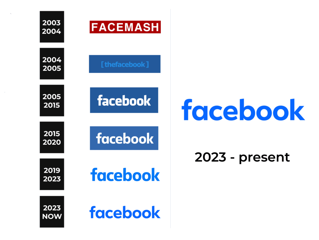
The original logotype didn’t have many differences with the following ones in its core concept – it was an inscription placed on a large rectangle, often put at the top areas of the website pages. The letters occupied most of the rectangle, being almost as long as the background shape itself. As for the coloring, so the characters were white, while their background – red.
2004 – 2005
As the rebranding and expanding of the software succeeded, the developers made a similar rectangular signboard as the original, but modified. The inscription was changed to ‘TheFacebook’, written in square brackets, which were distanced from the letters. They now occupied a small area at the center of the shape.
2005 – 2015
With the final renaming and further advancement, Zuckerberg team developed their product’s iconic brand mark. ‘The’ symbols were erased, and the new name caption was painted white and placed over a sea-blue rectangle.
2015 – 2019
A new typeface came up with 2015 logo renovation. All letters received small modifications, keeping their previous bold style. The whole text was widened, as well as its background.
2019 – 2023
Finally, in the latter version, they took off the shape and colored the word blue.
2023 – now
Color
Why did they use a blue and white color palette? Well, there are two opinions. First, it’s related to Mark Zuckerberg’s disability to recognize red and green colors, which was highlighted by some prominent media. This trouble inspired the FB author to use a blue background for the white word. There is another vision, a more marketing one. There are many researches about how different shades affect the human brain and increase the brand’s selling ability. Blue symbolizes openness, space, technological style, as well as clearness. In collaboration with white, it creates an inviting image for the brand.
Font
The typefaces changed dramatically throughout the platform’s development. The first nameplate had prominent capitalized letters with a bold sans-serif style. On the 2004 logo iteration, they wrote typical lowercase letters without serifs. Apart from the older logo, they had very small intervals in between. The letters in the 2005 wordmark had quite bold lines. They were straight, and they had simplistic and minimalistic style. To depict its successor, the designers from FB chose less bold typeface with widened letters. The vertical bar of ‘b’ and ‘a’ characters became more pronounced, while the rest symbols got slight modifications. The similar typeface was used in the 2019 wordmark.
