Disneytoon Studios Logo
Tags: 3D animation | animated films | movie
Founded in the late 1980s as Disney MovieToons, Disneytoon Studios was a division of the renowned media giant’s Television Animation, focusing primarily on direct-to-video and occasional theatrical animated films. During the 1990s and 2000s, the studio played a crucial role in Disney’s animation sector, producing sequels and spin-offs to classic Disney animations. These productions filled gaps between major theatrical releases, helping to maintain Disney’s prominence in the animation market.
Meaning and History
![]()
Early successes, such as ‘DuckTales the Movie: Treasure of the Lost Lamp’ in 1990, set the stage for a series of follow-up films to Disney classics. Notable among these were ‘The Return of Jafar’ (1994), an ‘Aladdin’ sequel, and ‘Beauty and the Beast: The Enchanted Christmas’ (1997).
While these films didn’t always receive the same critical acclaim as their theatrical counterparts, they achieved commercial success and kept Disney’s characters in the public eye. Beyond sequels, Disneytoon Studios also developed original content, including the ‘Disney Fairies’ series and the ‘Tinker Bell’ movies.
The closure of Disneytoon Studios in 2018 reflected a strategic shift by The Walt Disney Company towards digital and 3D animation. Ending an era of traditional 2D animation at Disney, this decision acknowledged the changing dynamics of the animation industry. Despite its closure, the studio’s legacy endures through its films and characters, which remain integral to Disney’s animation heritage and continue to delight audiences globally.
What is Disney Movietoons?
Disneytoon Studios emerged as a key division of Disney Television Animation, specializing in direct-to-video and some theatrical animated films. Throughout the 90s and early 2000s, the studio became instrumental in Disney’s animation landscape, mainly producing sequels and spin-offs of Disney’s beloved classics. Its contributions significantly bridged the intervals between major Disney movie releases, reinforcing the company’s standing in the animation industry.
1990 – 2003
![]()
The initial logo for Disneytoon Studios presents its initial name, Disney Movietoons, featured in warm yellow & black letters. The portion ‘Disney’ is written in its characteristic script, signifying tradition and magic, while ‘Movietoons’ stands below in a bold, capitalized sans-serif type, conveying modernity and accessibility. An animated film reel and fluttering music notes sit to the left, symbolizing the studio’s dedication to animated musical productions.
2003 – 2011
![]()
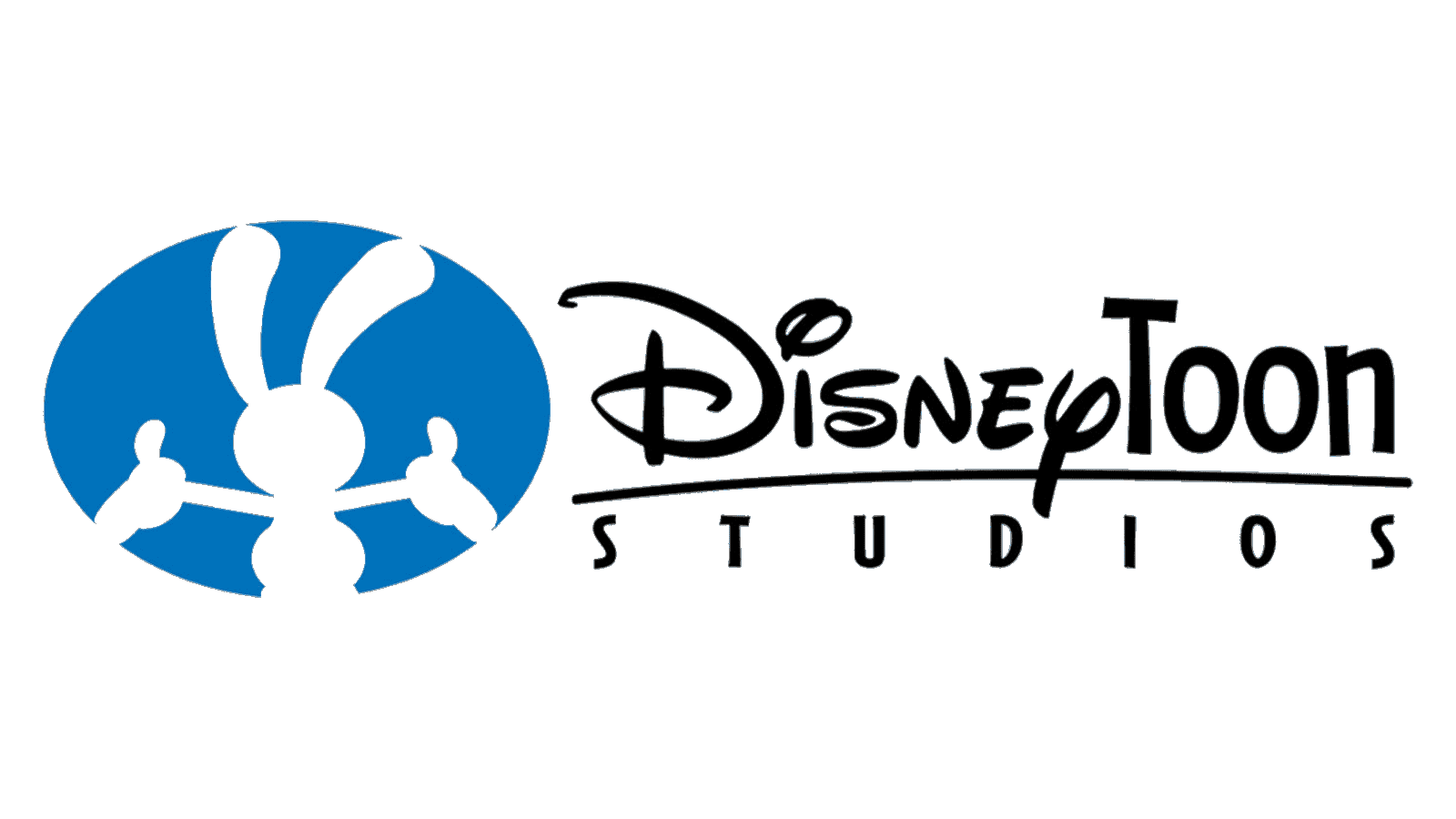
During this phase, ‘DisneyToon Studios’ adopts a more cohesive branding approach. The script for ‘Disney’ remains, ensuring brand recognition, but ‘Toon Studios’ now joins in a sans-serif font that is both bold and straightforward. This part is separated by a thin curled line from the word ‘Studios’. Additionally, there is an oval featuring the Mickey Mouse’s silhouette
2011 – 2018
![]()
In this final logo, ‘Disneytoon Studios’ opts for a minimalist approach, with the traditional handwritten script used for the first word, and a capitalized script used for the word ‘Studios’. Black and white replace any color, suggesting a classic, timeless look. This simplified logo embodies the studio’s evolution towards a more refined and sophisticated identity, reflecting its continued narrative craftsmanship in animation.
Font
The nameplate ‘Disney Movietoons’ from the 1990-2003 logo utilizes a distinctive combination of typefaces. The word ‘Disney’ is rendered in its iconic, fluid handwritten script that has become emblematic of the brand’s fairy-tale essence. It sits above ‘Movietoons,’ which is in stark contrast, employing a bold, all-caps sans-serif font.
This font exudes a modern and accessible vibe, indicating the studio’s commitment to creating content that is both current and universally appealing. The decision to use two different typefaces within the same logo bridges the gap between the storied tradition of Disney and the contemporary flair of the studio’s then-current projects.
Color
Regarding the color scheme, the logo employs a gradient that blends from a cheerful yellow to a passionate red. This gradient represents the dynamic and spirited nature of animation that the studio is renowned for. Yellow, often associated with creativity and happiness, fades into red, a color that conveys excitement and boldness.
As the studio’s identity matured, the subsequent logo (2003-2011) chose a striking red and white palette. Red dominated the ‘Toon Studios’ portion, reinforcing the studio’s vibrant and energetic storytelling, while white provided a crisp contrast that ensured the ‘Disney’ script remained clear and recognizable.