Dallas Stars Logo
Tags: NHL | professional team | USA
Dallas Stars is a team of hockey players that has earned a great reputation over its more than 50-year-old history. It has many players that made the team very proud and earned it multiple awards. The Stars have earned a position as one of the most valuable clubs in the United States as it has the sixth-best power play, third-best penalty kill, and many other achievements.
Meaning and History
When more clubs were added to the league in 1967, they could not ignore Minnesota, which always had the most professional American hockey players. The new club played for the first time on October 21st of the same year. In 1981, Minnesota appeared at the Stanley Cup Final but was fairly easily by the rising New York Islanders. Minnesota North Stars, which is how the team was first called, was inspired by the “Star of the North” motto of the state. When they moved in the early 90s, they got a more fit name – Dallas Stars.
What is Dallas Stars?
The Dallas Stars is a team that plays ice hockey professionally as part of the NHL. The team has received one Stanley Cup but it does not stop its fans from valuing all its other achievements. St. Louis Blues and the Stars have been fiercely competing since their acceptance to the NHL.
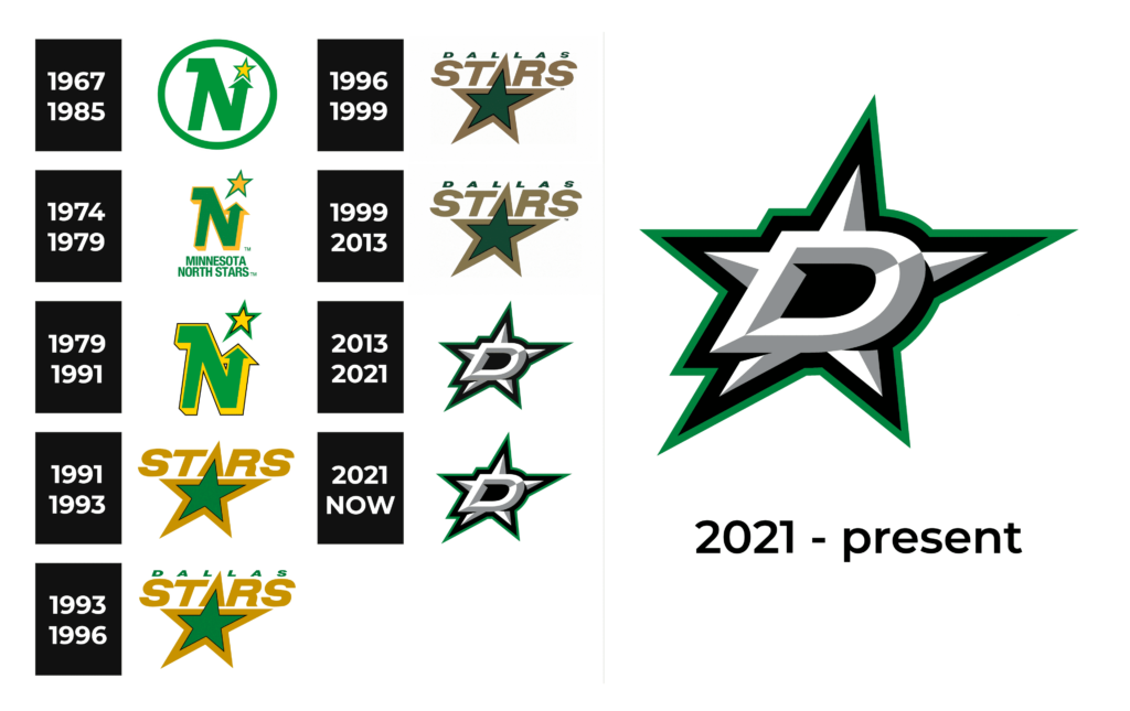
1967 – 1985
The “North Stars” was symbolized by a large “N” with its right vertical line being stylized as an arrow pointing at a golden star above it. A green ring gave the symbol a stronger and more serious appearance. Under this round emblem, it had “Minnesota North Stars” printed in two lines using the same green. The designer used a bold, sans-serif typeface that featured very close spacing, which created a bold, confident look.
1974 – 1979
A bright emblem was created by removing the framing and adding more yellow. It was added as a shade behind the “N” which created a three-dimensional look. The star was higher and made slightly larger. More yellow created a beautiful accent while the new position of the star instantly reminded of the “The sky is the limit” phrase and showed that there are no limits to the team’s success.
1979 – 1991
The “N” symbol with a star became closely associated with the team, so the inscription was no longer necessary. The emblem was slightly redesigned by adding a thin black outline to the initial. This enhanced its three-dimensional appearance and allowed it to stand out even more.
1991 – 1993
This logo gave birth to a series of logos with a large star. A green star with a thick golden border around it was the main element. “Stars” was printed in gold, using a sans-serif, bold font right above it. The inscription was centered, so the “A” was formed by one of the star points.
1993 – 1996
The main change this time was the replacement of a golden color with light brown. The black outline around the star was made thinner to avoid a very dark, negative impression. Above the “Stars”, they added a new location printed in a relatively small font of a green color that coordinated with the green star.
1996 – 1999
A minor modification was done again. The green color got much darker. It looked rich and made the emblem look sophisticated and dashing.
1999 – 2013
Not many realized there was a new logo introduced in 1999. It had the same elements, shape, etc. However, both the green and the light brown were not as dark.
2013 – 2021
This logo looks striking and very modern. The star took a new shape and now had a three-dimensional look. Moreover, instead of writing “Dallas Stars” at the top, the designers added a large “D” in front of the star. Both elements were done in white and light gray and appeared to have volume. A black and green outline around the star referenced earlier versions.
2021 – Today
As the team has already done previously, they played with colors a bit to make the log brighter and even more appealing. This time, they mainly touched the green color.
Font and Color
The team’s logo features a Skyline Green that was inspired by one of the most iconic skylines in the world. The other colors are white, black, and light gray. The color choices create a very rich, powerful, and sophisticated impression. The team always went for bold, sans-serif typefaces that reflected the strength and determination of its players.


