Courtyard Logo
Tags: hotels | luxury | middle-class hotels | motels
The Marriott hotel chain is known for exceptional service quality and its reputation as one of the best hotel chains in the world. Marriott is a multi-brand corporation. It presents hotels and motels that cover a wide range of target groups. Marriott’s trademarks include luxury hotels under the Bulgari and Renaissance brands and middle-class hotels Courtyard Marriott.
Meaning and History
Marriott began in 1927 as a modest family catering business. The first hotel under the Marriott brand appeared in 1957. Today, Marriott hotels can be found on all continents of the planet, with the exception of Antarctica. The giant empire has over 2,500 hotels around the world. In 1983, it entered the middle-class segment by opening the first hotel under the Marriott Courtyard brand. Courtyard by Marriott opened its 1,000th hotel in March 2015 with the Courtyard Washington Walla Walla in Washington.
What is Courtyard?
The Courtyard brand has the largest number of hotels in the Marriott portfolio. The brand celebrated its 40th anniversary in 2023.
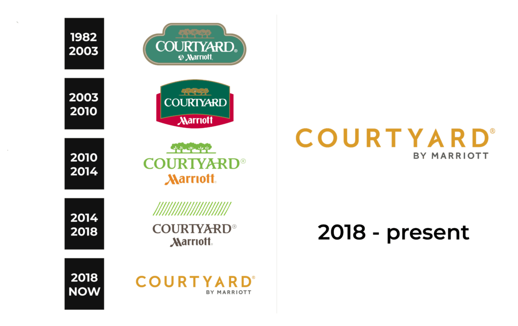
1982 – 2003
The first logo of the chain had a welcoming and relaxing color palette that was dominated by green and white with splashes of golden. The shape of the emblem also featured rounded forms for a friendly look. Even a line of trees above the name told the visitors that this is a place where they can peacefully relax and feel welcomed. The style of the inscription gave the logo a touch of sophistication and hinted at the high level of services provided at Courtyard.
2003 – 2010
The updated logo had a much bolder look with more sharp lines and a bright red added to the color palette. The name of the brand was done in the same style and even placed on a green background with a tree line above it. The “Marriot” inscription now was also done in white and placed on a red background that was tacked behind the green one. It was a perfect addition of color that reflected the strong position of the brand.
2010 – 2014
This logo has a very different feel than the previous two versions as it now has a white background. The emblem was also made lighter and brighter. Light green is used for the trees and the name. Both elements, otherwise, preserved their shape and reminded of the original idea. “Marriot” was now printed in orange and featured a slightly bigger font compared to the previous logos.
2014 – 2018
If it was not for the same font and style of inscription, it would be hard to recognize the logo. The company knew this very well and used exactly the same font for its name since the creation of its logos. This version introduced a dark gray for the inscription, which created a professional and serious look. It no longer looked like the logo of a preschool camp. To create an association with the green trees seen earlier, they added thin diagonal alternating green and white lines.
2018 – Today
This logo brings back that orange color seen a few years earlier but in a lighter shade. The company also modified the font, removing the serifs and disconnecting the “A” and the “R”. In the lower right corner under the name, it said “By Marriot” in small, sans-serif font of a light gray color. This is a relatively drastic change the Courtyard logo has undergone so far.
Font and Color
The brand used multiple colors throughout the years. The latest logo features orange as the main color and light gray as the secondary. The orange is considered to be a color that stands for warmth, energy, confidence, sociability, and success. All these qualities are a great association for a hotel brand. Originally, the company went for a more elegant and sophisticated typeface choice. Later, it was simplified and looked more like Noyh Geometric Medium or Hurme Geometric Sans 1 SemiBold.


