Horse always was an animal associated to nobility, power, velocity, and work. It left its trace in a majority of human life spheres – from agriculture to manufacturing industry. That’s one of the reasons why the whole families, cities, and countries used coats of arms depicting horses. Later, the entrepreneurs from those societies founded the car companies using these emblems as the logotypes. But one should be warned that horses don’t have to a part of heraldic crests to become a corporate emblem – there are many examples proving that too.
Porsche
![]()
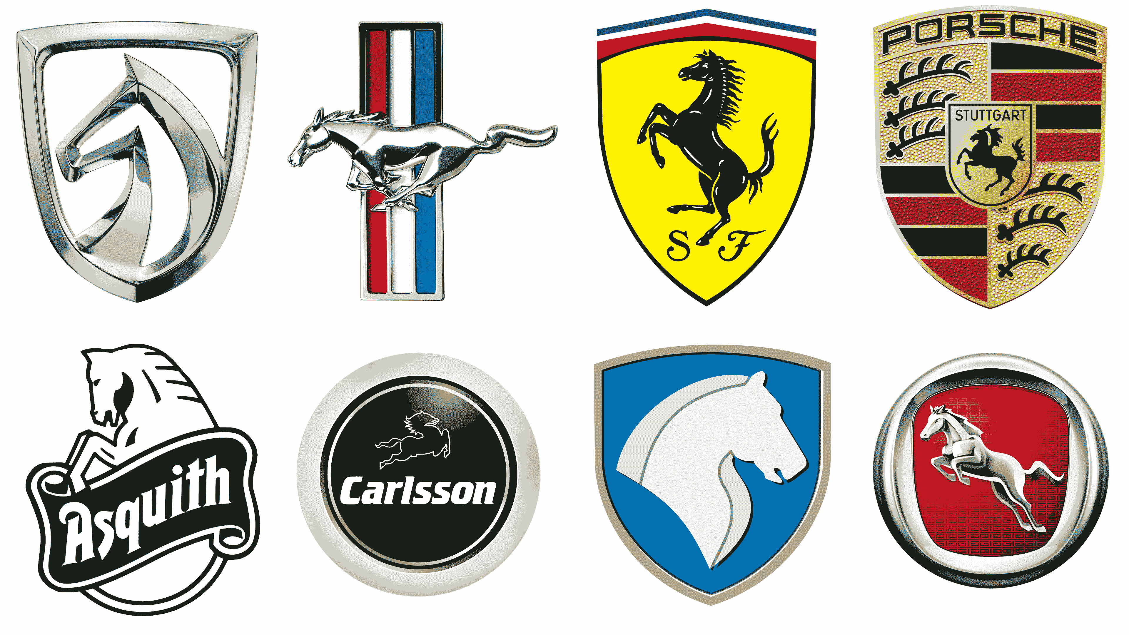
At the center of the modern corporate logotype, the Porsche company brand designers put a yellow shield with a horse rearing up. Above it, there is the ‘Stuttgart’ inscription, pointing at that it’s the coat of arms of the city where Porsche was born. This shield is embedded centrally into a bigger shield, which is split into four sectors. The upper right one depicts three black horns on the yellow background. Its neighboring segment features four stripes, two black, two red. They’re all separated by thin golden outlines from one another. The two lower zones of the badge feature the same images, but in a mirrored order. The marque’s name is put along the top of the crest.
Ferrari
![]()
The crest of the Ferrari racing cars brand shows a yellow rectangle with the Italian tricolor, drawn horizontally in the upper part. The bright yellow is the unchanging color of Modena, thebirth town of the founder, Erzo Ferarri. At the bottom, there is the nameplate. Its first ‘f’ is uppercase with upper bar covering the whole word. The characters have a heavy serif font with angular shapes. The horse standing on hind legs is positioned centrally. There are white lines meant to make the black animal more detalized. Actually, Erzo Ferrari started a long tradition by putting therearing mount as the main symbol. The mother of his friend, Francesco Baracca, advised Erzo to use the horse as the emblem because it would bring luck and success to his business.
Ford Mustang
![]()
The iconic logotype galloping pony badge is often placed over the vehicle radiator’s grid. The horse’s head is extended, and the whole animal is drawnin profile. It has a metallic silver style without any inscriptions. This logotype, symbolizing style, power, and speed of Mustang cars, has a long story. The brand designer, Philip T. Clark, was tasked to create the logotype showing the 1964 vehicle model young mood combined with American spirit. So, after a hundred days of work, he has introduced the iconic badge with a horse galloping to the left. This logotype was renewed for more than a dozen of times, but the main concept remained unchanged.
Baojun
![]()
Baojun is a Chinese marquee of medium-cost vehicles, established in 2010. It used a literal depiction of the horse as its emblem before 2019. This minimalistic metallic silver picture of a horse’s head drawn in profile and incorporated into a shield-shaped frame, was a suitable emblem for the brand, which name translates from Chinese as ‘Treasured Horses’. This image would be changed to a more abstract composition of a rectangle with the right left corner elongated. It was separated from a larger rhomb-like figure. These 3D shapes are painted gradient white, gray, and dark gray to create a metallic style. This combination slightly reminds of a horse nodding its head. As for the lettering, so the nameplate is executed in a custom typeface with sharp, high-tech letters.
Hanteng Autos
![]()
Hanteng is a private automobile company, focused on production, development and distribution of traditional fuel-based vehicles. Their logotype displays a jumping horse, colored metallic gray, and placed on a rich red rectangle. All this is incorporated in a silver ring shimmering bright and dark shades. Why did they use horse as the emblem? By the logo’s idea, jumping/running horse means the potential of the company’s products, red background – progress, evolution, and vitality, and the silver frame stands for exclusivity of every vehicle by Hanteng. The horse is also suitable for the brand’s name: ‘tang’ is the way horse is moving – running, and ‘Han’ is the name of a prominent Chinese family, known for its progressivism.
Khodro
![]()
Khodro is an Iranian vehicle producer, founded as Iran National in 1962. They’re focused on developing of high-quality cars, capable of competing with European and American counterparts. Situated in 5 factories, Khodro creates about 700,000 automobiles annually. Khodro’s modern logotype features a blue shield with a gray frame. At the crest’s center, they put a mount’s proud head, shown from the side and having small ears. The image has two upper and lower stripes, separating the proper head, colored white, and the animal’s gray mane. Why the horse? Although these animals weren’t significant in their culture, Persians were known for growing extra fast, strong, and graceful horses. So, the Arabian horse was suitable for the brand of safe and quick cars.
Carlsson Automobile
![]()
Carlsson is a vehicle renovation and redesign business with a German background. It was founded in the end of the 1980s by Hartge brothers in Saarland. The company mostly tunes Mercedes sports and racing automobiles, increasing their speed and mobility. To create the identity of a professional racing car tuning company, the brothers called the business after a famous racer, Ingvar Carlsson. Their company’s logotype also makes such image: a quick and determined horse, shown in white contour, is dashing towards at full speed. The animal is placed above the name caption, and all this combination is placed in a circular black badge with a white frame.
Asquith Motors
![]()
Asquith Motors is a British marquee of vans, caravan cars, and street trading-dedicated vehicles. The autos were mostly made in a vintage style of 1920s-1930s, often using parts of larger producers’ cars. The business appeared in 1981 in Essex, and it was a one-man project by Bruce West, who developed the Asquith’s structure, corporate identity, and early products, as well as secured their popularization across the world. Displaying this hard work, West has used an unchanging symbol of work and effort – the horse. In the Asquith badge, the mount comes out of a green ribbon with the white name, nodding its head and legs. The ribbon is contoured bold white, and below it there is a semicircle.