Ferrari is an Italian company specializing in the production of racing and elite cars. The company (its original name was Auto Avio Costruzioni) was founded in 1939 by the famous racer and car tester “Alfa Romeo” Enzo Ferrari. The first car with the actual name “Ferrari” appeared in 1946.
Meaning and History
![]()
Ferrari’s logo was unveiled in 1929. The black horse on a bright yellow background was not chosen by chance — this was preceded by a curious story: the emblem was used on the Francesco Baracca fighter (during the First World War), but after several battles, his plane was shot down. In 1928, Enzo Ferrari met the parents of the virtuoso pilot, who suggested using the emblem on cars, explaining this decision by the fact that the symbol brings good luck.
1923 – 1929
![]()
From the beginning, the prancing horse served as the brand’s defining characteristic. The only thing that made it different from all the other logos created later was the fact that it was facing right instead of left. The company’s first color choice was gleaming silver, which gave an impression of refinement and advanced technology. It appeared like the horse and the shield, which serves as the base, were not flat thanks to the bright spots and highlights.
1929 – 1932
![]()
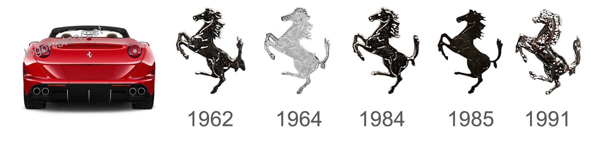
In 1929 Ferrari logo was represented by a prancing horse, located on a yellow triangular shield. That was a distinctive feature of the emblem, as the yellow color Enzo added himself — this is the color of his hometown of Modena. There are two beautiful capital letters “S” and “F” (meaning “Scuderia Ferrari”) at the bottom of the emblem. And on top of the shield, there are three stripes of different colors: black, white, and red. Moreover, the icon has a black outline. Another interesting nuance: on the planes of Francesco Barak, the horse’s tail was lowered down, while Enzo changed the position of the tail, pointing it up.
1932 – 1940
![]()
During that period, a few things changed. The shape of the logo stayed the same, but the background color changed: it became a little darker. The black outline that framed the icon was removed, and the colors of the stripes above the horse became green, white, and red (Italy flag).
1940 – 1945
![]()
During this period, the logo was a circle, which inside was orange and yellow on the sides. The words “AUTO-AVIO COSTRUZIONI” were written around the perimeter. Small images of the flag of Italy were on the left and right. The image of a winged horse was in the center. The horse’s wings were spread. The horse reared up. The image of the horse was black and white.
1945 – 1947
![]()
The brand created a few variations of the logo during this time. It was back then that it introduced the vertical rectangular shape of the emblem that the majority of people are familiar with. A variant with an arched top was also utilized by the corporation, although it is now obvious which form prevailed. With a black prancing horse and a bright yellow backdrop, the design also included a banner at the top in the colors of the Italian flag. No matter the slight variations, each version will be easily identifiable with the Ferrari brand.
1947 – 1951
![]()
The logo had the form of a vertically elongated rectangle. Thin stripes that conveyed the colors of the flag of Italy were on top of the rectangle. The image of a black rampant horse was in the center. The brand name in black letters was below. The horse and the brand name were depicted on a yellow background.
1951 – 1960
![]()
The designers continued to develop the same image. The shape and main elements of the logo had not changed. Only the upper stripes depicting the flag of Italy became wider, and the horse had a shiny metal outline. The same outline appeared in the letters in the brand name.
1960 – 1981
![]()
As the brand has already done a few times, the logo was somewhat updated to reflect a new vision of the company. The modifications are not obvious if you are not a fan of the brand or do not compare different versions side by side. The horse has been redrawn to look more graceful and polished. Although the inscription at the bottom seems untouched, the green line at the very top has been made more saturated to match the bold red color. Overall, the logo stayed true to the brand’s roots and reflected that it is a stable brand that not only perfects its logo but also its products.
1981 – 2005
![]()
It was a continuation of the same theme in the logo. The form and basic elements also remained unchanged. Only the outline of both the horse and the letters disappeared.
2005 – 2010
![]()
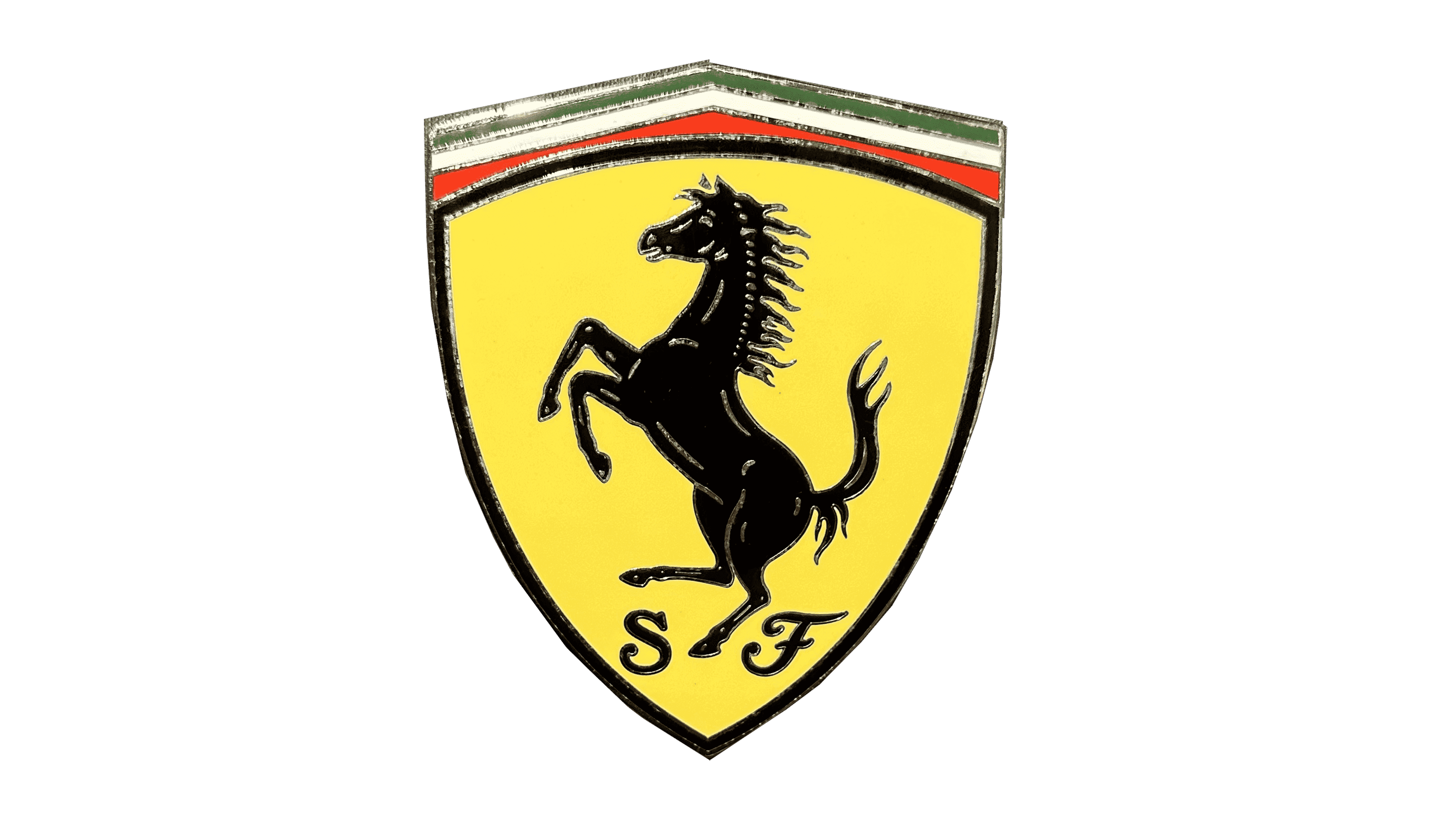
The Ferrari logo takes on a rectangular shape. Instead of the letters “S” and “F”, the inscription “Ferrari” appears. The unique feature of the name is that the upper element of the letter “F” covers all other characters. The image of the horse remains unchanged, as does the color scheme of the logo as a whole.
2010 – now
![]()
Ferrari stays true to its history. Since 2002, the logo has hardly changed. The only thing that was slightly different was the color of the background again. The yellow became a little bit darker compared to the 1947-2002 version of the logo.
Symbol

The horse symbol of the brand has a large, flowing mane and is depicted jumping. A black horse symbolizes victory and Ferrari had numerous victories to prove it. The spectator should understand the significance of a car with a horse symbol. It represents strength, courage, and speed. Even to describe a vehicle’s power, horsepower is the term used. Accordingly, it is not surprising that Ferrari chose a strong horse that is not standing still as its symbol. Right underneath, there was the brand name printed using a bold font with bracketed slab serifs. A unique feature of this inscription was the letter “F”. The top horizontal line of the letter was extended above the whole name.
Emblem
1952
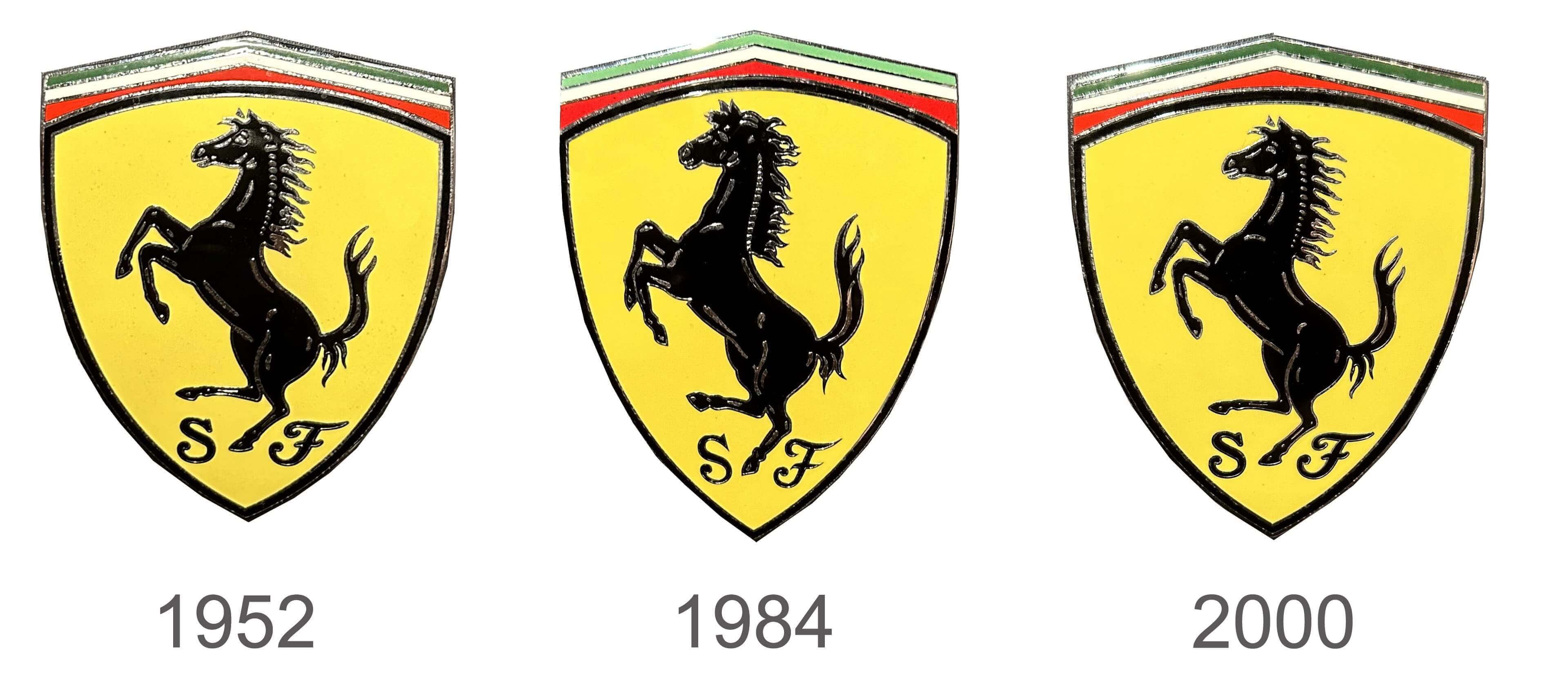
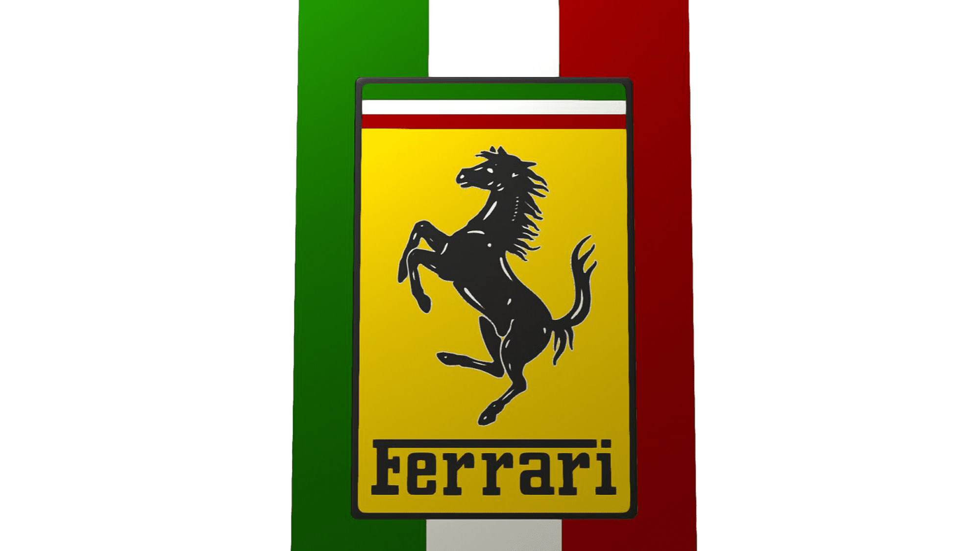
A bright yellow base in the form of a triangular shield has a serious and at the same time energetic appearance. The rearing horse, which has since become closely linked to the brand, is depicted in the center. The emblem was decorated by the Italian flag that stretched across the top. At the bottom, there were two letters. Not many know that they stand for “Scuderia Ferrari”, where the first word translates as “stable”.
1984
The company modified its logo by redrawing the horse. It was now standing taller and had a more muscular, stronger appearance. The initials, on the other hand, got more refined and looked even more elegant. This created a beautiful contrast. Otherwise, the logo idea stayed unchanged.
2000
In 2000, the company began to use the emblem it introduced almost half a century ago. It did not even make any adjustments to it, which reflected the brand’s loyalty to its original values.
Font
Scuderia Ferrari logo
Scuderia Ferrari is an Italian car racing team that is a division of Ferrari automobile company. Its logo is practically indistinguishable from the main Ferrari logo. The only difference is that sometimes it is depicted on a red background because red is the main color of Scuderia Ferrari team cars.
As for the 2004 F430 Scuderia, it was created as a deep redesign of the previous 360 Modena. The car owes its appearance to the famous designer Frank Stephenson, who developed the appearance of many cars, for example, Ferrari 612 Scaglietti. The side of the Ferrari F430 received a beautiful, mesmerizing silhouette. A group of engineers calls their machine innovative. In the technology of car production with the use of “space metal” Ferrari reached a new level.
The Legends
250 Testa Rossa of 1956 — a car which participated in races for a long time, excellent technical characteristics allowed it to even win several times in prestigious competitions. 365 GTB4 Daytona of 1967 — a car designed to compete with the legendary Lamborghini Miura, as the confrontation between the two legendary automakers Ferrari and Lamborghini goes back a long way. F-40 of 1987 — an immortal car, because it was the last that the founder of the company, Enzo Ferrari, worked on during his lifetime. Testarossa 512 of 1991 — a car that won many hearts and became the real era of the 90s in the West.