The Boeing Company, a global leader in aircraft and satellite supply, adopted its current name in 1961, marking a pivotal moment. Previously, it was the “Boeing Airplane Company,” which only reflected one aspect of its work. This rebranding enabled expansion into missile production, military aircraft, and commercial aviation.
Meaning and History
In 1903, at just 22 years old, William Boeing shifted from a successful logging venture to a boat factory, but his fascination with aviation soon led to the formal registration of his aviation enterprise in 1916. Multiple name changes followed as the company evolved into a conglomerate.
Key moments included the acquisition of Rockwell International Corporation’s defense and aerospace divisions in 1996 and the merger with McDonnell Douglas Corporation in 1997, propelling Boeing to new heights. Today, Boeing aircraft feature a classic wordmark with a graphic composition inspired by the former McDonnell Douglas logo.
What is Boeing?
Boeing, an American company founded in the mid-1910s, has consistently held a prominent position in the aerospace industry. Renowned for its expertise in designing and manufacturing aircraft and rockets, Boeing serves both military and commercial sectors.
1920 – 1930
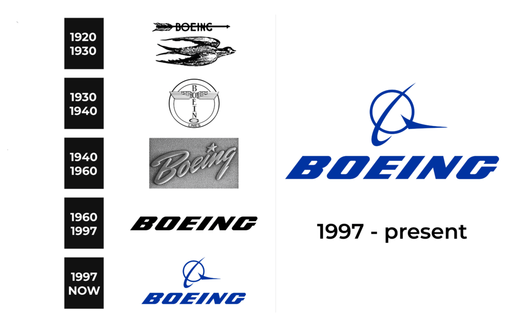
Boeing’s early logo featured three distinct emblems in the 1920s. The first depicted a soaring bird with an arrow and wordmark, symbolizing speed and freedom. The second showcased winged loops, evoking quality and style. The third, a minimalist logo, featured a wordmark flanked by white wings outlined in black, signifying the company’s core specialization.
1930 – 1940
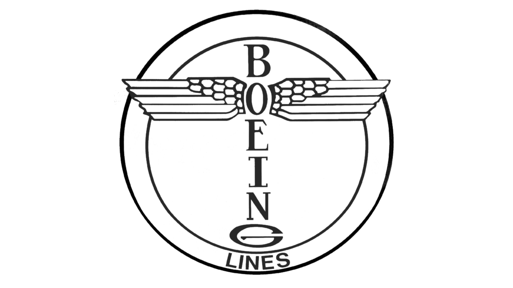
In 1930, a new visual identity introduced a totem with wings atop a vertically oriented wordmark, creating a distinctive emblem that endured for a decade.
1940 – 1960
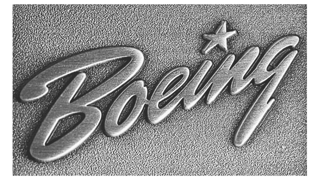
A script typeface in 1940 brought a different logo, symbolizing progress and dynamism. The star above the “I” conveyed style and design. This logo represented Boeing for two decades.
1960 – 1997
The 1960 logotype featured powerful all-caps lettering in an italicized sans-serif font, enduring to this day, often incorporating plane digit codes like Boeing-747.
1997 – today
In 1997, post-merger with McDonnell Douglas, Boeing’s logo transformed, merging elements from both companies. The bold logotype and an emblem of a circle with a stylized wing symbolize its essence.
Color
The current logo employs blue and gray, symbolizing air, speed, and safety.
Font
The logo features uppercase lettering in a bespoke slanted sans-serif font, possibly inspired by Tipemite Oblique or House Sans Italic Heavy typefaces.
