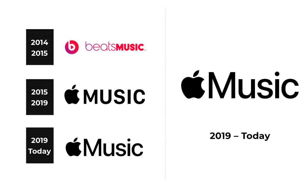
Apple Music Logo
Tags: Apple | mobile app | streaming service
Apple Music is a streaming service that gained immense popularity in the US, all countries of Europe, and the world. Although individuals can store their favorite tracks on their devices and listen offline, most choose to simply stream online. This gives access to all the music while saving memory space on the device. With Apple Music, one can create playlists of favorite tracks, play collections of music experts, and discover individual artists and their music. Absolutely all the songs of the service are available for a small monthly fee, and there are more than 100 million of them!
Meaning and History
Back in January 2014, rapper Dr. Dre launched a music service – Beats Music, which was available only to residents of the US. The service catalog was truly huge and had many cool features. Apple immediately saw an awesome possibility. In May 2014, it acquired Beats Electronics along with Beats Music for three billion dollars. As part of the deal, co-founders Jimmy Iovine and Dr. Dre joined the management of Apple. Apple closed the service in November 2015 to launch a new service, Apple Music, seven months later. The company offered users of Beats Music to transfer their accounts to Apple Music. In this case, one’s entire library and settings will be transferred automatically. Since its launch, Apple Music has grown rapidly in popularity, reaching 6 million subscribers in just 10 months. At the end of the year 2022, Apple Music celebrated 100 million songs in its catalog.
What is Apple Music?
Apple Music is Apple’s official music streaming service, which is available on all popular operating systems and platforms. Everything that can ever come to the mind of a person who listens to music is already in this service. If you are too lazy to delve into terabytes of music on your own, Apple’s intelligent assistant will help.
2014 – 2015
Dr. Drew had a colorful logo for his service. “Beats Music” was printed using two different fonts and styles. The first word featured thin, smooth lines and the first two letters formed almost a perfect circle. The color went from purple on the left to red on the right. The second word was written without any spacing in between. All capital letters had the same height as the “e”, “a” and “s” in “beats”. It looked bold thanks to the red and thick strokes with slightly rounded corners, except for the “M” which had a sharp “V” pointing down. It was a very fascinating approach. The inscription was decorated by a round emblem that had a purple and red gradient. Letter “b” with a play symbol in the center. It not only stood for the first letter in the name but also reminded of simple headphones.
2015 – 2019
With Apple, the logo acquired a more minimalistic look. It was black with the Apple emblem and “Music” on the right. The latter was printed using a simple, sans-serif font. All uppercase letters were of the same height as the logo on the left.
2019 – Today
An updated logo does not look much different. The company abandoned all capital letters and capitalized only “M”. It was taller than before, reaching almost the top of the apple’s leaf. The other letters are just a bit lower than the top of the fruit.
Font and Color
The first logo featured neon red and purple with a white background, while the other two versions used black as the main color. The Beats Music used Abeat by Kai font for the inscription. San Francisco Compact typeface, which was designed specifically for the Apple Watch, was used for logos since 2015. It has no serifs, straight cuts, and strokes of the same width.


