Zara is owned by Spanish magnate Amancio Ortega, who also owns multiple other well-known brands. The fast-fashion format, in which the entire range of goods is updated every 2 weeks, encouraged customers to shop faster and come back for new items. The group is unique in its ability to deliver the same collections to stores located on five continents in countries with very different cultures, and it’s not about advertising. The main advertising of Zara is the most advantageous location of stores, mainly on the main streets of big cities, as well as affordable pricing policy.
Meaning and History
![]()
It all started with 20 euros that Amancio Ortega and his brother put into launching their own business. The founders opened the first Zara store in 1975. It was located on the main street in A Coruña. Ortega wanted to name it Zorba, after the character in the Hollywood film Zorba the Greek, but he could not register this name, so the name the world knows today appeared instead. The company was quite successful and rapidly expanded. Inditex, which Zara was part of, entered the international market in the late 1980s as a result of Zara’s widespread acceptance in Spain. They opened their first overseas store in 1988 in Porto, Portugal and it did not stop there.
What is Zara?
Zara provides a wide range of clothing for adults of both sexes as well as younger populations. It also has accessories, home products, among other goods. The well-known brand Zara always reacts very quickly to modern trends. It allows the ordinary to be stylish, fashionable, and modern and at the same time save money.
1975 – 1980’s
![]()
The original logo of the company reminded of a tag. Its black color with white details and inscription made the brand look sophisticated and modern. The tag was placed on a diagonal, which gave the emblem dynamics, and had a shadow behind it for an even more realistic image. The brand name was printed using a bold, serif font with rounded strokes. Underneath, it said “Tiendas de Moda”, which translates as “Fashion Stores” in Spanish. It surely looked unique, but at the same time very relatable and could be instantly associated with shopping.
1980’s – 2008
![]()
The new logo has a very minimalistic design, which combined with the black color gives the logo a genuinely timeless appearance. The logo looks modern and stylish even several decades later. It features just the name of the brand and no tags or anything in the background. It is printed straight using a bold font with serifs and strokes that have varying thicknesses. The thinner lines gave the logo a touch of elegance, while thicker lines reflected the strong position of the brand.
2008 – 2019
![]()
The logo was slightly updated at the beginning of the new century. The company chose a different font but thanks to the use of black color, all uppercase letters, high-contrast strokes, and serifs, it is easily relatable to the previous version. The characters not only have wider hairline serifs but also more spacing between the letters. This design move gave the brand a confident and solid look.
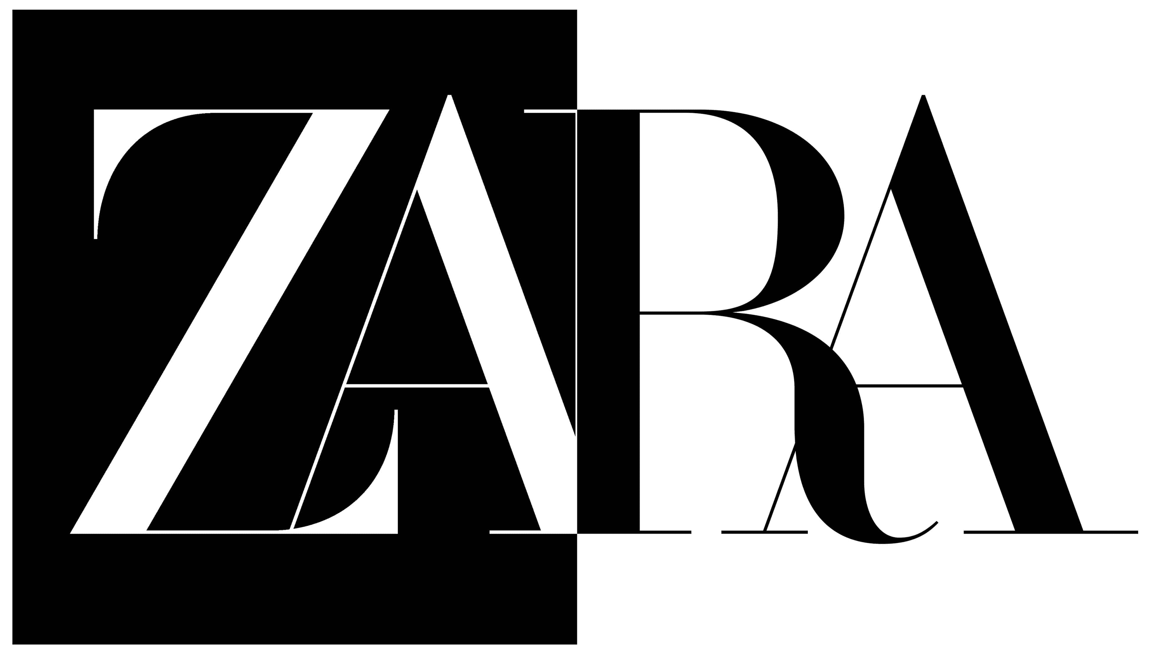
2019 – Today
![]()
An introduction of a new font gave the logo a completely new feel. It now looked luxurious, elegant, and sophisticated. This was mainly achieved by using contrasting strokes and beautiful curves in combination with straight lines and thin, hairline serifs. A unique feature of this logo was the overlapping letters. Given that there are thin strokes in the background, such a design move did not ruin the legibility of the logo but instead added personality and interest.
Font and Color
The font used in the original logo features thick, rounded strokes and serifs and resembles TT Tsars Bold font or Calmius Semi Bold font. In the 80s, the company introduced a different font that featured transitional serifs and gave the logo a sharper and more stylish appearance. The new font used to print the name in 2008 is surprisingly close to Compass TRF. It was replaced by a font known as Didot and drawn by Baron & Baron association.
The company has always used black color to write its name. it is not only a formal color that is powerful, timeless, and versatile, but it also gives a touch of sophistication and elegance.