Washington Redskins are a professional rugby franchise from the East Division of NFL, which was established in 1932 in Boston. The team has won numerous titles during its pretty long history and today is owned by Daniel Snyder with Ron Rivera as the head coach.
Meaning and history
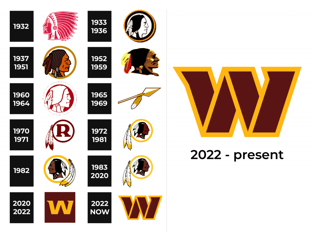
The Washington Redskins is deservedly considered to be one of the most success-ful rugby franchises. The NFL team that has won five World Championships, has a very intense visual identity history. The franchise has had around eight logo rede-signs, but all of them were created as a tribute to the Native American legacy.
1932
1933 – 1936
1937 – 1951
The initial logo for the franchise was designed in 1937 and depicted a portrait of the Native American man in profile, enclosed in a yellow circle frame. The man was looking right and had a red headdress in his dark brown hair.
1952 – 1959
The redesign of 1952 removed the rounded frame and made the contours of the In-dian man more distinct and clean. The portrait became more detailed and more thoroughly executed. The color of the feather headdress was changed from red to red and yellow, adding freshness and joy to the overall picture.
1960 – 1964
In 1969 the logo became simpler and minimalist. The stylized rounded medallion with a red and white Native American profile now looks modern and strong. As for the new color palette, it was a perfect reflection of passion, love, and power.
1965 – 1969
A completely new design was created for the franchise in 1965. The portrait of a man was replaced by a golden arrow with a feather on it. It was the image, symbol-izing progress, fighting spirit, and eternal movement.
1970 – 1971
Another major redesign was made to the Redskins visual identity in 1970. The ar-row was removed from the logo and the new circular medallion appeared. The bold and smooth red letter “R” in serif font is placed in the middle, the circular frame is decorated by two feathers on its left. One of the versions was executed in a bur-gundy red and white color palette, while another one had yellow as an additional color.
1972 – 1981
The portrait of an Indian man came back to the team’s visual identity in 1972. The feather decoration of the circular frame remained, while the letter “R” was replaced by a colorful profile. The shade of the frame was changed from red to yellow. The Native American man from the logo gained a dark brown skin tone and black hair with a white feather headdress.
1982
In 1982 a new version was created — the man was now turned to the left and the feathers from the frame were curved, repeating the contours of the frame. This ver-sion only stayed with the team for one year.
1983 – 2020
In 1983 there was the last redesign of the Redskins logo, where the version from 1972 was brought back with slightly modified contours.
2020 – 2022
2022 – now
Symbol
The Native Indian man has been a symbol of the Washington Redskins since the very beginning of the team’s history. On almost all the versions the man was facing right, like looking into tomorrow, symbolizing growth and progress.
Emblem
An additional emblem for Redskins was designed in 2009. It is a sleek and smooth yellow letter “R” in a custom script typeface. The emblem is sometimes placed on white background, but usually, the team uses it in combination with the iconic Red-skins’ burgundy.
Helmets
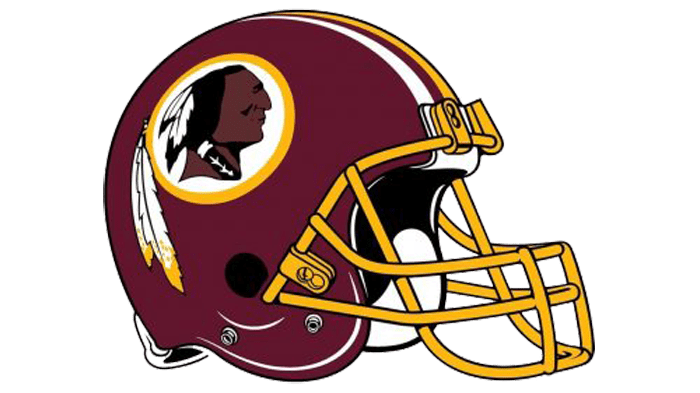
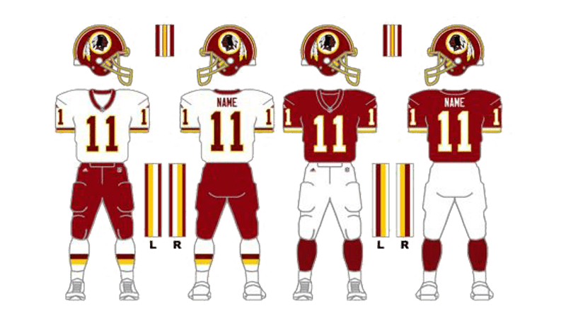
The design of the Redskins’ helmet was created in 1978 and is still in use by the team. The rich burgundy shade is the main color of the helmet. The white yellow and brow emblem is placed in the sides and accompanied by yellow, white, and burgundy stripes in the middle.
Uniforms
The main home uniform of the Washington Redskins consists of a burgundy jersey with white numbers. The shoulders are decorated with white and yellow details. As for the pants, they are executed in white and have burgundy and yellow stripes on the sides.
The road uniform of the famous team is composed of a white jersey with burgundy numbers and other small elements, and the bright yellow pants, decorated by bur-gundy and white stripes.
