Versace Logo
Tags: accessories | aromas | clothing
Versace is an Italian high-end fashion house bearing the name of its founder, Giani Versace. Since 1978, the label has been offering bright designs, combining the elements of opulence, sensuality, and innovation. Their product line includes clothing, accessories, aromas, and home appliance products, all of which are characterized by style and quality.
Meaning and History
![]()
The brand’s moniker carries the unforgotten legacy of its founder and represents a mark of luxury, elegance, and style in the industry. Its iconic emblem, the Medusa head, reflects the mythical creature renowned for its capturing beauty that literally makes men freeze into stones. The idea of captivating beauty is the basis of the brand’s aesthetic.
Throughout the years, it secured the fame of a brand that creates and distributes bold designs and cultivates taste among the masses. It has worn up numerous stars and social influencers, hence solidifying its status as a high fashion brand.
What is Versace?
Versace is an international fashion label holding origins in Italy. It was founded by Gianni Versace in 1978 to spread bold and distiguished designs of clothes and accessories. Alongside them, the brand also sells aroma perfumes and footwear.
1980 – 1990
![]()
The earliest crest of Versace displayed the name caption on a transparent backdrop. It was elegantly written in a sleek and narrow typeface without serifs, with each letter placed close to one another. To distinguish the two words, the letters ‘g’ and ‘v’ were made capitalized. The script used in this wording bore a striking resemblance to the Sophi Sophi Regular script.
1990 – 1997
![]()
During most of the 90s, the brand used a wordmark executed in a thick typeface without serifs. The letters were put close to one another, as previously, while the words became separate.
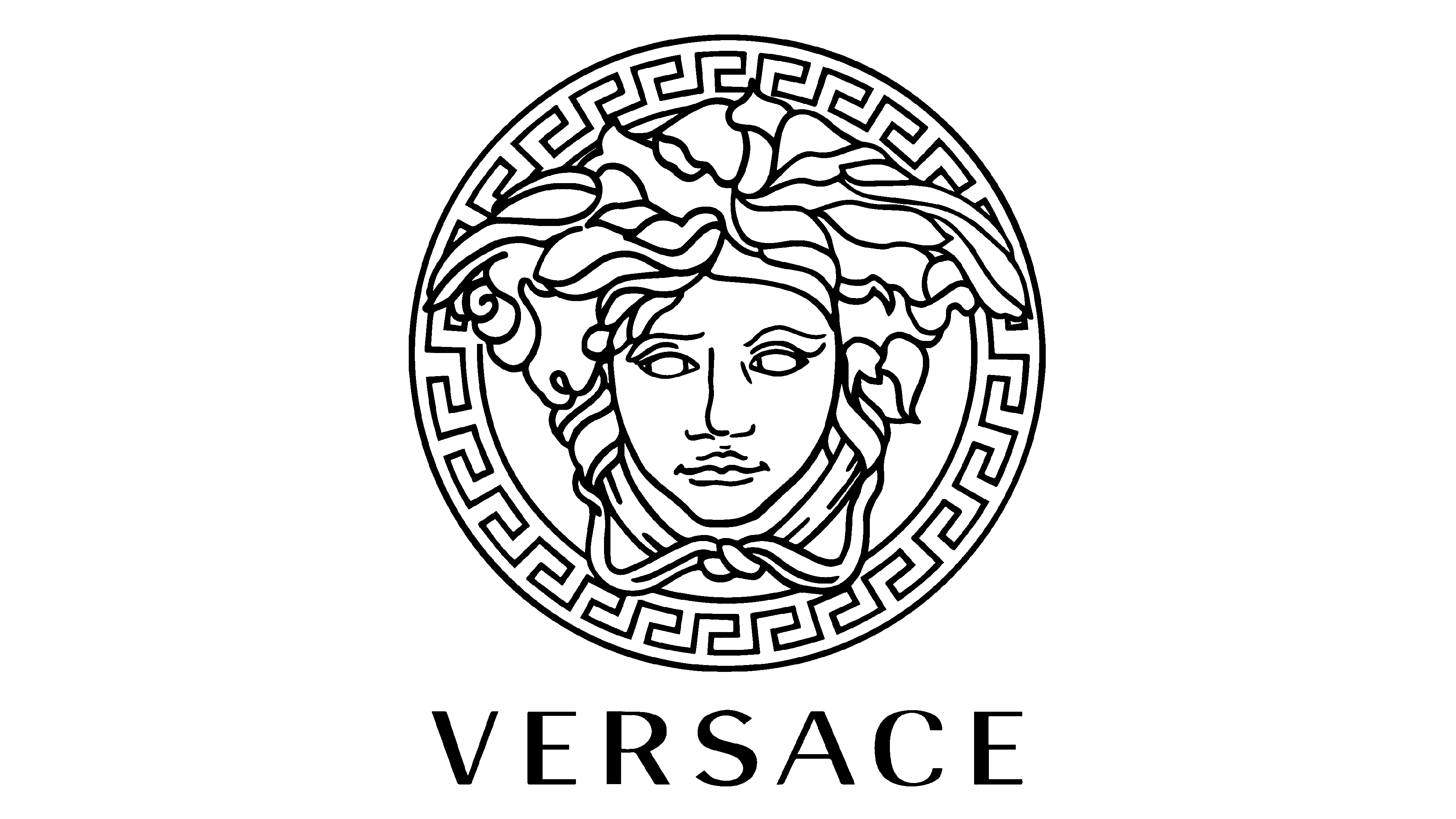
1993 – 1997
![]()
The iconic circular badge with Meduza as its main component appeared in 1993. It represented the creature’s head with empty eyes. The long hair partly covered the top of the frame – a circle with Ancient Greek ornaments on it.
1997 – 2008
![]()
During the late 90s and the 2000s, Versace used the logo with the familiar emblem plus the name along the lower edge. It was written in the script looking like that of the 1990 wordmark.
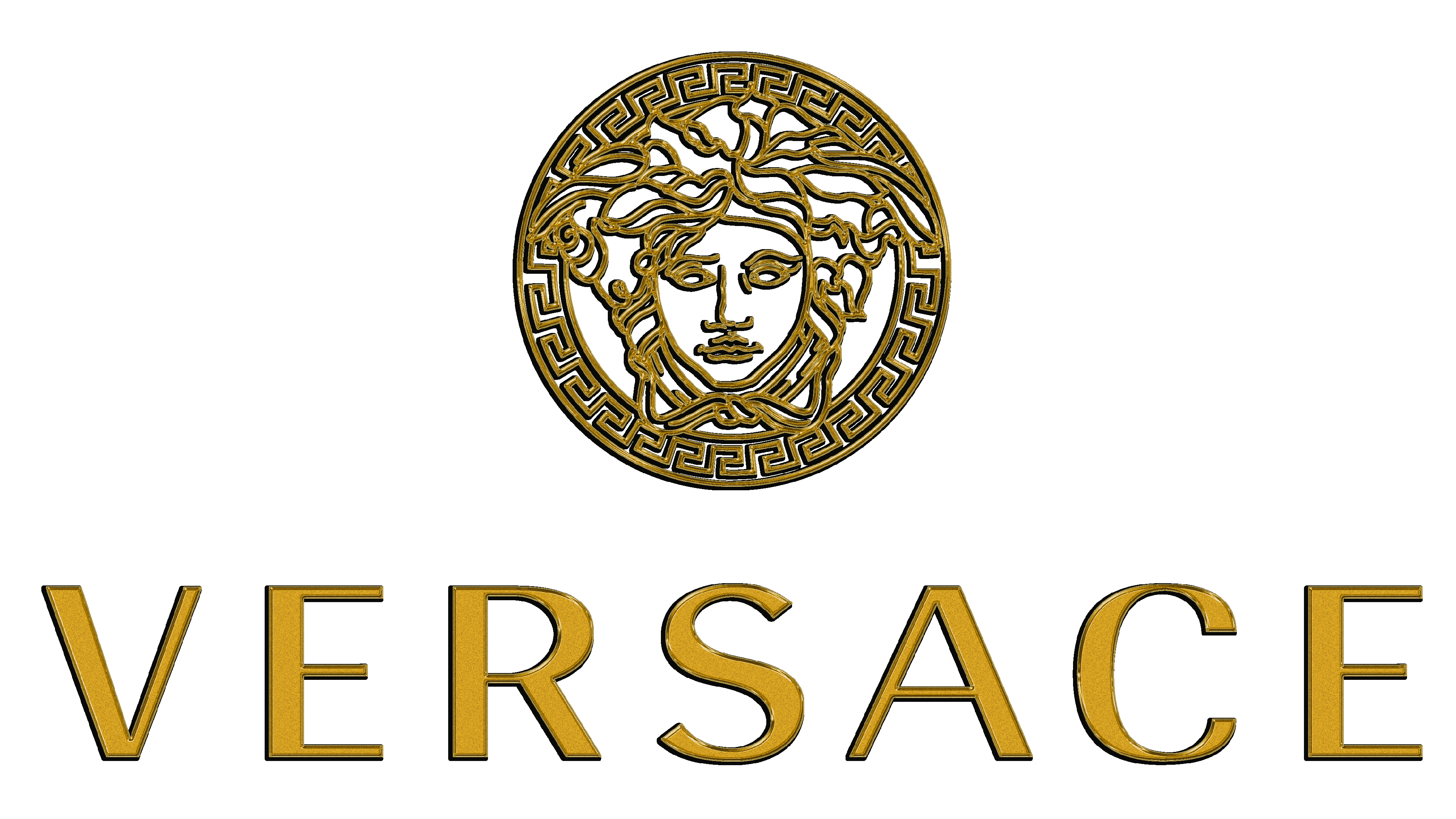
2008 – today
![]()
The Versace logo underwent refinement again in 2008. It was characterized by an enlarged name caption, positioned horizontally beneath the emblem.
Font
The typography featured below the graphic incorporates a commercial typeface known as Radiant RR Bold, crafted by renowned designers Robert Middleton and Steve Jackaman in April 2002 specifically for the Red Rooster Collection. The letterforms exhibit a distinctive blend of chiseled, grotesque elegance, characterized by slender strokes and subtle thickening at the midpoint of the verticals.
Color
The brand’s color code is black and white, which stresss out the professionalism and quality of the brand.