Total Logo
Tags: chemical industry | France | oil | petrol
In addition to oil production facilities, Total owns chemical industry enterprises and facilities in several related industries. Even though the company is considered French, only 28% of its shareholders are from this country, the remaining 31% are from North America, and 49% are from European countries. 89.6% of the company’s shares are in free float.
Meaning and History
The then-Prime Minister of France, the legendary Raymond Poincaré, abandoned a plan to partner with Royal Dutch Shell and instead decided to create a national oil company. He entrusted this to Colonel Ernest Mercier, and soon, in March 1924, with the financial help of 90 French banks and companies, the Compagnie Française des Pétroles (CFP) was born. As a war reparations, the company received from Deutsche Bank a 25 percent stake in the Turkish Oil a company that had mining rights in present-day Iraq. So, France got its first own access to oil. In 1954, CFP introduced its own brand of gasoline to the European market under the name Total. It turned out to be so popular that 30 years later, in 1985, the company rebranded and became known as Total CFP, and 6 years later, before entering the New York Stock Exchange, it simply dropped its historical name, becoming known as Total.
What is Total?
Total is the second largest public company in France and one of the largest oil companies in the world, engaged in the exploration, production, processing, and marketing of hydrocarbons, as well as petrochemicals and energy. Total is one of the top five oil and gas “supermajors”, which also include ExxonMobil, BP, Royal Dutch Shell, and Chevron.
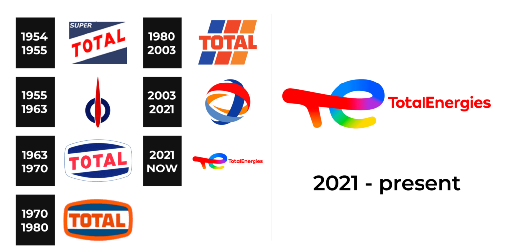
1954 – 1955
This logo does not look extraordinary but thanks to the color palette and interesting placement of the name, it has a unique and memorable appearance. The designers used a dark blue rectangle as the base and added a white line diagonally across it. The name was printed in bold, red using all uppercase, sans-serif letters. It stood out against the white and created a powerful impression. In the upper left corner, the emblem also had “Super” printed in a much smaller, white font to create an image of brand supremacy.
1955 – 1963
The new logo preserved only the color palette. It has a blue ring with a white center and a red pointed line going vertically through it. This abstract image reflects the stable position of the company symbolized by a blue color while the red shows that the company is powerfully moving forward. For many, this logo reminds of a fuels symbol in the automobile, which is very appropriate considering that the main products of the company are made for automobiles.
1963 – 1970
This logo reminds of the original version. There were only a few modifications, which mainly consisted of changing the shape of the emblem. It now had a rounded form without “Super” printed at the top. The emblem also got a white border with a thin blue line that made it stand out on any background.
1970 – 1980
The designers worked with the existing emblem, making it change with the company. The inscription was now placed straight, giving the company a more serious look. The white border was replaced by a red color, which went with the red of the lettering. The new look is bold and speaks of an influential company.
1980 – 2003
A new bright and dynamic identity was introduced in 1980. The blue rectangular background was replaced by three diagonal lines of different colors. The first line was done in blue and the second one in orange, the two colors seen in the previous logos, while the last one was done in a new color orange. There was no border, but the name still had a white background.
2003 – 2021
This logo is futuristic, bright, and dynamic. The logo no longer had the name and consisted of a sphere formed from three stripes. They were done in dark and light blue as well as red. The back side of these strips was printed in orange. Under this abstract sphere, the logo had the name printed in red. It used a very interesting font that elegantly combined straight cuts with curved lines and curved ends.
2021 – Today
This logo looks futuristic and colorful, just like most earlier versions. The name was printed in red using a sans-serif font with the first letters capitalized. The most striking element of this logo was the bold emblem on the left. The initials were done as one smooth stroked that started with red and transitioned into other colors following a rainbow pattern.
Font and Color
The company has always used a bright and bold color palette. It included a powerful and daring red, some orange, as well as blue that symbolized trust and responsibility. The white color in every logo was a perfect base and stood for perfection. For the font, the company almost always went for just a bold typeface without serifs and all uppercase letters. In 2003, the font acquired smoother lines and curves and this trend was supported by the logo introduced in 2021.
