The Tennessee Volunteers are the sports teams at the University of Tennessee, part of the NCAA Division I and the SEC. Known as the Vols, they compete in various sports including football, basketball, and baseball. The program is celebrated for its strong traditions, distinctive orange and white colors, and the Bluetick Coonhound mascot, Smokey.
Meaning and History
![]()
The Vols have a notable history, especially in football and women’s basketball. Football boasts several national and SEC titles, with historical leadership from Coach Robert Neyland. Women’s basketball flourished under Coach Pat Summitt, securing numerous NCAA championships. Neyland Stadium and the legacy of ‘Rocky Top’ highlight their rich traditions.
The Tennessee Volunteers have left a mark with national achievements in various sports, creating a legacy of athletic excellence. Their passionate fan base and traditions like the ‘Vol Walk’ exemplify the spirit of the program. The Volunteers continue to influence collegiate sports with a history of producing professional athletes and contributing significantly to college athletics.
What is Tennessee Volunteers?
Volunteers is the representative program of the University of Tennessee in USA Student Athletics. The program was started in 1891 and includes sports ranging from American football to basketball to soccer and hockey. The head coach of the VOLS is Josh Heupel, and their hub resides in Nayland Stadium.
1967 – 1983
![]()
The first logo is a simple, solid letter ‘T’ in a bold, serif font. The color is a shade of orange that is likely indicative of the university’s colors.
1983 – 1997
![]()
The central figure of the 1983 logo is a man, depicted in profile, holding a 19th-century gun. This character is likely representing a volunteer, harkening back to the state’s nickname, ‘The Volunteer State.’ The man is wearing what appears to be a coonskin cap, which is associated with frontiersmen of the 18th and 19th centuries, an era when Tennessee earned its nickname.
The details in the image are stylized and the man’s hair and the fringes of his clothing are depicted with dynamic lines, suggesting movement. Beneath the figure, the word ‘VOLS’ is written in large, bold letters, with a star substituting for the letter ‘O’, adding a patriotic or possibly a collegiate athletic star quality to the logo. The letters are stylized with motion lines underneath them, giving the impression that the boat is moving swiftly through the water.
1997 – 2015
![]()
The logo returns to a simpler design, much like the 1967 version. It is the same serif ‘T’, but the font has minor modifications regarding the height and width of the symbol.
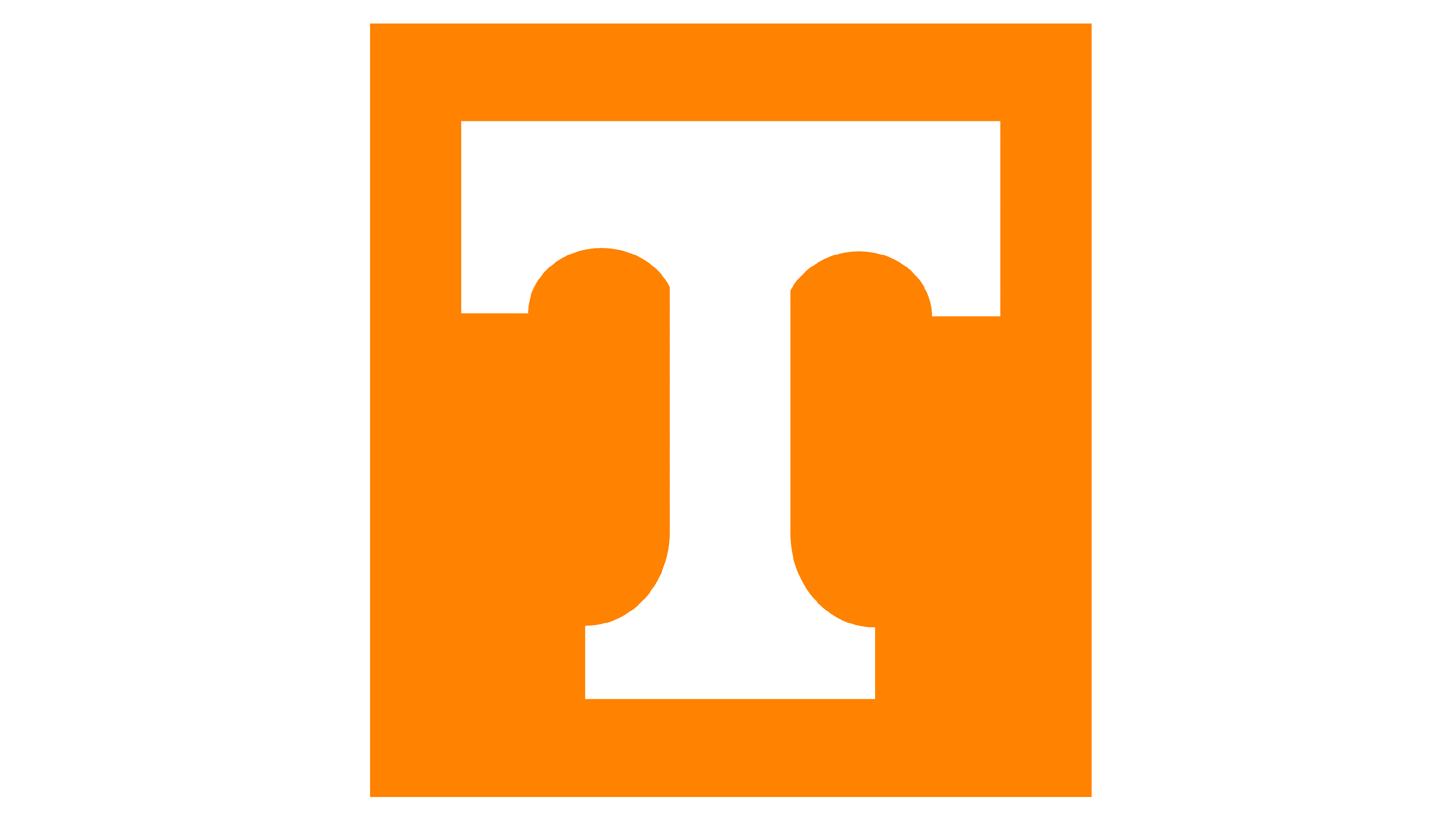
2015 – today
![]()
The most recent logo is again a simple ‘T’, similar to the previous iteration but now with a registered trademark symbol to the lower right of the ‘T’.
Color
The color scheme throughout the evolution of the Tennessee Volunteers’ logos is anchored by the distinctive ‘Tennessee Orange,’ a bright and bold hue that is instantly recognizable and is a critical aspect of the university’s branding. This particular shade of orange is used consistently across all iterations, ensuring a strong visual identity, both striking and emblematic of the Volunteers’ spirit.
Variations in tone are observed in the 1983 logo due to the use of gradients and shading, adding depth and a modern flair to the design at the time. The consistent use of this vibrant orange, often paired with white for contrast, underscores the tradition and energy of the Tennessee Volunteers and ensures brand recognition.
Font
In terms of typography, the Tennessee Volunteers’ logos have consistently featured a bold, serif ‘T’ as the centerpiece. The 1967 logo showcases a sans-serif, blocky typeface with pronounced serifs, embodying the straightforward and authoritative styles of mid-20th-century design.
This style becomes more dynamic in 1983 with the addition of a graphic element and a stylized, motion-inspired typeface for ‘VOLS.’ The ‘T’ returns to focus on the 1997 and 2015 logos, where it is refined and streamlined for modern sensibilities, retaining the serif feature but with a more balanced and digital-friendly design.