Mercer Bears Logo
Tags: athletics | Division I | USA
Located in Macon, Georgia, Mercer University is a private research institution. It is among the state’s oldest private universities. More than 130 academic programs at different levels are available to students at Mercer University. All students at Mercer University are welcome to participate in the extensive and diverse array of extracurricular activities available. This aids in their potential fulfillment and multifaceted personal development.
Meaning and History
Mercer University was founded in 1833 as a private university. For athletes, this university is a dream come true. The southern United States is home to the NCAA Division I sporting teams of Mercer Bears. In the US, Division I of the National Collegiate Athletic Association (NCAA) is the top division of collegiate athletics. From 1906 to 1911 and 1919 to 1937, Mercer participated in the Southern Intercollegiate Athletic Association (SIAA). Before 1924, the athletic teams were referred to as “Baptists” instead of “Bears”. It was the students who chose Bear as their mascot. He was named “Toby” in 1949, while a female mascot is known as “Tot”. The teams were referred to as Bears way earlier all because they had mustaches and long hair. This made one of the viewers refer to the team as “Bears” and the name caught on.
What is Mercer?
The Mercer Bears are the athletic teams of Mercer University in the United States. Mercer is the only private university in Georgia with an NCAA Division I athletic program and field teams in eight men’s and nine women’s sports.
1988 – Today
![]()
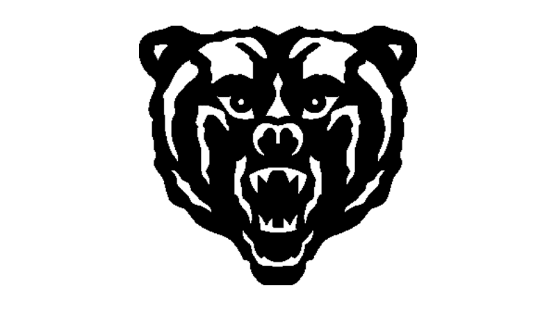
The bear image placed in the center of the logo looks fearful and strong. Its frightening appearance tells everyone that the Bears will defend their university and win the game no what. The black and white contrasting color palette enhances that impressive look. The orange color of the initial behind as well as bold strokes and slab serifs create a daring and strong image of the sports teams. The designers added a white and black border around the initial to connect it to the bear illustration and create a cohesive image.
Font and Color
The orange color creates a feeling of excitement and optimism. It has high energy and increases competitiveness, which makes it clear why Mercer Bears chose this color for the logo. Black is another prominent color in the logo. It is used to symbolize power, independence, a sense of control, and inner strength. The white color creates a nice contrast while remaining a relatively neutral element.
The logo features a bold font with thick, blocky slab serifs. The latter create a bold and impactful look, conveying a sense of strength and stability. Combined with the bright orange, the initial grabs the audience’s attention without taking too much attention away from the focal point – the Bear. The simplicity of the font choice for the logo is also explained by the fact that it should be easily read at a distance.