Tampa Bay Rays are a professional sports team, originating from St. Petersburg, Florida. The brand was established in 1998. They’ve been playing baseball, taking part in the main American and Canadian leagues, such as American League of Professional Baseball and Major League Baseball. Many of the franchise’s participants achieved the Ford C. Frick trophy, and they’re listed in the Baseball Hall of Fame. The club’s hub is Tropicana Field.
Meaning and history
The team was founded in 1998 as Tampa Bay Devil Rays, following around 30 years of continuous attempts to set up an expansion club and invite other already playing teams to set up their headquarters in the Tampa Bay populated area.
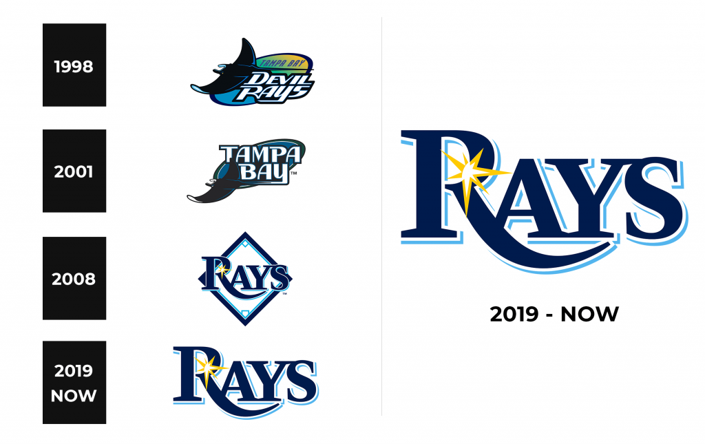
Although the franchise’s initial ten years were rather unsuccessful, the team kept on playing. In 2007, two years after the club’s transmitting to Stewart Sternberg’s property, the Rays renovated their brand identity, writing the ‘devil’ word out of the inscription and changing the logotype. It was accompanied by the team renovation and inviting of the new players, which led to the first successful season of 2008. A few other successful seasons took place in the years to come.
What is Tampa Bay Rays?
Tampa Bay Rays is a baseball club, having its main park located in St. Petersburg and named Tropicana Field. The franchise appeared. It competes in American League as well as Major League Baseball. The franchise plays as a part of the Baseball Hall of Fame, while most of its members won the Ford C. Frick awards.
1998 – 2000
The first logotype of their brand showed a gradient blue, green, and yellow oval with a dark blue coloring. At its top they put the italicized sans-serif ‘Tampa Bay’ inscription, styled in all capitals. Below it were two large elements: a blue ray, moving somewhere to the left and spreading its body over the half of the oval, and the ‘Devil Rays’ lettering, written in a very bold and angular typeface with uppercase sans-serif characters, contoured fat black.
2001 – 2007
The latter club insignia displayed the scat downsized and located in the lover area of the dark blue oval, contoured white and dark green. A large space was occupied by the ‘Tampa Ray’ words, using the similar script to the ‘Devil Rays’ inscription from the former logo, but not tilted.
2008 – 2018
Stewart Sternberg hosted the Tampa Bay Rays’ refreshed redesign. Now it was focused on the large ‘Rays’ word, placed over a dark blue rhomboid frame with a bright blue inner contour and white fitting. Over the first ‘r’ symbol, they put a yellow star with unequal bars
2018 – Today
With the brand’s development and popularization, the brand designers decided to make the crest more compact. They also removed the frame and left just the ‘Rays’ nameplate.
Color
Why did the brand designers of the franchise choose the sea blue as the main shade? Well, because the main animal of the club is ray, this dark blue and bright blue color combination reminds of water environment and fits the brand perfectly. White is an additional color, added to create a contrast. Finally, the yellow is used to depict the star with multiple bars, symbolizing the rays of the sun.
Font
The forms of the characters shown in the team’s logotype seem to have a capitalized font equipped with prominent serifs. The initial ‘r’ character is enlarged, and it’s equipped with an elongated tail, closing to the last ‘s’. The most similar script to this one is Hermecito A SC, developed by Ali Rafaeli.
