Chicago Cubs play the beloved American sport, baseball, professionally. The team had several logos throughout its history. With over a hundred years of history, it is not surprising. At the same time, one will see that it had the same base with a large “C” (with a few exceptions). This allowed even non-fans to recognize the logo instantly, while the true fans felt even closer to the club.
Meaning and History
![]()
Although Chicago Cups have been playing since 1903, its history goes back even further, all the way to 1876, when the team was known as White Stockings. The club played for over one hundred years without a championship during the World Series. Their determination to go on has been awarded in 2016 with a memorable victory. Despite a very prolonged drought time, the Cubs had many amazing and memorable moments for which the fans love the club. The Cubs are referred to as “the North Siders” because Wrigley Field is located in the Chicago metropolis.
What is Chicago Cubs?
Chicago Cubs have represented the MLB for over a century. David Ross is praised for helping the team get that trophy in 2016 and becoming a World Series Champion during the last game ever in his whole MLB career.
1903 – 1905
![]()
An Old English font was used to write the letter “C”. It was just a lucky coincidence that the team’s name had each word start with a “C”. This allowed the designers to create a very elegant and sophisticated emblem. The dark blue color enhanced this impression.
1906
![]()
Soon, the club went for a more traditional font and used a classic black color. The logo still featured the letter “C”, but here it is printed as a perfect circle with a slit on the right and slab serif added to the top end. This logo is an expression of perfectionism and professionalism.
1907
![]()
Here, the club turned to a Gothic font. The ends of the strokes resembled a wishbone. The logo turned out simple, yet there was something graceful about it, mainly thanks to the dark color.
1908 – 1915
![]()
A new team image was presented in 1908. The letter “C” was the main element, but the logo now had a baseball player stylized as a brown bear. The bear character not only referred to the “Cubs” part of the name but also reflected the strength of the team. It was placed in the center of the logo facing right with the “C” serving as a frame.
1911
![]()
No major updates were done this time. In fact, the team simply had the bear repainted in blue to match the color of the letter. This monochrome color palette as well as clean lines of the letter and straight cuts created a very professional look. It also inspired respect and admiration.
1916
![]()
A perfectly round “C” was transformed into a horizontally stretched-out oval shape with a pointed spine that reminded of gothic fonts. For many, it also resembled an eye. Another major change was the introduction of a red color, it was used for the letter in combination with a dark blue outline and the outline of the bear in the center. The bear silhouette, by the way, now looked more realistic and was standing on all four legs. Thanks to the red color, this logo looks bolder and makes the team appear stronger and more confident.
1917
![]()
For the first time in history, the club introduced a logo that did not have the “C” as the main element. Actually, it went for something new and different by printing the full name in two lines. It was done in a familiar dark blue color, which provided recognition and stood for team confidence and stability. When it comes to the font, the designers went for a sans-serif, geometric font with cut corners. To add even more interest, they printed the top line on a slight arch.
1918
![]()
It was not long before the team brought back the capitalized “C”. In this version, it is no longer round or even oval. It had a shape of a rectangle with rounded corners and a slit on the right to make it look like a letter. There is no bear, which was seen in a few earlier versions. Instead, the company added the full word “Cubs” using a sans-serif font with rounded corners and a combination of straight and diagonal cuts. Besides dark blue, the logo now has a sandy brown color. The logo turned out simple and its shape reminded
1919 – 1926
![]()
The well-recognized letter “C” is red and has an eye shape once again. Instead of the bear, it holds the remaining letters to form the word “Cubs”. The remaining characters are all capitalized and use a Gothic-style font. The team did a great job maintaining a recognizable logo while showing the fans that they are never standing still and constantly improving and getting better.
1927 – 1936
![]()
Even though the shape of the “C” remained unchanged, the center of the logo was changed again. The club brought back the standing bear silhouette it had drawn in 1908. Its dark blue color was a nice compliment to the blue border around the letter. This logo looked very familiar as the designers used existing logo elements and combined them in a new way.
1937 – 1940
![]()
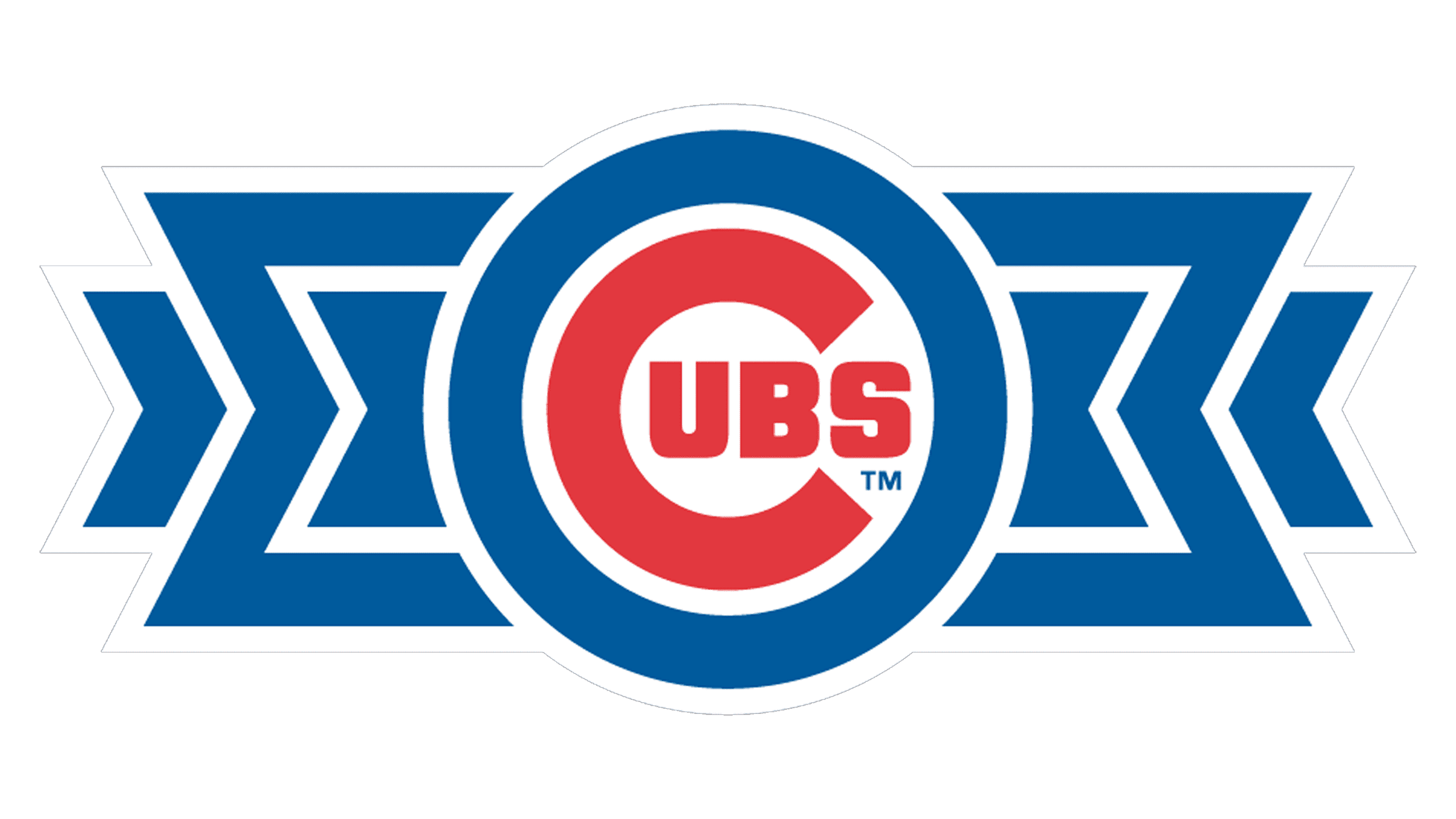
The logo surely looks like something new. At the same time, it appears quite familiar. First of all, this was achieved by using a red and blue color palette, although the blue here is lighter and brighter. The shape of the letter “C” has already been used in two earlier versions. The idea to add “UBS” in the center to spell out Cubs also appeared twenty years earlier. It might seem that the designers lacked creativity, but it was a perfect way to reflect the long history of the club while bringing more attention to the Chicago Cubs.
1941 – 1945
![]()
This logo looks nothing like the team had earlier. A bear head is presented without any inscriptions and looks quite aggressive and determined. It is done in natural brown and off-white color. It was an artistic interpretation of the Chicago Cubs name. Besides, the bear character has been seen in their logos several times, so it is no wonder that they decided to design something like this.
1946 – 1947
![]()
A logo with the “C” was brought back. This version looks a lot like the one introduced in 1937. The blue outline, though, was changed to create a frame around the whole emblem instead of just the letter “C”. It was the only blue element in the logo, while all the letters were done in red. This actually made it easier to read the word Cubs and created a more cohesive.
1948 – 1956
![]()
The logo was slightly modified in 1948. Mainly, the letter “C” was significantly thinner, which was replaced by more white space around it. The letters inside, on the other hand, got larger and closer. These changes made the logo appear more balanced as the thickness of the strokes was almost the same.
1957 – 1978
![]()
A little less than ten years after the last logo update, the club had it modified again. The logo now has a round shape with a blue border. The “C” got thicker again, while the other letters were spaced further apart. There was significantly more white space, which made the logo appear lighter and it did not appear so cramped.
1979 – Today
![]()
This logo looks bold and quite dark. The blue border around the emblem got as thick as the letter “C”. This made the log look almost like it was a shooting target plate. Despite all the changes the logo has gone through, the club was able to maintain a recognizable image.
Font and Color
It is not hard to tell that dark blue and red colors have reappeared in most logos as they were updated throughout the century-long history of the club. These are sophisticated and powerful colors that create an image of a strong and confident team. One can also see a bit of brown in a couple of versions, but it was rather an exception, rather than an image associated with the club.
Unlike the color palette, the font choices were more varied. There was an Old English style font as well as Gothic font. In addition, the team went for simple, clean fonts, some of which had serifs. There are geometric fonts and fonts that have a more rounded, fluent shape. The latest logo, which was introduced in 1979, features a geometric font for the large “C”, while the rest of the letters are done using a font similar to Philosophy by WeKnow or Neographik from Monotype.