Super Bowl Logo
Tags: competition | football | NFL | USA
The Super Bowl is the yearly competition of the National Football League (NFL), highlighting the end of the playing season. It features the victorious teams of the NFL’s conference-wide tournaments trying to win the Vince Lombardi Trophy. Apart from being an athletic event, the Super Bowl became a national pride for the US, proclaimed for its massive viewership numbers, elaborate ads, and star-studded inter shows.
Meaning and History
This legendary competition originated from the NFL and AFL union agreement, leading to a yearly competition among the conference champions since 1970. Evolving beyond a mere sports match, it turned into the beacon of American football industry, akin to an unofficial holiday.
With its huge number of fans, both in the U.S. and internationally, the Super Bowl is celebrated not just for the intense football game but also for its high-end advertisements and star-studded performances. Social gatherings and sports-related festivities surround this event, with the victorious club given the Vince Lombardi Trophy, named in honor of the renowned coach of the Green Bay Packers who secured wins in the first two Super Bowls.
What is Super Bowl?
The Super Bowl is the largest competition in the American football industry, held on the last Sunday of February. The show stars top-tier clubs from the NFL, who compete for the Vince Lombardi Trophy in the online and offline presence of millions of fans.
I (1967)
A classic, bold font with ‘First World Championship Game AFL vs NFL’ in red on a gray banner.
II (1968)
A patriotic theme with ‘SUPER BOWL’ in large, block letters, underscored by three stars and red stripes.
III (1969)
A modernist style, with ‘SUPER BOWL’ in a blue sans-serif font, the ‘O’ represented by a football.
IV (1970)
A dynamic design, the word ‘SUPER’ arching above a large ‘BOWL IV’ with stars and stripes on the football.
V (1971)
A straightforward style with ‘SUPER BOWL V’ in a strong serif font, colored in deep blue.
VI (1972)
The numeral ‘VI’ stands out in gold with a simplistic ‘SUPER BOWL’ in blue above.
VII (1973)
A return to the classic, with ‘SUPER BOWL VII’ in a bold red font.
VIII (1974)
A playful typeface for ‘SUPER BOWL VIII’ with a wave-like blue pattern.
IX (1975)
A minimalist design with a sleek ‘SUPER BOWL IX’ in light blue.
X (1976)
A celebratory style with ‘SUPER BOWL X’ in gold, giving a sense of grandeur.
XI (1977)
Bold red ‘SUPER BOWL XI’ with a graphic element resembling a goal post or a cheerleader’s megaphone.
XII (1978)
‘SUPER BOWL XII’ in a patriotic red font, complemented by a blue outline.
XIII (1979)
A striking design with a red ‘SUPER BOWL XIII’ and a blue, star-filled football.
XIV (1980)
Elegant ‘SUPER BOWL XIV’ in a cursive-like font, with a strong, assertive presence.
XV (1981)
A grand, gold ‘XV’ dominates, with ‘SUPER BOWL’ in a serif font above.
XVI (1982)
A modern approach with ‘SUPER BOWL XVI’ in bold blue and yellow, featuring a football and goalpost icon.
XVII (1983)
A classic look, ‘SUPER BOWL XVII’ in a serif font with a football design above it.
XVIII (1984)
A creative twist with ‘SUPER BOWL’ in white on a blue banner, flanked by red and white stripes.
XIX (1985)
A strong, futuristic design with ‘SUPER BOWL XIX’ in a sleek font, with red and blue accents.
XX (1986)
A bold departure, ‘SUPER BOWL’ on a blue ribbon, with ‘XX’ in a large, angular font.
XXI (1987)
The emblem boasts a sophisticated rose in dark red and stylized ‘SUPER BOWL XXI’ in blue and red tones, perhaps reflecting the game’s location in Pasadena, home of the Rose Bowl.
XXII (1988)
This shield-like design employs a classic American color scheme with ‘SUPER BOWL XXII’ prominently in the center.
XXIII (1989)
Bold and streamlined, the logo features ‘SUPER BOWL XXIII’ in a strong red font, accompanied by graphic elements resembling goal posts.
XXIV (1990)
Elegance is key in this diamond-shaped design with a blue border and ‘SUPER BOWL XXIV’ in red and white, offering a nod to tradition.
XXV (1991)
Patriotism shines through in this star-themed logo, centering ‘SUPER BOWL XXV’ within a star-spangled banner design.
XXVI (1992)
Vibrancy radiates from this crest, with ‘SUPER BOWL XXVI’ surrounded by red and blue elements, giving a sense of motion.
XXVII (1993)
Intricate in design, the emblem features ‘SUPER BOWL’ on a ribbon above a stylized ‘XXVII,’ complete with a floral-like motif suggesting festivity.
XXVIII (1994)
The logo strikes a chord with its angular, futuristic ‘SUPER BOWL XXVIII’ set against a palette of blue and silver.
XXIX (1995)
Colors burst forth in a dynamic starburst pattern, framing ‘SUPER BOWL XXIX’ in bold lettering.
XXX (1996)
Southwestern motifs create a kaleidoscopic effect around the central ‘SUPER BOWL XXX.’
XXXI (1997)
Speed and movement are suggested by the italicized lettering of ‘SUPER BOWL XXXI’ and the stylized football and goalpost design.
XXXII (1998)
Sleekness defines this logo, with a strong horizontal emphasis and ‘SUPER BOWL XXXII’ underscored by an elongated graphic.
XXXIII (1999)
Chunky font and a stylized sunburst pattern lend a modern, emblematic look to ‘SUPER BOWL XXXIII.’
XXXIV (2000)
Futurism comesintoo play in the sharp design featuring ‘SUPER BOWL XXXIV’ against a navy and gold silhouette of a football.
XXXV (2001)
Strength is on display with the bold, blocky ‘SUPER BOWL XXXV,’ where red and blue Roman numerals interlock.
XXXVI (2002)
Stately font and a fleur-de-lis motif subtly nod to the host city, New Orleans, in this distinguished logo for ‘SUPER BOWL XXXVI.’
XXXVII (2003)
The design for ‘SUPER BOWL XXXVII’ is lively and curvaceous, with navy lettering accented by a yellow football shape and vivid red details.
XXXVIII (2004)
Cleanliness and modernity are central to this design, encapsulating ‘SUPER BOWL XXXVIII’ in blue and red within a stylized silver football outline.
XXXIX (2005)
Minimalism guides this design, featuring ‘SUPER BOWL XXXIX’ in solid blue typeface, complemented by silver football imagery.
XL (2006)
Commemoration is the theme, with ‘SUPER BOWL XL’ displayed in a return to a more classic, straightforward red, white, and blue style.
XLI (2007)
Vivid orange and blue hues infuse energy into the logo, featuring a football in forward motion atop the event’s name.
XLII (2008)
Red, white, and blue return with a dynamic, angular shape giving a sense of forward thrust to the football above.
XLIII (2009)
The design presents a streamlined football in motion, slicing through the event title set against a backdrop of red and turquoise.
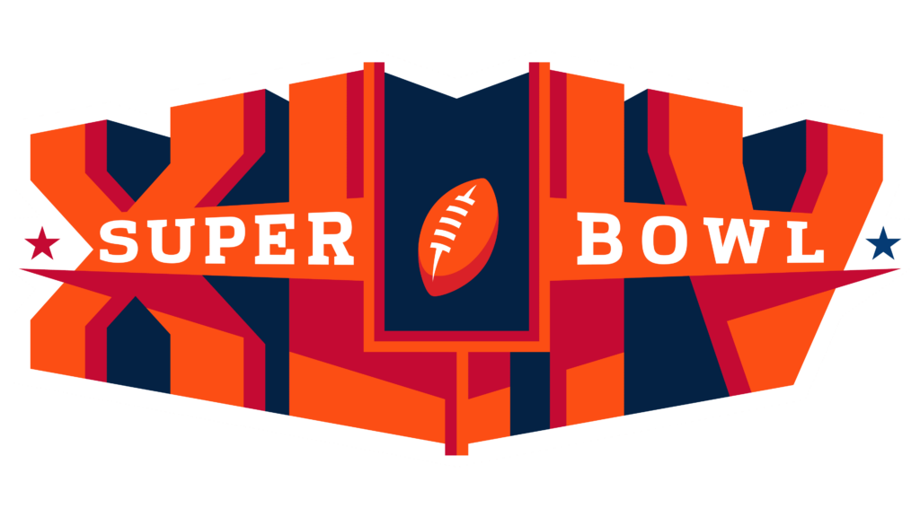
XLIV (2010)
Stark contrasts between the orange and deep blue hues offer a bold statement, with the Lombardi Trophy centrally placed.
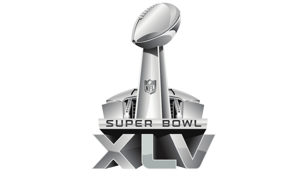
XLV (2011)
Simplicity reigns with a monochrome Lombardi Trophy, highlighting the event’s name in a classic serif font.
XLVI (2012)
Architectural elements beneath the trophy give a nod to the host city’s skyline, setting the stage in grayscale tones.
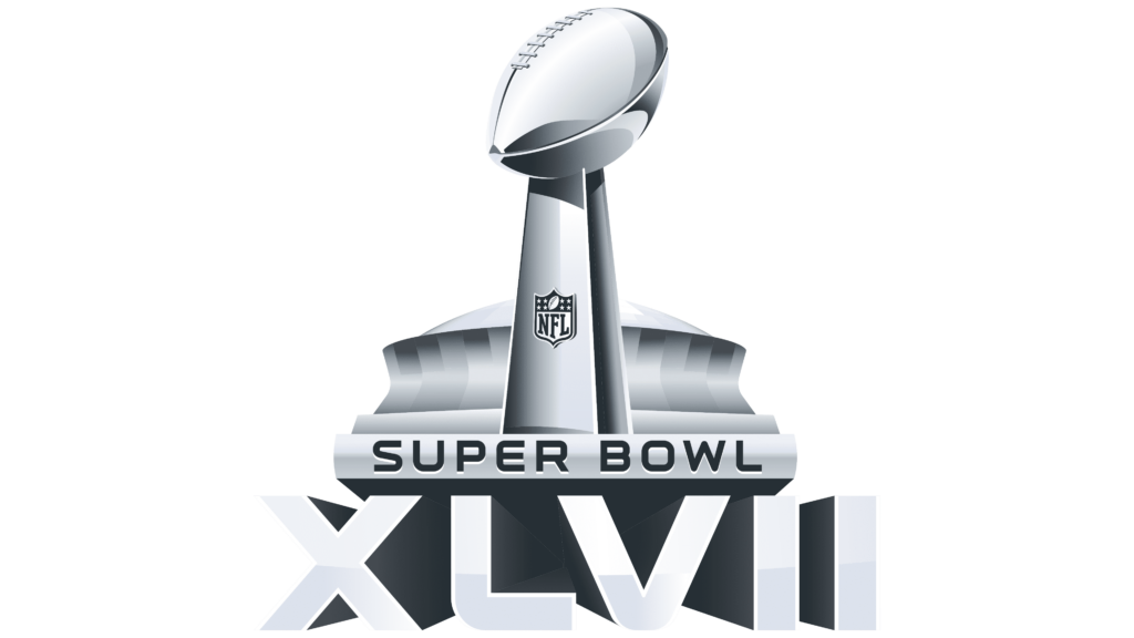
XLVII (2013)
Similar architectural motifs continue, with a slightly altered perspective on the trophy and skyline, maintaining the grayscale palette.
XLVIII (2014)
The trophy stands tall against the backdrop of a stylized stadium, evoking the grandeur of the event in metallic tones.
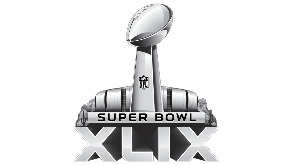
XLIX (2015)
Monochromatic elegance is displayed as the trophy is flanked by bold, stylized numerals denoting the event’s year.
50 (2016)
Celebrating a milestone, the logo breaks tradition with ’50’ in large, gold numerals, flanked by the Lombardi Trophy and black accents.
LI (2017)
Red and gray shades dominate, highlighting the trophy and creating a sense of depth with the bold ‘LI’ below.
LII (2018)
Continuity is key, as the design mirrors its predecessor’s style, this time with the number ‘LII’ in strong, metallic letters.
LIII (2019)
The logo depicts the trophy, supported by the numerals ‘LIII’ in a deep blue, creating a sleek appearance.
LIV (2020)
Modernity surfaces with crisp, clean lines as the trophy stands above the ‘LIV,’ fashioned in a minimalist style.
LV (2021)
Metallic tones return, offering a contemporary look with the Lombardi Trophy perched above the ‘LV’ encased in a silver hue.
LVI (2022)
Boldness comes forth in this logo, with a fiery backdrop suggesting the host city’s vibrant culture, the trophy front and center.
LVII (2023)
The design captures attention with a rich blue and purple palette, symbolizing regality and the thrill of the game.
LVIII (2024)
Future-forward, the logo features a sleek trophy design, with the numerals ‘LVIII’ in a stylized font, hinting at innovation and progress.
LIX (2025)
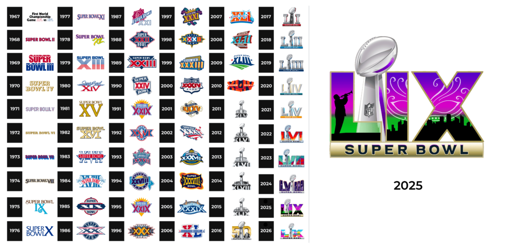
The logo features the Roman numeral “LIX,” which corresponds to the number 59. The design includes the Vince Lombardi Trophy in the center, a silhouette of a person playing the trumpet, a stylized city skyline, and a color scheme of green, purple, and gold. The words “SUPER BOWL” are displayed at the bottom with a golden gradient.
LX (2026)
The Super Bowl LX logo is a vibrant and dynamic design that captures the excitement and energy of the event. At the center stands a gleaming silver Super Bowl trophy, symbolizing the pinnacle of achievement in American football. The trophy is flanked by colorful, stylized illustrations of iconic landmarks, including the Golden Gate Bridge and lush landscapes, representing the host city’s rich culture and natural beauty. The background bursts with bright, neon colors, adding a modern and festive touch to the design. Below the trophy, the words “SUPER BOWL” are boldly displayed in a sleek, metallic font, emphasizing the grandeur of the occasion. This logo effectively conveys the thrill and anticipation of the Super Bowl, making it a visually captivating representation of the event.
Color
The brand designers have used a whole bunch of color codes throughout the brand’s illustrious history, and rebrandings. However, the latter logotypes feature a minimalistic combination, based on metallic gray combined with some other hues.
Font
The recent logotypes feature a somewhat flattened typeface with rounded characters and no serifs or extensive elements.
