Subway Logo
Tags: fast-food chain | fresh salads | sandwiches
Over time, Subway eateries became the world’s largest restaurant chain. Subway’s core concept is the desire to attract people to healthy fast food. It reflected this in its slogan “Eat fresh!”. Now, Subway’s main competitors in the world are brands such as McDonald’s, Burger King, and 7-Eleven, however, Subway does not seem to even think about giving up its leadership position to them. Franchisees do not need to think about the control system; it is already configured. In addition, a well-known brand attracts many customers. Subway provides its unique recipes for snacks and other dishes that are famous not only in the United States but throughout the world.
Meaning and History
The brand’s history began in 1965, when its founder Fred DeLuca opened a regular sandwich shop in Connecticut at the age of 17. He desired to earn some money before going off to a medical school, but turned out business was his thing. Over time, shops turned into fast food restaurants, and the level of service, design, and equipment of establishments increased significantly. Fred and his partner began to develop a chain of restaurants using a franchising system. The first franchise was sold in 1974. The first diner was called “Pete’s Super Submarines” in honor of Peter Buck (visually the sandwiches resembled submarines). Mistakenly, customers thought that the establishment sold pizza, which was never on the menu at all, so the brand was renamed “Pete`s Subway”, and after a while into the well-known to this day – Subway.
What is Subway?
The Subway chain is the largest in the world and even surpasses McDonald’s in the number of outlets. The main menu item to this day is sandwiches with various fillings and sauces, as well as fresh salads and soft drinks.
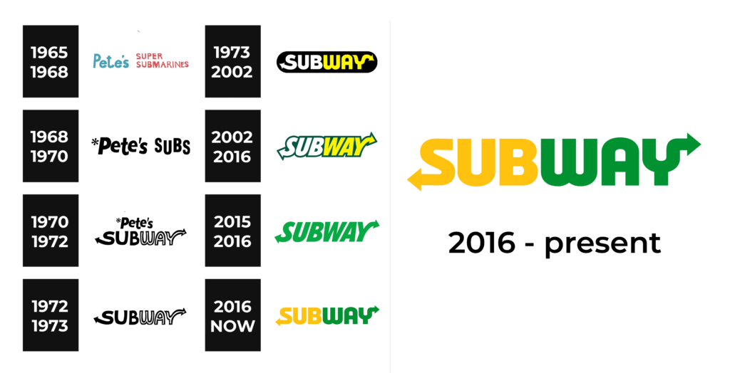
1965 – 1968
This logo is nothing unordinary and looks like a neat, hand-drawn plate with the name of the company. The first word is done in beach blue and larger font. The rest of the name is split between two lines and aligned to the left. These two lines are done in a muted red color. The font choice is what makes it appear handwritten as the strokes’ thickness slightly varies. All uppercase letters give it a traditional and simpler look.
1968 – 1970
As the name of the company changed, so was the logo. It now said “ Pete’s Subs” in black, bold, sans-serif font. All the characters were not lined up in one line, which preserved that friendly and easy-going impression. The first word had only the first letter capitalized, while the second word had all uppercase letters and more spacing between the letters. There was another one little detail a flower or star in the upper left corner.
1970 – 1972
This logo modification was also done due to the name change. Here, the logo has the name stacked in two lines. The first line was done in the same exact way as in the previous version. The second line features a significantly larger inscription with a sans-serif font with fluent, smooth strokes. It was this logo that introduced the arrows on either end of the word “Subway”. Moreover, the designers added another detail that created interest – the inscription was split in half by color, where the first half is done in black and the second is in white with a black outline. this logo presented the company as more advanced and stylish.
1972 – 1973
This logo looks bright and joyful. The yellow color invites everyone to come in and try everything that Subway has to offer. The top line is gone and now the logo has only “Subway”. The new name and logo are short and simple. The fact that the letter “W” looks like a mirror image of the well-recognized “M” in McDonald’s creates an association with another well-known chain. This increases trust and attracts more customers without going over the border and losing the unique features of this particular chain.
1973 – 2002
Although this logo was created half a century ago, it still looks modern and stylish. The black elongated oval background creates a perfect contrast for the yellow and white inscription. The latter features capitalized letters with smooth rounded strokes and straight cuts. It also had the arrows introduced a few years earlier.
2002 – 2016
The black background was removed and replaced by a thick dark green outline, which blended as the characters were spaced very closely. The natural green created an image of an environmentally friendly company and healthy food. The font used to print the name had straight lines and cuts, giving it a more serious look. The logo otherwise remained pretty minimalistic, which allowed the company to use it for a prolonged time without making any adjustments.
2015 – 2016
For a short period of time, the green color was the only color used in the logo. It was surely a reference to the fresh and healthy food cooked at Subway. It was the same logo created back in 2002, but here it has no outline and the name is not split in half.
2016 – Today
The company brought back the logo it had designed in 1973. There was no black base, though, and the color palette was changed to a combination of yellow and green. The colors were not too bright and looked very natural. The arrows were also redrawn to point straight horizontally. The logo looked inviting and reflected the company’s desire to give its customers healthy food and bright happiness.
Font and Color
Initially, the company’s logo looked handwritten. Most of the logos designed for the Subway brand have fonts with smooth curves and straight cuts. One of the unique features is the “S” and “Y” that have arrows on the ends.
The logos of the brand used many different color palettes. The first logo was more colorful and had a green-blue with red. For the next five years, the logos were done in a black-and-white color palette. It was the year 1973 that the company introduced a bright and happy yellow color. Since 2002, the logos featured a green color, which reflected the company’s strive to offer healthy and fresh food.


