Seattle Seahawks are a professional rugby franchise from the West Division of NFL, which was established in 1974 in Washington. One of the most successful franchises in American football, the Seahawks are best known for its fans, who set the world record in Noise. Today the team is owned by Paul G. Allen Trust and has Pete Carroll as the head coach.
Meaning and history
![]()
The logo, which can definitely be called iconic, was designed in 1976, and the artist took his inspiration from the Native American arts in general and the Kwakwaka’wakw Northwest Mask in particular. The tribal mask-inspired design was only slightly modified throughout the team’s history, showing their value of national heritage and respect to the country’s roots.
1976 – 2001
![]()
The initial logo design was composed of a hawk’s head in profile, looking to the right. The image was executed in bright blue, green, and white colors, symbolizing growth, reliability, and loyalty. The eye of the bird was executed in the traditional tribal-art manner.
2002 – 2011
![]()
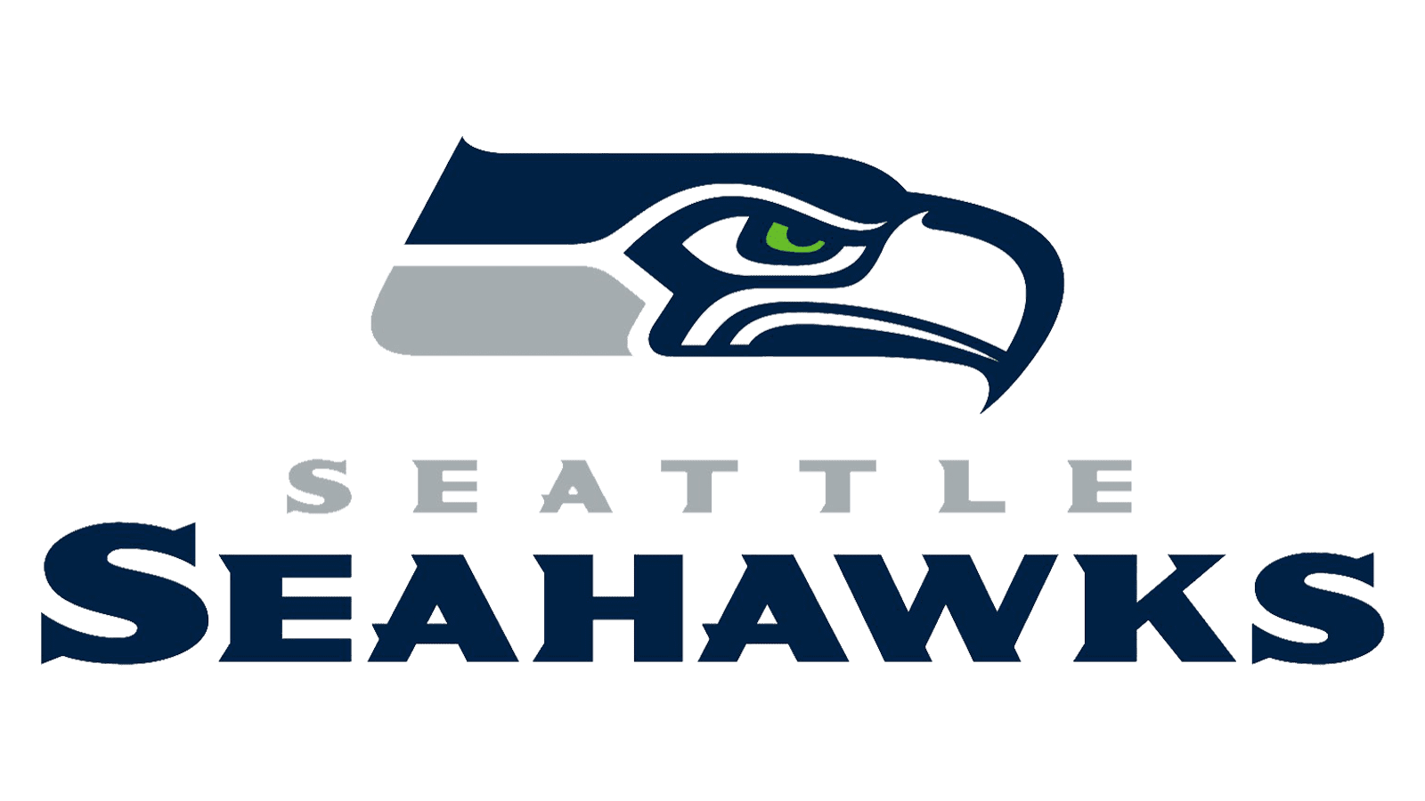
The hawk’s head is being dramatically redesigned in 2002. The concept, style, and idea remained the same, but the tribal motives are now almost gone and all the lines of the image are modern and smooth. As for the color palette, it has also been changed. The bright blue color was replaced by two new shades of blue — a calm light one and a navy-blue. The yawn now looks aggressive and dangerous, perfectly reflecting the spirit and character of the famous rugby team.
2012 – Today
![]()
The redesign of 2012 brought a slightly modernized color palette to the iconic logo. The light blue part of the image is now switched to a gray one, which adds professionalism and brutality to the team’s visual identity. The main blue became a little brighter, but it didn’t break the sense of danger and determination of the team’s players, on the contrary, the feeling of glory and power is definitely stronger in the new version.
Symbol
The hawk, resembling the ancient cultures and civilizations, is the perfect choice for a powerful professional rugby team, which main value is progress, success, and excellence. Even after two redesigns, there is still a resemblance to the Egyptian-mask art in the image, which is known and loved all over the world.
Emblem
For the emblem, the franchise puts the iconic hawk’s head on a gradient blue background, where the flying bird is embossed. It represents success and glory, adding some brutality and courage to the overall image. Sometimes the emblem is accompanied by the custom white wordmark, executed in a modern serif font with sharp distinctive angles and smooth lines.
Helmets
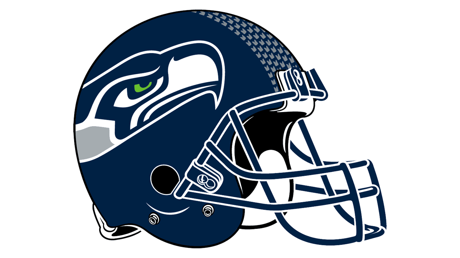
The Seahawks’ helmet design featured a solid navy-blue color and has the hawk’s head logo on both sides. Instead of the stripes, which most teams place in the middle of the helmet, the Seattle franchise decorates their helms with a gray dot pattern.
Uniforms
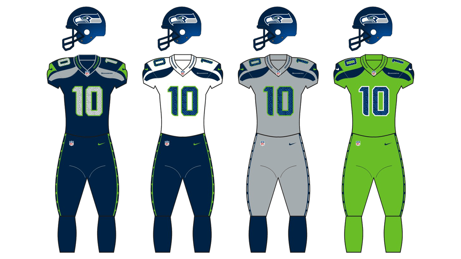
The home uniform of the Seattle Seahawks consists of a navy-blue jersey with green players number and gray decorative details on the shoulders. The pants feature a solid gray color and blue with green side stripes.
For their road outfit, the team wears a snow-white uniform with navy blue detail and delicate green accents.