San Fransisco 49ers are a professional rugby franchise, competing in NFL and named after the years when the team joined the National Football League, 1949. Today the team, owned by Denise DeBartolo York, is considered to be one of the most successful in the history of American football. The team has Kyle Shanahan as their head coach.
Meaning and history
![]()
The logo of The San Francisco 49ers is considered to be one of the most recognizable among all the rugby teams in the world. Despite its simplicity, it has a strong character and a bright color palette, which makes it truly remarkable. The first team’s logo was created in the 1940s, and the initial version was the only one without the ironic monogram. So, actually, there was only one major visual identity redesign in the franchise’s history — in 1968. All the other logos were simply modified and cleaned versions of it.
1946 – 1967
![]()
The initial logo, designed in 1946, was a funny and detailed image of a drunk gold-miner in a red and white suit and black boots. The man with black hair and mustache has a gun in each hand and his hat falling off the head. It was a bright and memorable picture, evoking a smile and a sense of passion and power due to its color palette.
1968 – 1988
![]()
The prototype of the iconic logo we all know today was created in 1968. It was a horizontally located red oval with a thick black outline. Two intertwined letters “S” and “F” in white traditional serif font were placed in its middle.
1989 – 1995
![]()
In 1989 the letters get a thin black outline, which balanced the frame of the oval logo and makes the whole look cleaner and more professional.
1996 – 2008
![]()
The redesign of 1996 brought a new double outline to the logo medallion — the inner gold frame was added to the picture, representing excellence and a fundamental approach. The white letters became bolder, as well as their outline. Now the logo started looking sleeker and brighter.
2009 – Today
![]()
In 2009 the logo was slightly modified again — the red color gained a scarlet shade, while the letters were enlarged and became more visible now. The new red gave the great contrast the logo was lacking before, so today the 49ers logo looks balanced and harmonized as never before.
Symbol
Until 2011 in addition to the main logo and emblem, the team also used a red shield in a double gold and black outline with bold white “49” digits on it. This symbol was as much recognizable as the official logo and was a perfect accompaniment to the franchise’s visual identity.
Emblem
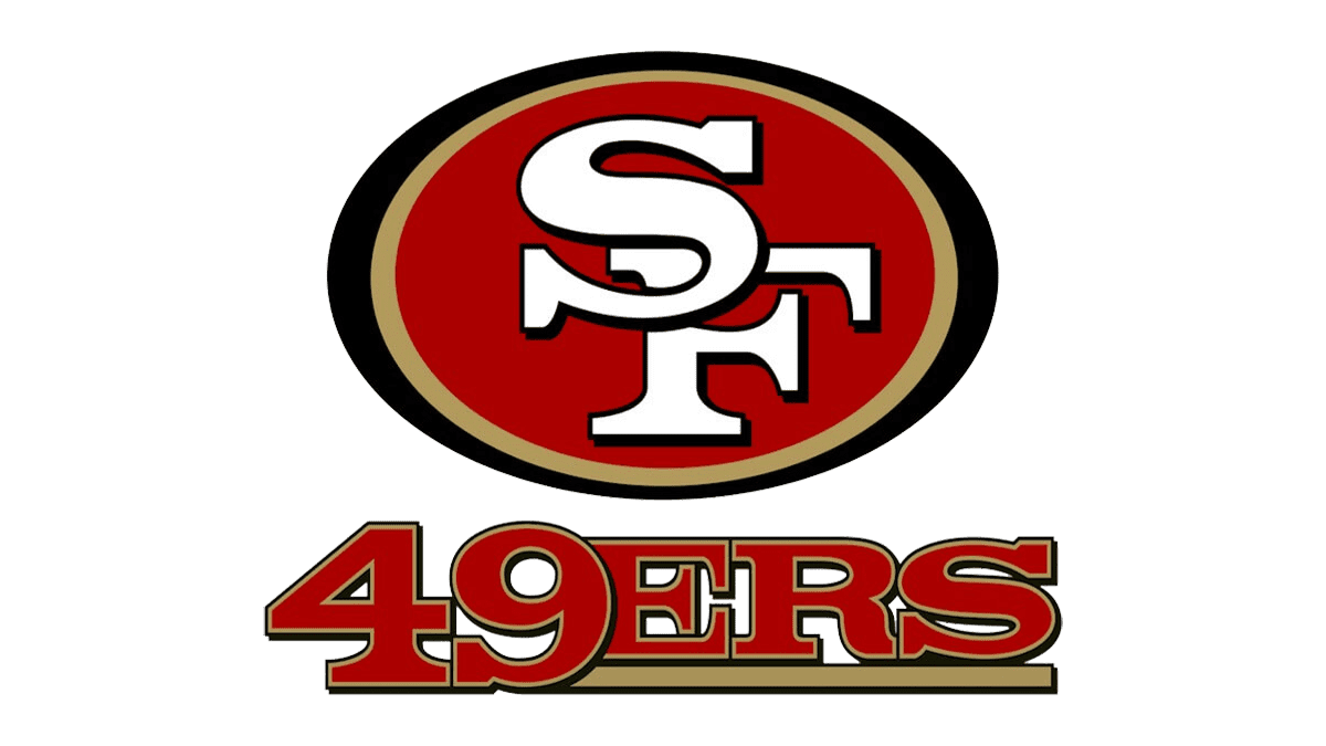
The horizontal oval emblem of the San Francisco team is usually placed on a golden background, in order to give it a luxury look, which represents professionalism and excellence of the team and evokes a sense of uniqueness and exclusivity.
Helmets
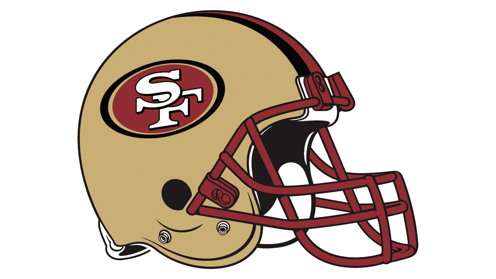
The 49ers helmets in sleek gold color are complemented by the iconic emblem on the sides and three lines in the middle — white and two red ones. Until 2009 the grill of the team’s helmets was red, but today it is colored white, which looks more sophisticated and calm.
Uniforms
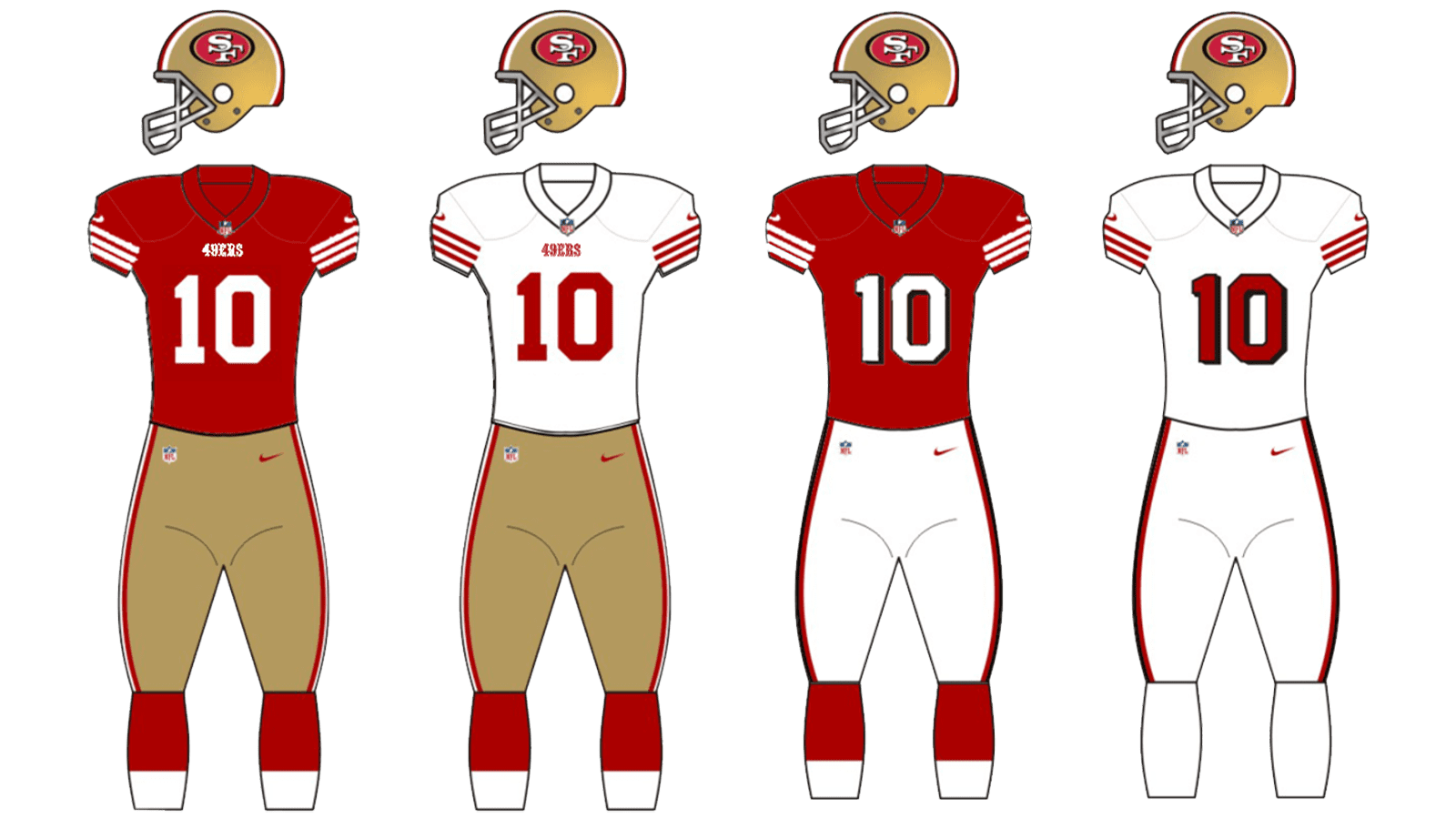
There are two versions of the San Francisco 49ers uniform — the home one and the road one. For the home games the team wears red jerseys with white accents and numbers, and the gold pants with three lines, repeating the ones on the helmets — white and two reds.
The road uniform consists of a white jersey with red details and the same gold-colored pants with red and white side stripes.