Safari Logo
Tags: Apple | web browser
Safari, a distinguished web browser, stands as Apple Inc.’s brainchild, crafted to redefine the digital browsing experience. In the pantheon of Apple’s innovative creations, Safari shines as a key player, conceived under the visionary guidance of co-founders Steve Jobs, Steve Wozniak, and Ronald Wayne. As the browser unfolds its capabilities, it becomes evident that its primary theatre of operation lies within the Apple ecosystem. This strategic focus enables Safari to deliver an unparalleled browsing experience on devices such as the iPhone, iPad, and Mac. The browser’s deep integration with Apple’s hardware and software is a testament to its commitment to offering a streamlined, secure, and highly efficient web navigation experience. The elegance and simplicity of Safari’s interface, combined with its robust performance, exemplify Apple’s dedication to user-centric design and innovation.
Meaning and history
Safari, the brainchild of Apple Inc., embarked on its digital voyage in January 2003. This marked a pivotal moment in Apple’s history, as the company, led by Steve Jobs and his co-founders, shifted from dependency on external browsers to forging its own path in web navigation. Safari’s journey is highlighted by several landmark achievements. In 2008, the introduction of the Nitro JavaScript engine revolutionized web browsing speed, setting new performance benchmarks. Safari was also at the forefront of advocating for HTML5, pushing the boundaries of web technology. The browser’s unwavering commitment to user privacy, exemplified by features like Intelligent Tracking Prevention, has been a game-changer in safeguarding user data. Presently, Safari is more than a browser; it’s an integral part of Apple’s digital ecosystem, constantly evolving with updates in iOS, iPadOS, and macOS. It’s current standing in the tech world is a blend of relentless innovation, a focus on enhancing user interfaces and maintaining a fortress of security and privacy, making it a top choice among Apple aficionados.
What is Safari?
Safari is a web browser designed by Apple Inc., offering a secure, efficient, and user-friendly internet navigation experience. Primarily tailored for Apple’s ecosystem, it embodies a blend of speed, privacy, and seamless integration across devices like iPhones, Macs, and iPads.
iOS
2007 – 2013
For Safari’s introduction on the original operating system, the logo was conceptualized as a square compass, blending traditional navigation symbols with modern design. The corners of this compass were gently rounded, and it featured intricate circular markings denoting the cardinal points through fine gradations. These were represented by almost dot-sized strokes and serifed capital letters, each encased in a dark blue circle. The backdrop of the dial was artistically rendered as a map of the world, with a particular focus on the Americas, and the arrows pointed in a northeast direction. This specific design choice was tailored for iPhone OS 1 and continued through iOS versions up to 6, encapsulating a phase in the evolution of mobile technology.
2013 – 2017
Following an update, the logo’s design was streamlined to embrace simplicity. The designers opted to remove the square background, the map, and the letter symbols, as well as the central decorative elements, focusing solely on the compass dial. This resulted in a 2D design, accentuated by striking red and white arrows. The design also saw the introduction of a blue gradient, a departure from the previous tonal circle, lending a fresh, modern feel. This redesign was characteristic of iOS versions 7 to 10, marking a distinct chapter in the visual identity of the platform.
2017 – Today
The advent of iOS 11 brought with it a refreshed logo for the web browser, albeit with subtle modifications. The designers chose to eliminate the white background and the gray square frame, subtly shifting the arrow to the left and reducing its ends. This was complemented by a transition to a pastel color palette, softening the overall aesthetic and aligning it with contemporary design trends. These minor yet impactful changes symbolized a continued evolution in digital branding, reflective of the subtle shifts in user interface design philosophy.
macOS
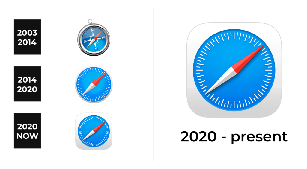
2003 – 2014
The original incarnation of the logo showcased a compass, meticulously crafted to exude a lifelike presence. This symbol of navigation was encased within an expansive, lustrous silver frame, its surface dancing with light, casting reflections and glares that brought a dynamic gloss to both the metallic rim and the glass. The compass itself was artfully tilted to the left, while its needle, defying this orientation, pointed steadfastly to the right. This creative juxtaposition served as a metaphor for the system’s inherent ability to recalibrate and guide users back to the correct path, no matter their deviations. This iconic logo adorned a variety of devices, spanning an era from Mac OS X Panther all the way to Mavericks, marking a significant period in technological aesthetics.
2014 – 2020
In a bold move, Apple redefined its browser’s identity, drawing inspiration from the sleek, minimalist design language of iOS 7. The logo underwent a transformation, shedding its realistic roots for a more abstract, print-friendly avatar. It now portrayed only the compass dial, captured from an overhead perspective, emphasizing a clean, front-facing view. The arrow, true to its original direction, subtly pointed to the northeast, albeit under a lesser angle. The design was simplified further by omitting the cardinal points’ lettering, opting instead for a nuanced approach with gradations indicated by strokes of varying lengths. Added to this was a faint framing edge and a central line that cleaved the arrow, lending it a subtle three-dimensional effect. This evolved icon became a signature element of macOS Catalina and its earlier versions, symbolizing a new era in digital navigation.
2020 – Today
The logo’s most recent update introduced a background for the compass – a muted, light gray square with softly rounded corners. This alteration marked a departure from previous designs, as the gradient that once adorned the dial was removed, and the compass hand was refined to a more delicate, thinner profile. This change signaled a shift towards subtlety and minimalism, reflecting a contemporary aesthetic that values understated elegance.
