Rolex Logo
Tags: quality | Switzerland | watchmaking
Rolex is a highly acknowledged label in the watchmaking market. Throughout its rich heritage dating back to 1905, Rolex has made itself a reputation as a high-end producer with an exceptional approach to quality. The daring innovations, stylish designs, and unwavering constancy are still parts of Rolex products.
Meaning and history
It is believed that the name ‘Rolex’ has its origins in the sound of timepieces being wound, whereas the part ‘ro’ reflects the movement of the mechanism, while the portion ‘lex’ adds an air of precision and status.
Rolex appeared in 1905 thanks to Swiss entrepreneurs Hans Wilsdorf and Alfred Davis. Back when it was a small workshop in London, Rolex secured a reputation for high quality. In 1910, it was the first ever watch label to get a certificate of chronometric precision in Bienne, Switzerland. This document confirmed the excellency of their watches and gave them a worldwide reputation.
As the years passed by, Rolex introduced new breathtaking solutions and horological inventions, such as the first water-resistant wristwatch, Oyster, released in 1926. The firm’s heritage is also accompanied by numerous remarkable events in which it took part. These include achievements in world exploration, such as expeditions to the highest mountains and deepest depths of the world.
What is Rolex?
Rolex is a prestigious Geneva-based watchmaking label with a great legacy in horology, dating back to the early 20th century. It is recognized for unaltered craftsmanship, timeless style, and uncompromising quality.
1905 – 1965
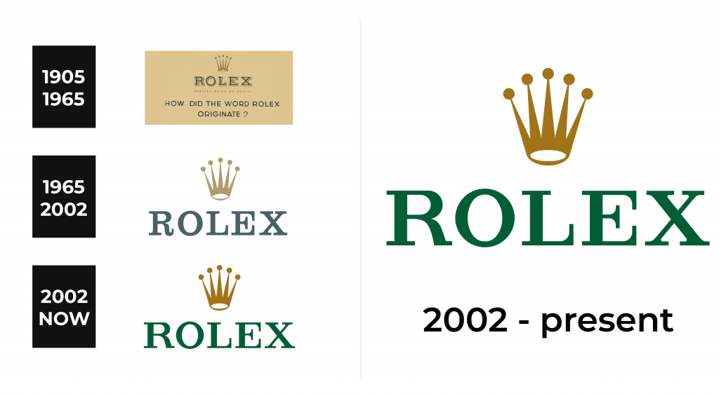
The inaugural Rolex logo, introduced in 1905, showcased a cream hue as the backdrop, with a resolute serif inscription in a captivating shade of verdant green, decorated by a discernible contour and a graceful, nuanced shadow. Above the inscription was a regal golden crown with five elongated pinnacles that exuded an air of refinement and sophistication.
1965 – 2002
In the year 1965, the Rolex logo was transformed, although its essence remained steadfast. The very fabric of its composition and chromatic tapestry experienced a subtle metamorphosis, as the tones of gold and green, while retaining their enchanting allure, underwent a gentle dimming and illumination. The very fibers of the typography were finessed, bestowing upon the renewed emblem and discarding all traces of outlining and shadows that once embellished its countenance.
2002 – today
In 2002, Rolex underwent a metamorphosis, enhancing its official palette with intensified hues. A luminous forest green was the color for the name caption, now reimagined in a bold and assertive serif typeface. The crown, a steadfast symbol of prestige, retained its elegant contours while basking in an elevated and deepened golden radiance.
Font
The legendary Rolex emblem draws influence from the Garamond typeface, infused with bespoke modifications for heightened uniqueness. The captivatingly crafted brand name exudes is written with capital letters, having slender yet striking serifs.
Color
In its latter logotype Rolex used a forest green hue. The crown retained its timeless gold-tone contours.


